Brand Identity (Name, Mascot, Logo & Colour System)
The conceptual development of the Bellomio brand was driven by the creation of a cohesive and engaging visual identity, combining naming, mascot design, logo development, and a structured colour system. This stage formed the foundation of the entire project, ensuring consistency across all later applications such as packaging, posters, and 3D visualisations.
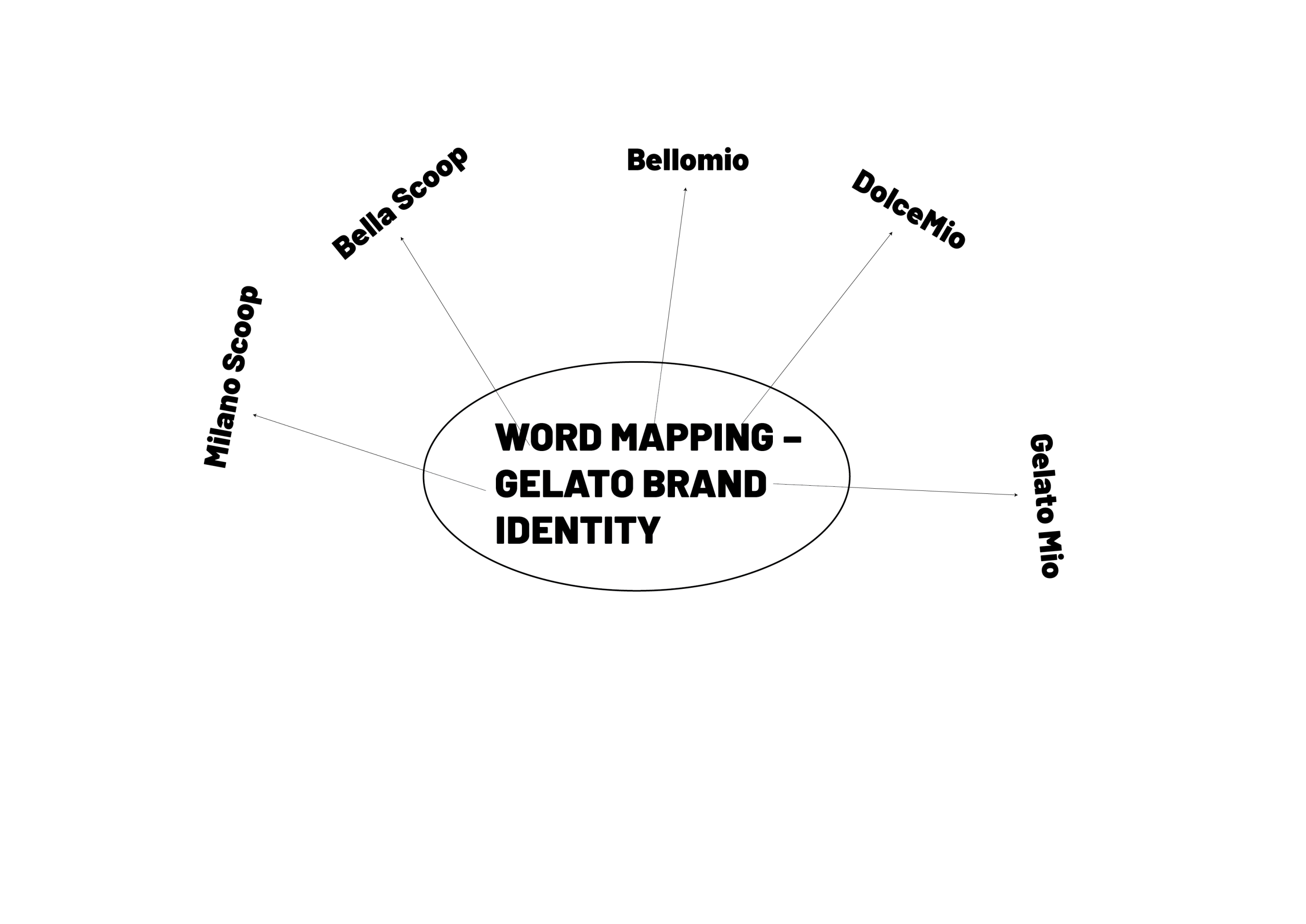
The brand name Bellomio was carefully selected to reflect both cultural context and emotional appeal. Derived from Italian-inspired language, the name combines “bello” (beautiful) and “mio” (mine), suggesting a personal and enjoyable experience. This aligns with the concept of gelato as something indulgent and emotionally satisfying. The name was chosen over other alternatives due to its memorability, rhythm, and strong connection to the “Italian summer” theme, which guided the overall direction of the project.
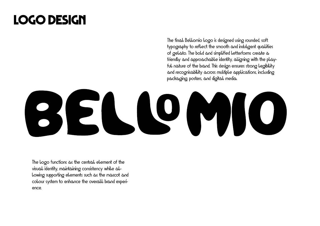
The logo design was developed to visually reinforce the personality of the brand. A rounded, soft typographic style was chosen to reflect the smooth and creamy qualities of gelato while also creating a friendly and approachable tone. The bold, simplified letterforms ensure clarity and recognisability across different scales and applications, making the logo effective in both digital and physical contexts.
Word Mapping
Logo Development
The logo was designed to complement the playful and friendly nature of the brand. Its rounded forms mirror the organic shapes found in the mascot design, creating a cohesive visual relationship between elements. The simplicity of the logo ensures adaptability across multiple platforms, while its bold presence allows it to function as a strong focal point within compositions.
Final Bellomio logo design, featuring rounded typography that reflects the soft, playful qualities of the brand.
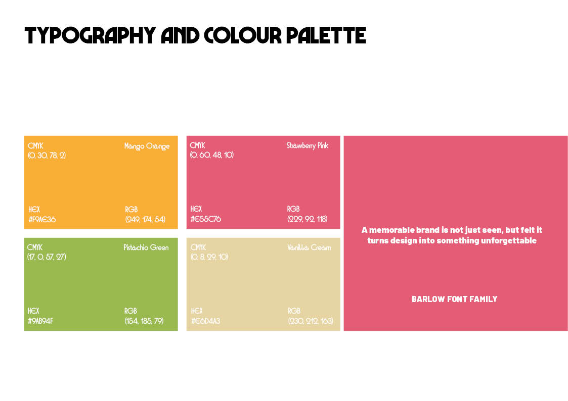
A key part of the identity system is the development of a flavour-based colour palette. Each colour was selected to represent a specific gelato flavour, creating a clear and intuitive visual system. Orange represents mango, pink represents strawberry, green represents pistachio, and a soft neutral tone represents vanilla. These colours were chosen for their vibrancy and ability to attract attention while maintaining harmony across the brand. This system allows for easy product differentiation while ensuring visual consistency throughout all design outputs.
Development of the Bellomio colour palette, linking each colour to a specific gelato flavour to create a cohesive and recognisable visual system
Mascot Development & Iteration
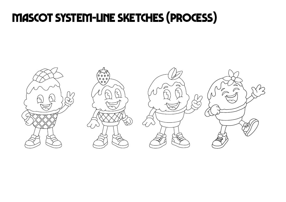
The mascot plays a central role in the Bellomio brand identity, acting as a visual representation of the product’s personality. The design process involved multiple iterations, starting from simple line drawings and progressing into fully coloured characters. Early sketches explored different proportions, facial expressions, and stylistic approaches. Through refinement, the character was simplified to ensure clarity, recognisability, and adaptability.
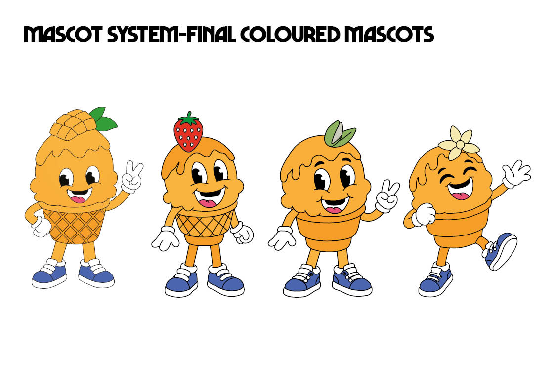
Different variations of the mascot were created to represent individual flavours, incorporating subtle changes such as toppings and colour adjustments. For example, the mango character includes a mango element, while the strawberry and pistachio versions incorporate corresponding visual details. This system allows the brand to maintain consistency while offering variety across its product range.
Additionally, the use of expressive poses and gestures enhances the character’s personality, making it more engaging and relatable to the audience. The final designs balance simplicity with detail, ensuring they remain effective across different scales and applications.
Mascot development process, showing progression from initial line drawings to refined, coloured characters representing different gelato flavours.
Final Mascot Variations
The final mascot system demonstrates a consistent visual language across all flavour variations. Each character maintains the same core structure while incorporating flavour-specific details, reinforcing both brand identity and product differentiation. This approach ensures that the brand remains cohesive while offering a dynamic and engaging visual experience.
Final mascot variations, demonstrating consistency across different flavours while maintaining individual visual identity.