The experimentation and prototyping phase of the Bellomio project focused on testing how the brand identity could be translated across different formats, materials, and visual systems. This stage was essential in bridging the gap between initial concept development and final realisation, allowing for the refinement of both aesthetic and functional aspects of the design.
A key starting point in this phase was the development of the checkerboard pattern system. The pattern, inspired by traditional Italian dining tablecloths, was initially explored as a bold, central visual element. Early pattern tests featured high contrast between the orange background and white squares, creating a strong visual impact. However, through experimentation, it became clear that when applied at full scale, the pattern could dominate the composition and compete with the logo and mascot. As a result, the pattern was refined into a more controlled system, often repositioned to the lower section of layouts or reduced in scale. This allowed it to function as a supportive branding element rather than a distracting feature.
Pattern Development Exploration – Testing scale, placement, and contrast of the Italian-inspired checkerboard pattern to achieve visual balance.
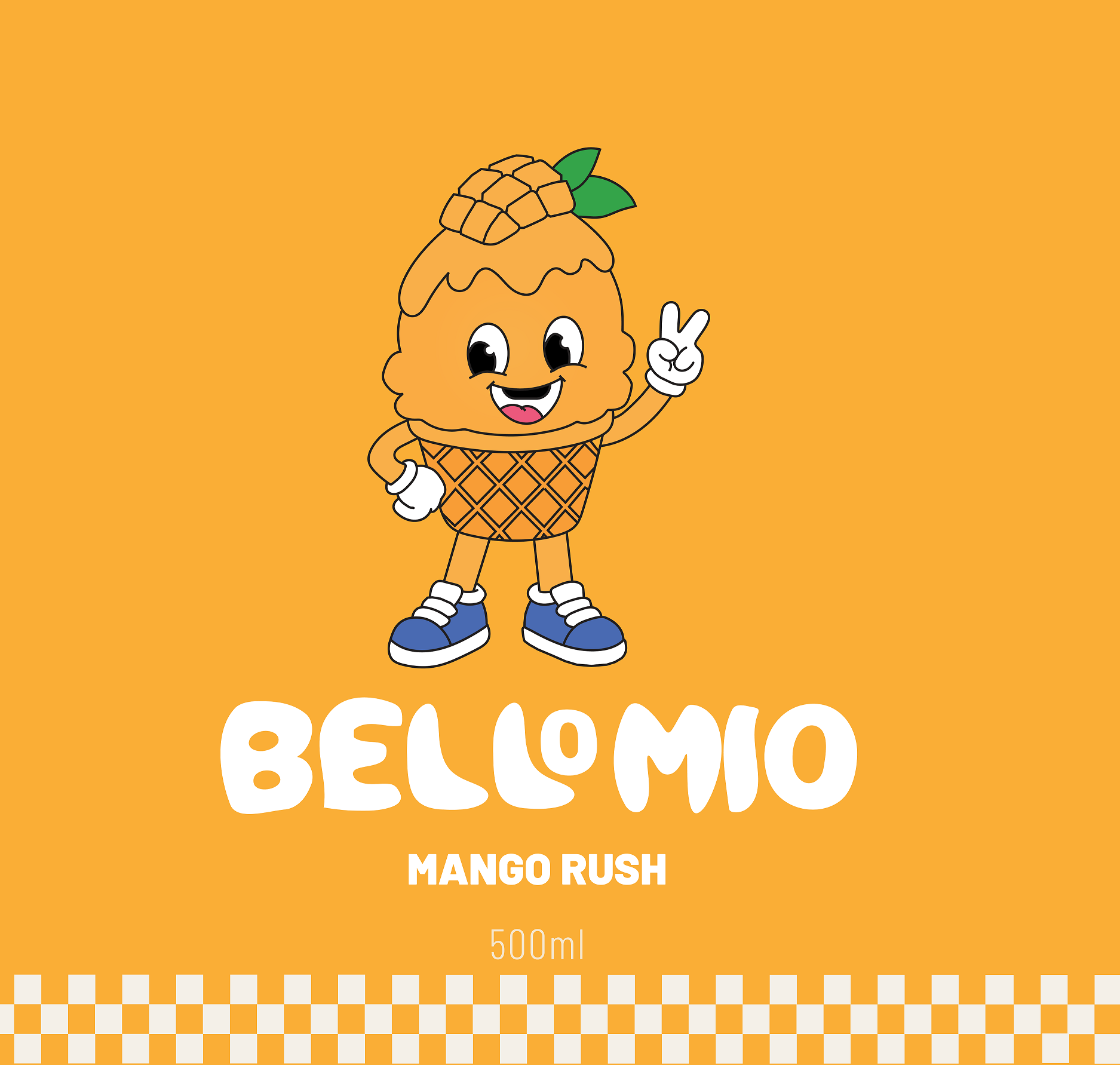
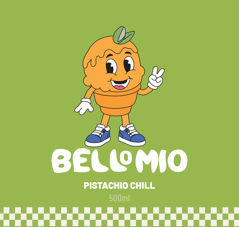
The next stage of experimentation involved applying the brand across poster formats for different gelato flavours. Each poster explored how colour, typography, and composition could work together to communicate flavour identity while maintaining brand consistency. The Mango Rush design uses a bold orange background to evoke warmth and energy, while Strawberry Bliss introduces a vibrant pink tone to communicate sweetness and playfulness. Pistachio Chill incorporates a softer green palette, reflecting freshness and calmness, and Vanilla Cloud uses a neutral cream tone to suggest smoothness and simplicity.
Through comparing these variations, the importance of a consistent layout system became evident. The positioning of the logo, flavour text, and pattern was standardised across all designs, creating a recognisable visual structure. At the same time, colour and mascot variations allowed each flavour to maintain its individuality. This demonstrates an effective balance between consistency and flexibility within the branding system.
Flavour Poster Variations
Flavour Poster Variations
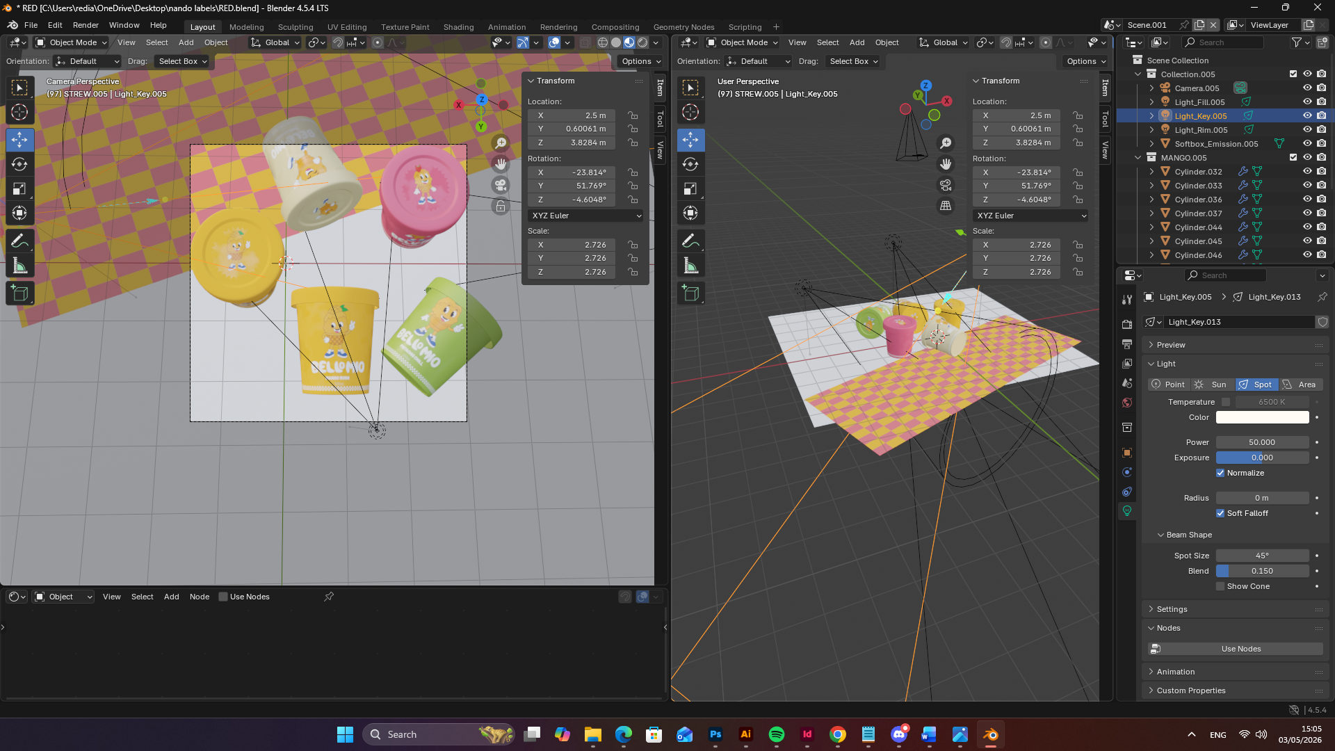
A major component of the prototyping phase was the transition from 2D design into 3D visualisation using Blender. This allowed the project to simulate real-world packaging and evaluate how the brand would function in a physical context. Early 3D renders revealed limitations in material realism, with surfaces appearing flat and lacking depth. To address this, material properties such as roughness, reflectivity, and subsurface characteristics were adjusted to better replicate plastic packaging. These refinements resulted in a more realistic appearance, enhancing the professional quality of the visual output.
Lighting experimentation also played a crucial role in improving the 3D renders. Initial lighting setups created harsh shadows and uneven highlights, which reduced clarity and visual appeal. Through testing softer lighting configurations, a more balanced and natural look was achieved. This not only improved the visibility of branding elements but also aligned the visuals with contemporary product advertising standards.
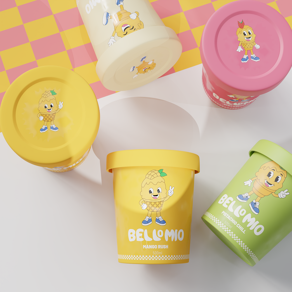
3D Packaging Prototyping (Initial Setup) – Early render testing focusing on material properties and lighting conditions
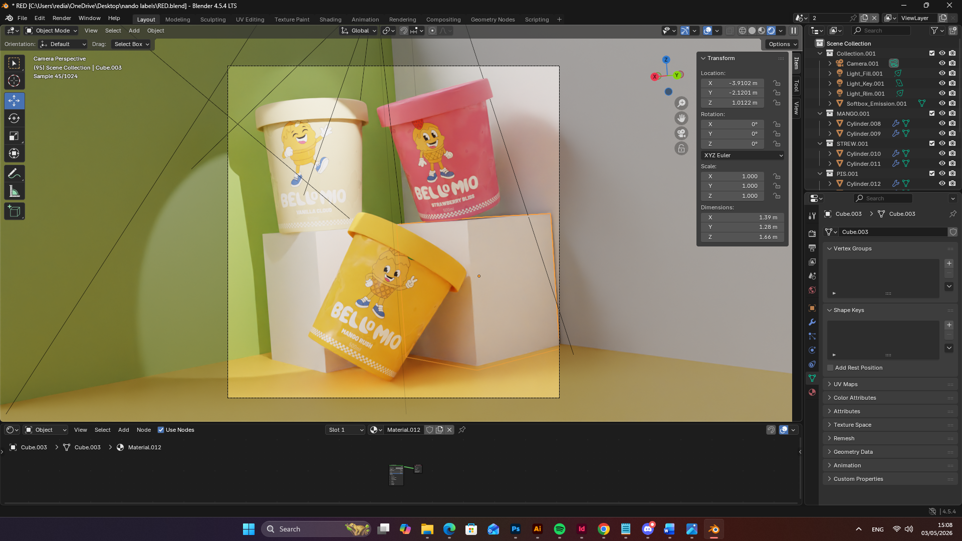
Further experimentation explored how multiple packaging units could interact within a composition. By stacking and arranging the gelato containers in different configurations, the project tested depth, perspective, and spatial relationships. These compositions helped simulate real retail or promotional scenarios, demonstrating how the product might appear in advertising campaigns. The use of dynamic arrangements added visual interest while maintaining clarity and focus on the branding.
Packaging Arrangement Exploration – Testing composition, stacking, and spatial relationships in 3D environments
Another refinement stage involved improving colour accuracy and consistency between 2D and 3D outputs. It was important that the colours used in posters translated effectively onto the packaging renders. Through iterative adjustments, a consistent colour system was achieved, ensuring that each flavour remained instantly recognisable across all formats. This highlights the importance of cross-media consistency in branding.
Finally, the integration of the mascot across both 2D and 3D applications was tested. The mascot needed to remain clear, readable, and visually engaging at different scales and on curved surfaces such as packaging. Through multiple iterations, the placement and size of the mascot were refined to ensure it complemented the logo rather than competing with it. This contributed to a more cohesive and balanced final design.
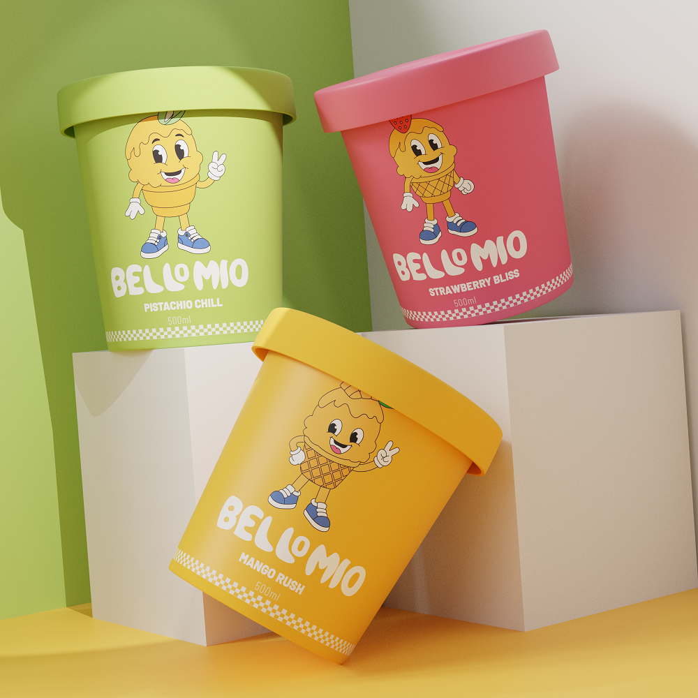
Final Packaging Visualisation – Refined 3D renders demonstrating consistency across materials, colour systems, and branding elements
Final Packaging Visualisation – Refined 3D renders demonstrating consistency across materials, colour systems, and branding elements
the experimentation and prototyping phase allowed for the critical evaluation of design decisions across multiple contexts. By testing pattern systems, layout structures, material properties, lighting, and composition, the project evolved into a cohesive and adaptable branding solution. This process demonstrates a strong understanding of both visual communication and practical application, ensuring that the Bellomio brand is not only visually engaging but also suitable for real-world implementation.
Final Evaluation
The Bellomio project demonstrates a successful response to the initial brief through the development of a cohesive and visually engaging gelato brand identity. The final outcome effectively combines character design, colour, and typography to communicate a playful and approachable brand personality, while maintaining consistency across multiple applications.
A key strength of the project is the considered integration of historical reference, specifically the reinterpretation of the Italian checkerboard tablecloth into a contemporary pattern system. This approach reflects an understanding of how cultural elements can inform modern design. Furthermore, the progression from 2D design into 3D visualisation enhances the professional quality of the work, aligning the project with current industry practices in product branding and advertising.
The design process demonstrates clear evidence of iteration and refinement, particularly in relation to composition, hierarchy, and clarity. Feedback was effectively incorporated to improve visual balance and strengthen communication. This iterative approach indicates an ability to critically evaluate and develop design outcomes.
While the project is resolved to a strong standard, further development could include expanding the brand into additional digital or motion-based applications, as well as refining typographic details at smaller scales. Overall, the project reflects a high level of technical competence, creativity, and critical awareness, resulting in a resolved and commercially relevant branding solution.