Responding to an Independent Project Brief
This project responds to a self-initiated design brief focused on developing a contemporary gelato brand identity titled Bellomio. The brief required the creation of a cohesive and adaptable visual system capable of functioning across multiple outputs, including packaging, promotional posters, and 3D-rendered advertising visuals. A key objective was to position the brand within a competitive food and beverage market by creating a distinctive and memorable identity that communicates both emotional appeal and commercial viability.
From the outset, the project was guided by the conceptual direction of “A Scoop Into Italian Summer,” which informed both the visual language and experiential qualities of the brand. Rather than approaching the brief purely as a surface-level branding exercise, the design process focused on constructing a narrative that connects the product to a lifestyle and cultural context. This approach aligns with contemporary branding strategies, where storytelling and emotional engagement are essential in influencing consumer perception and brand loyalty.
The target audience was identified as young adults and families who are visually driven and responsive to playful, character-led branding. This directly influenced the decision to incorporate bold colour palettes, simplified typography, and a mascot-based identity. Critically, this choice reflects an understanding of how modern audiences interact with brands across digital platforms, where immediacy, recognisability, and visual clarity are essential.
In responding to the brief, the project demonstrates a synthesis of graphic design and 3D visualisation, reflecting current industry practices where branding extends beyond static graphics into immersive and realistic product representation. The integration of Blender-based rendering allows the work to simulate real-world applications, strengthening its relevance to commercial contexts.
Historical and Contemporary References (Critical Analysis)
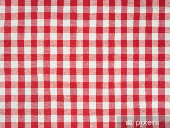
The historical foundation of this project is rooted in traditional Italian dining culture, specifically the iconic red-and-white checkered tablecloth. This pattern, widely associated with mid-20th century Italian trattorias, functions not only as a decorative element but also as a cultural signifier of authenticity, familiarity, and communal experience. Its repetitive geometric structure creates a strong visual rhythm, making it both functional and symbolically rich within the context of Italian food culture.
Rather than directly replicating this historical reference, the project critically reinterprets it as part of a contemporary branding system. This transformation demonstrates an awareness of how historical elements can be adapted to suit modern visual communication. By altering the colour palette to correspond with gelato flavours, the pattern shifts from a literal cultural reference to a flexible branding device. This decision reflects a deeper understanding of design translation, where meaning is preserved while form is evolved.
Importantly, this approach aligns with the project brief by reinforcing the “Italian summer” concept in a subtle yet recognisable way. Instead of relying on stereotypical imagery, the design embeds cultural references within the visual system itself, allowing the audience to engage with the brand on both a conscious and subconscious level.
Contemporary Reference – Gelato Branding & Visual Culture
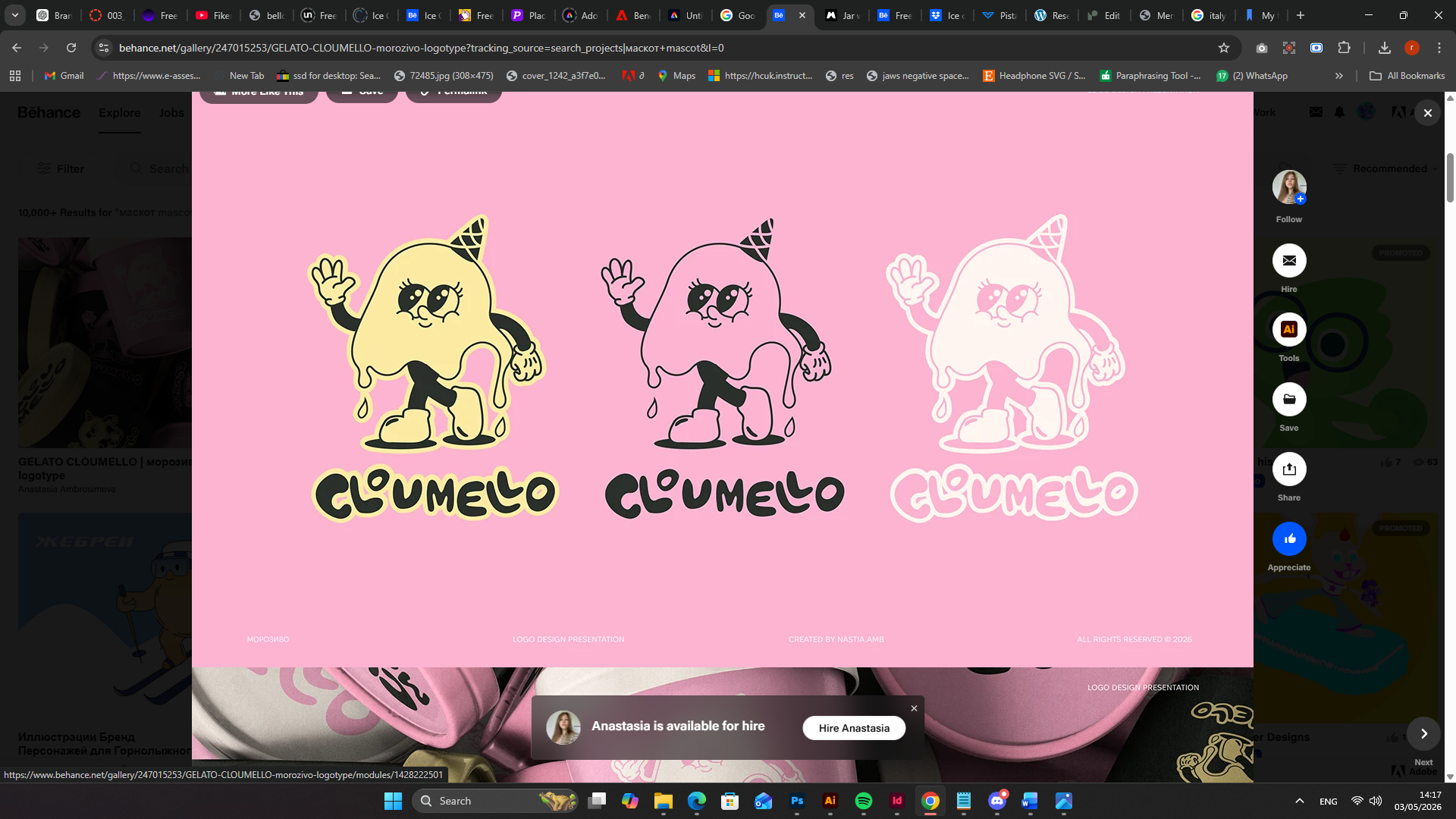
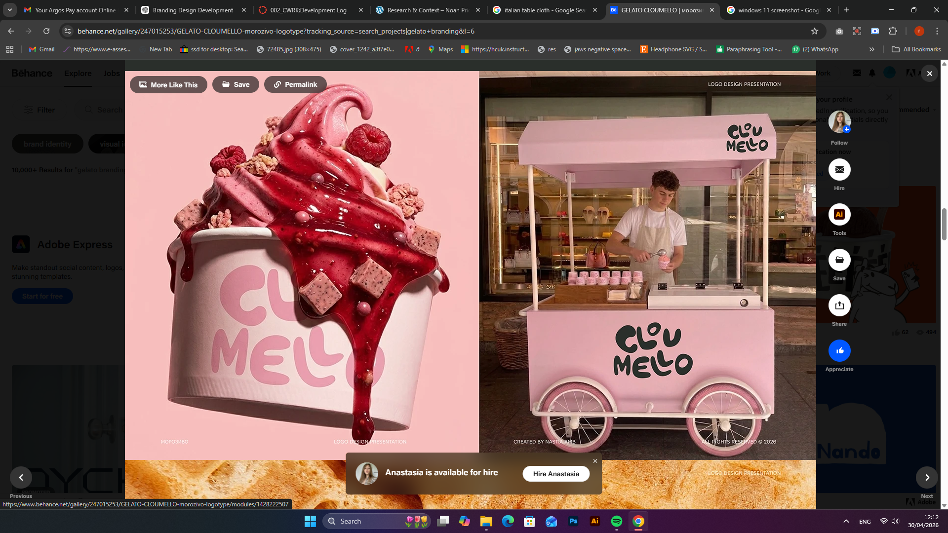
The contemporary direction of the project was informed by the analysis of current branding practices within the food and beverage industry, particularly those presented on platforms such as Behance. Projects such as Cloumelo demonstrate a shift towards minimal yet expressive branding, where character design, soft colour palettes, and high-quality 3D rendering are used to create emotionally engaging and visually distinctive identities.
A critical observation from these references is the emphasis on experience-driven design. Modern gelato branding no longer focuses solely on the product itself but instead constructs a visual narrative around it. This includes the use of floating compositions, soft lighting, and tactile material representation to evoke a sense of realism and desirability. These techniques were directly applied within the Bellomio project, particularly in the arrangement of containers and the development of lighting setups in Blender.
Additionally, contemporary branding often prioritises adaptability across platforms. The simplified typography and mascot-driven identity seen in these references influenced the development of Bellomio’s visual language, ensuring that the brand remains recognisable whether viewed on packaging, posters, or digital media. This demonstrates a clear alignment with the project brief, which required a cohesive system capable of functioning across multiple formats.
Critical Integration of References
The strength of this project lies in its ability to integrate both historical and contemporary references into a unified design outcome. Rather than treating these influences as separate, they are combined to create a layered visual identity that is both culturally grounded and visually current.
The historical Italian tablecloth provides conceptual depth and authenticity, anchoring the brand within a recognisable cultural framework. In contrast, contemporary branding techniques ensure that the final outcome aligns with current visual expectations and industry standards. This balance reflects a critical understanding of design practice, where innovation often emerges through the reinterpretation of existing visual languages.
Furthermore, this integration directly supports the project brief by ensuring that the brand communicates both emotional resonance and commercial effectiveness. The result is a design that not only meets the functional requirements of branding but also engages the audience through a carefully constructed visual narrative.
Reference List
- ACL Staffs (2025). What Makes Italian Striped Tablecloths Unique? Where History Meets Hospitality. [online] All Cotton and Linen. Available at: https://www.allcottonandlinen.com/blogs/news/what-makes-italian-striped-tablecloths-unique-where-history-meets-hospitality?srsltid=AfmBOopdHLWRd_V4ohaHACrAZO8AmDW88dEBkCJ1_Jx0_Nfh2cTl9o7o [Accessed 3 May 2026].
Ambrosimova, A. (2026). GELATO CLOUMELLO | морозиво logotype. [online] Behance. Available at: https://www.behance.net/gallery/247015253/GELATO-CLOUMELLO-morozivo-logotype?tracking_source=search_projects [Accessed 3 May 2026].