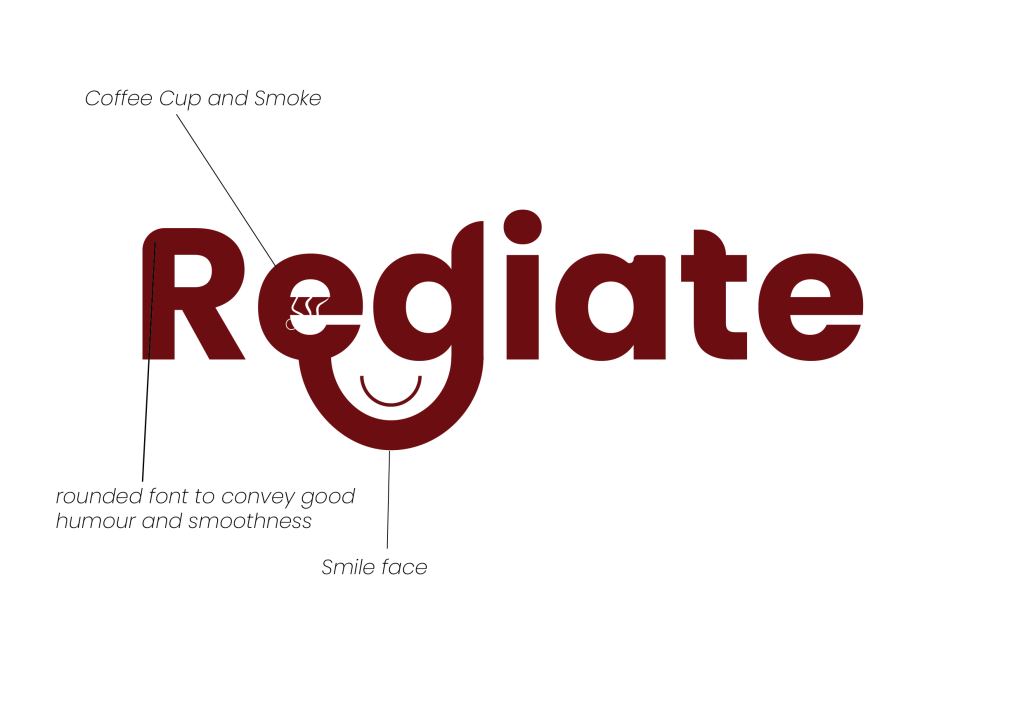
I should start by saying that this is my first personal logo that I conceptually designed. It’s easy to identify what this logo represents; I tried to express my personality and my hobbies through its design. I created it in Adobe Illustrator since I thought it was the easiest programme to use for creating vectors, especially when playing with typefaces.
The reason I employ rounded shapes in typefaces to convey my humour and relaxing personality is highlighted in the line above. In the (E) letter, I tried to use the white space as a coffee cup (Mag) and the smoke effect to tell an interesting story about how much I love coffee. I think I express my personality through the design overall, especially when it comes to the font and colour choices. I enjoy minimalist design a lot and try to incorporate it into all of my designs, which is why I chose the Poppins font. Finally, I tried drawing a shape to connect the letters D and E, and I put a smiling face because I enjoy making jokes and maintaining a positive outlook on life.

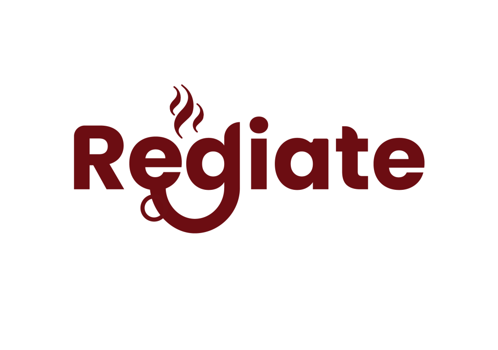
This is my second conceptual logo that I made for this project; conceptually, it isn’t all that different from the previous one, but there are some significant design differences between the two, as we’ll talk about in the Lab. After receiving some insightful feedback on my conceptual design, I decided to make some changes. I started by designing my cup in the shapes of the letters E and D, then I shaped coffee smoke above the two letters.
Additionally, everything else appears the same as it does in the previous image, so I decided not to elaborate on that here since I have already explained why I chose the font and style there.
