Refinement, Rationale, and Preparation for Final Realisation
The final stage of the Bellomio project involved a process of refinement in which key design decisions were evaluated and resolved to ensure a cohesive and effective outcome. These decisions were informed by prior research, experimentation, and user feedback, resulting in a visual identity that aligns with both the conceptual direction and practical requirements of the project brief.
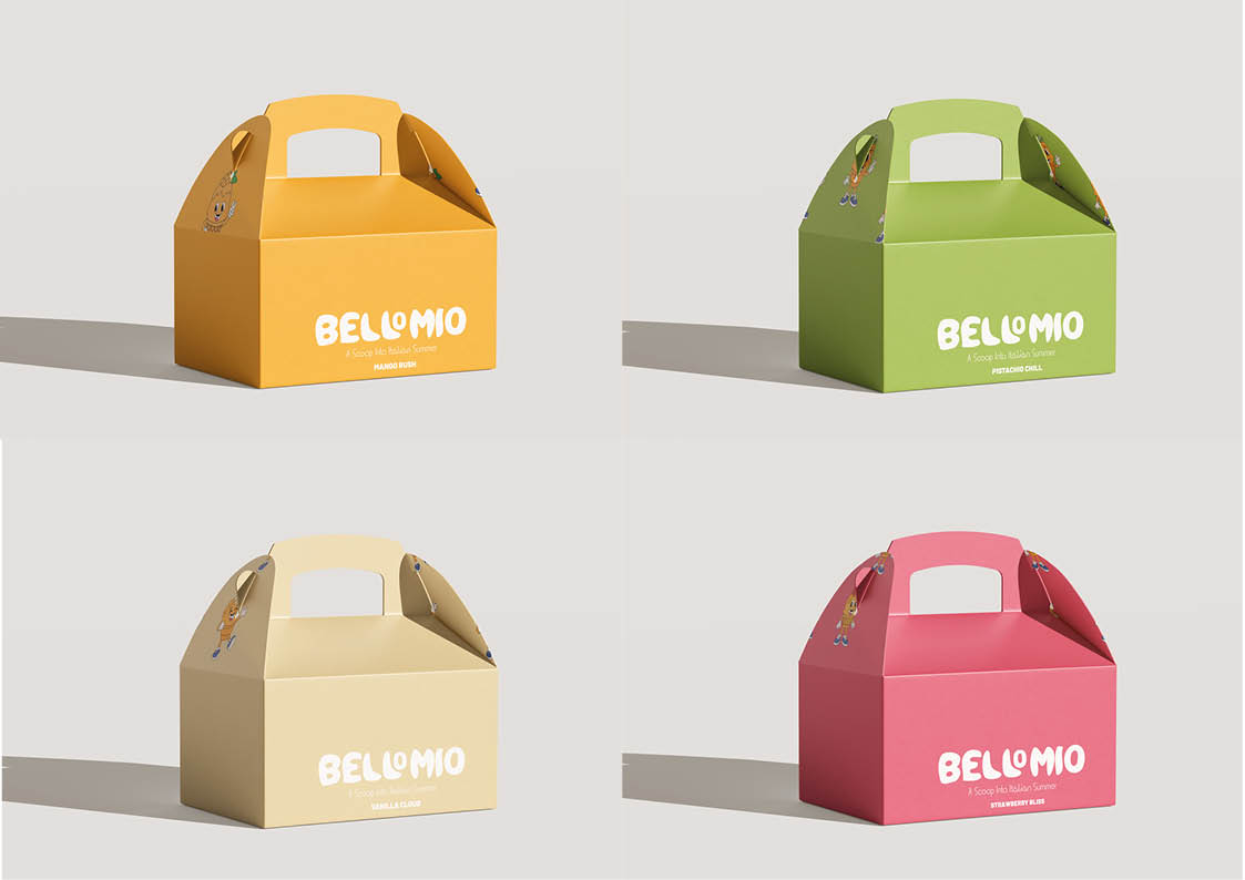
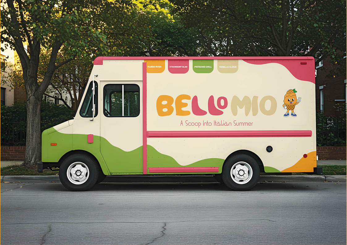
A primary design decision was the use of a flavour-based colour system. Bright, saturated colours were selected to reflect the sensory qualities of gelato while also enhancing visual impact within advertising contexts. Each colour was carefully assigned to a specific flavour, allowing for clear differentiation while maintaining overall brand consistency. This approach supports both aesthetic appeal and functional communication, ensuring that the product is easily identifiable across multiple applications.
The inclusion of a mascot as a central branding element was another key decision. This choice was informed by the intention to create an engaging and approachable identity that resonates with the target audience. The mascot was refined through iterative development to achieve a balance between simplicity and expressiveness, ensuring that it remains effective across different scales and formats. Its consistent application across flavour variations reinforces the brand identity while introducing subtle visual diversity.
The checkerboard pattern, derived from Italian dining culture, was retained as a supporting design element following refinement. Its use was carefully controlled to avoid overwhelming the composition, instead functioning as a subtle visual reference that reinforces the project’s conceptual theme of “Italian summer.” This decision demonstrates an understanding of how decorative elements can contribute to a design without compromising clarity or hierarchy.
The transition from 2D design to 3D visualisation required further informed decision-making, particularly in relation to materials, lighting, and composition. The use of realistic plastic materials and soft lighting was selected to align the project with contemporary product visualisation standards. These choices enhance the perceived quality of the product and ensure that the final renders are suitable for commercial presentation.
In preparation for final realisation, the design system was tested across multiple formats, including packaging, poster layouts, and environmental mockups. This ensured consistency and adaptability, confirming that the brand functions effectively in both digital and physical contexts. Adjustments were made to spacing, scale, and alignment to achieve a balanced and professional presentation.
Overall, the final design decisions reflect a considered and informed approach, where each element has been refined to support the overall concept and functionality of the brand. The outcome demonstrates a clear understanding of design principles, resulting in a cohesive, visually engaging, and commercially relevant solution.