Task 1 Abram Games and Graphic Design for Social Good in Post-War Britain
Graphic design played a crucial role in shaping public understanding and social values during the twentieth century, particularly in the post-war period. Following the Second World War, visual communication became an essential tool for rebuilding societies, educating citizens, and promoting collective responsibility. One influential example of design for good from this era is Abram Games’ Your Britain – Fight for It Now (1943), a poster that demonstrates how graphic design can achieve social impact through clarity, symbolism, and purpose.
Abram Games was a leading British graphic designer and the official war poster artist for the British government. Working during a time of national crisis and reconstruction, Games believed that design should communicate ideas as clearly and efficiently as possible. His design philosophy, famously described as “Maximum Meaning, Minimum Means,” focused on reducing visual noise while strengthening the message. This approach was particularly significant in the post-war period, when designers needed to communicate complex social ideas to a broad and diverse audience.
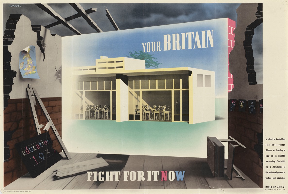
The Your Britain – Fight for It Now poster visually contrasts two visions of Britain. At its centre is a clean, modern school building labelled “Your Britain,” representing progress, education, and hope for a better future. The calm colour palette and structured architectural forms reflect post-war ideals of stability, order, and long-term social improvement. Surrounding this optimistic image is a dark, damaged interior space with crumbling walls and broken objects, symbolising poor living conditions and social neglect experienced during and after the war. This sharp contrast encourages viewers to reflect on the kind of society they want to rebuild.
Typography reinforces the message, with the phrase “FIGHT FOR IT NOW” positioned boldly at the bottom of the poster. The word “NOW” is highlighted in red to convey urgency and action, ensuring the message is both immediate and memorable. Through simplified imagery, strong visual hierarchy, and symbolic contrast, Games communicates a complex political message using minimal visual elements, clearly reflecting his design philosophy.
This poster exemplifies design for good by using visual communication to raise awareness and influence public attitudes toward social reform. Reflecting on Abram Games’ work has shaped my own design values, particularly my interest in creating branding and visual identities that serve people as well as businesses. His emphasis on clarity, purpose, and social responsibility reinforces my belief that graphic design should not only be visually effective but also meaningful and ethically grounded.
Task 2 Visual Analysis: The Lost Class—Graphic Design as Advocacy
“The Lost Class” campaign exemplifies how graphic design can extend beyond traditional media, using spatial, symbolic, and technological strategies to communicate societal issues with immediate impact. Conceived in response to gun violence, the intervention visualized the high school students who would have graduated in 2021 but were instead killed, turning statistical abstraction into a tangible, emotive experience.
Symbolic Minimalism and Negative Space
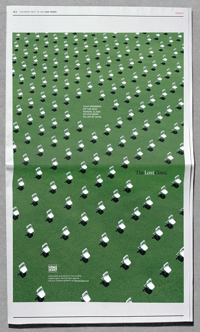
At the heart of the campaign was a stark visual metaphor: 3,044 white folding chairs, each representing a life lost to gun violence, arranged individually across a Las Vegas soundstage. The chairs, spaced meticulously, evoked the rows of tombstones at Arlington National Cemetery, as explained by Sam Shepherd, Executive Creative Director at Leo Burnett: “That’s what the graduation chairs represented to us… Arlington National Cemetery and the way the tombstones are arranged played a major role in our idea.”
This deliberate use of negative space amplified emotional resonance. The emptiness between chairs highlighted both the magnitude of loss and the individuality of each victim, turning cold statistics into a hauntingly human visualization. From any angle, viewers could see both the sheer scale of gun fatalities and the personal tragedy behind each chair. The design exemplifies how environmental graphic design and minimalism can convey narrative power without relying on text or complex imagery.
Typography and Branding
The campaign employed classic, serif academic typography for “James Madison Academy,” lending the ceremony a sense of authenticity. This “Trojan Horse” approach invited participants—including pro-gun advocates to engage with what they thought was a routine rehearsal. Instead, they faced the empty chairs, a powerful visual confrontation that reframed political debate into human tragedy.
Critical analysis: Typography here is not decorative, it reinforces credibility and narrative tension, making the design strategy psychologically impactful.
Technological Impact and Social Virality
Designed explicitly for the digital age, The Lost Class functioned as a hybrid between spatial graphic design and networked media activism. High-definition drone photography and cinematic videography were central to the campaign’s visual strategy, enabling the scale and repetition of the 3,044 empty chairs to be fully comprehended. Aerial perspectives transformed the installation into a data-like visual field, optimized for circulation across social media platforms where striking, legible imagery is essential for capturing attention in fast-moving feeds.
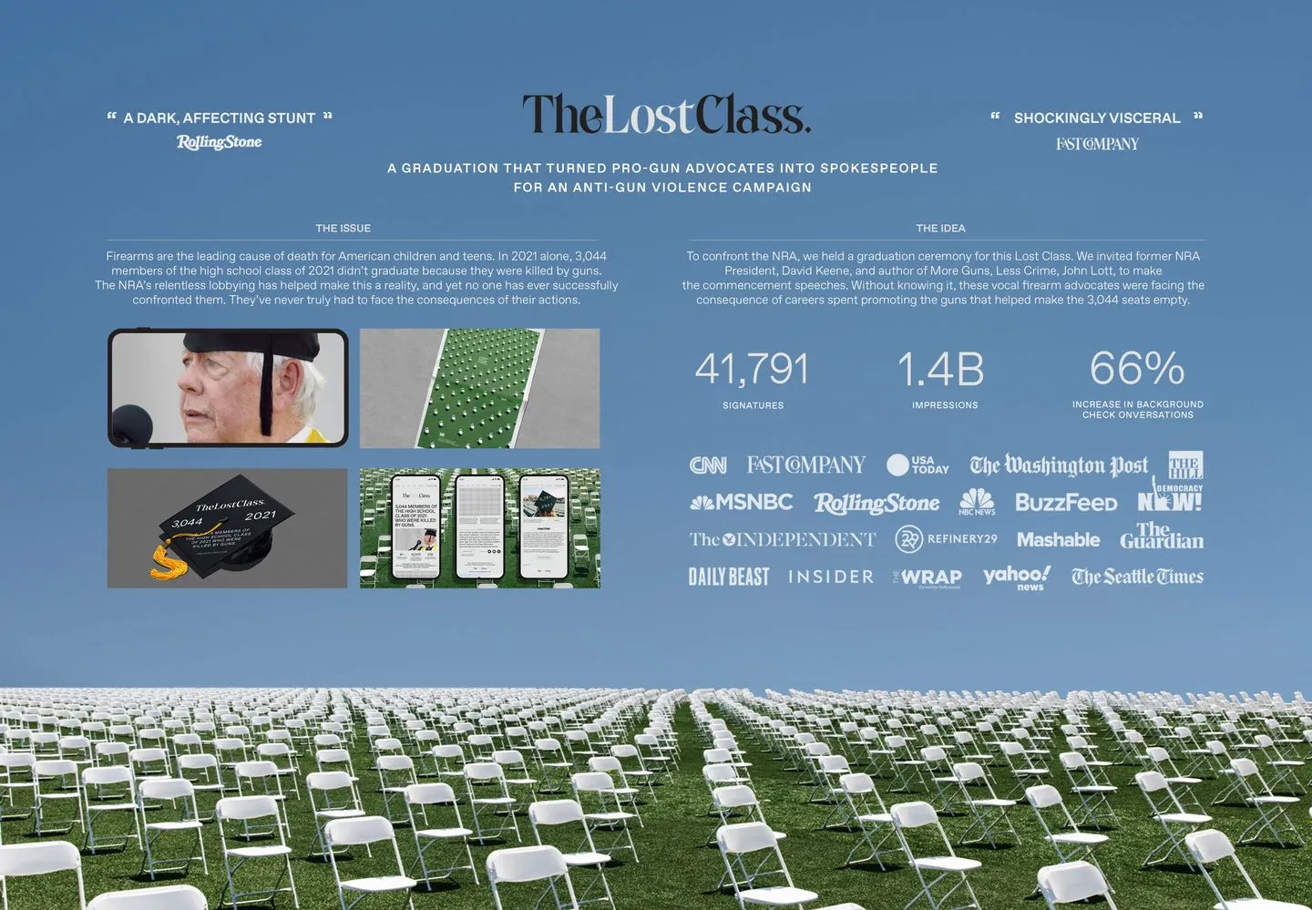
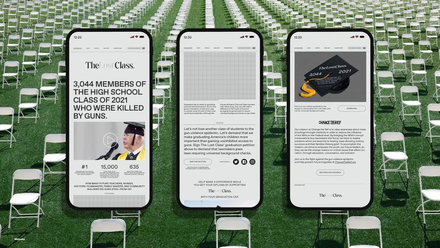
Crucially, the campaign did not rely on emotional impact alone. QR codes and integrated social links embedded within the visual content enabled a seamless transition from affective response to political action, allowing audiences to immediately engage with petitions advocating for universal background checks. This digitally enabled call-to-action generated over 40,000 signatures within days, demonstrating how graphic design—when aligned with participatory technology—can move beyond awareness-raising to exert direct pressure on policymakers. By collapsing the distance between seeing, sharing, and acting, the campaign exemplifies how contemporary graphic communication can harness digital platforms to produce measurable legislative influence.
Societal and Cultural Impact
“The Lost Class” successfully shifted cultural and political narratives. By humanising the victims, the campaign transformed gun control from an abstract political debate into a visible, irrefutable human tragedy. Winning the D&AD Black Pencil, the project reinforces the idea that graphic designers have a moral responsibility to address urgent societal issues.
Critical insight: This campaign demonstrates how spatial design, symbolic minimalism, negative space, and technology integration can converge to create both emotional engagement and actionable outcomes, setting a benchmark for “design for good” interventions.
Task 3: Collaborative workshop
When our team first formed, we decided to bypass the aesthetics and focus entirely on our target audience. We landed on the 14–29 age demographic, a group we understand intimately because we are part of it ourselves. While marketing to Gen Z and Millennials comes with unique challenges, we felt our own lived experiences gave us a distinct advantage in creating a message that felt authentic rather than “preachy.”
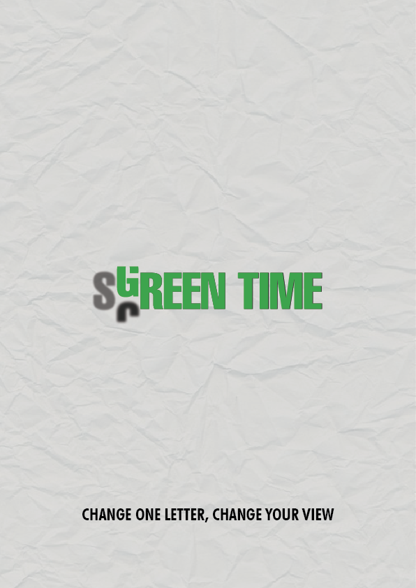
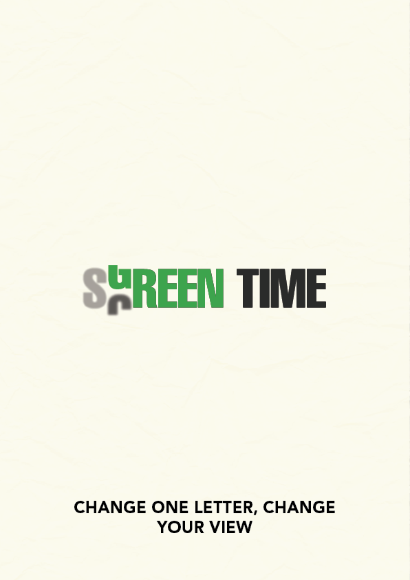
Our creative process was highly collaborative, moving seamlessly between in-class discussions and digital brainstorming. We utilized FigJam as a central hub for our ideas, where we mapped out the pros and cons of both “Screen Time” and “Green Time” to better understand the tension between digital life and the outdoors. This digital space allowed us to build a shared mood board and “bash” ideas together in real-time, refining our slogans and visual direction before ever touching a design program.
For my specific contribution to the campaign, I developed a minimalist typographic poster centered around a singular, transformative hook: “Change one letter, change your view.” The visual centerpiece is a vertical “scroll” transition where the C in Screen morphs into the G in Green. This motion mimics the familiar action of scrolling on a phone but redirects the viewer toward an organic, outdoor outcome. To enhance this, I set the S to a lower opacity to represent the fading of digital influence as the natural message takes over. I chose a clean, high-end typeface set against a tactile, crumpled paper texture to give the piece a professional “gallery” feel.
the teamwork aspect was invaluable. While I focused on the typographic execution, my teammate took a different approach by focusing on environmental photography and nature-based layouts. Working together made the workload much more manageable and allowed us to blend our unique skills. Seeing our initial, messy FigJam boards evolve into a polished, professional campaign really highlighted the power of collaboration.
Task 4
References List
National Army Museum (n.d.). Abram Games and the Power of the Poster | National Army Museum. [online] www.nam.ac.uk. Available at: https://www.nam.ac.uk/explore/abram-games-designer.
2. The (2025). The Lost Class | Communication Arts. [online] Communication Arts. Available at: https://www.commarts.com/project/34530/the-lost-class.
3. STA 100. (2021). The Lost Class. [online] Available at: https://100.typographicarts.org/winners/2021/the-lost-class [Accessed 17 Feb. 2026].
4. @dandad. (2022). What happened when Leo Burnett Chicago forced an NRA rep to face the consequences of gun violence | D&AD Annual 2022. [online] Available at: https://www.dandad.org/annual/2022/editorial/behind-the-work-leo-burnett-chicago-put-the-NRA-face-to-face-with-gun-violence?backRef=/insights/ [Accessed 17 Feb. 2026].