Proposal brief A4 PDF
Proposal presentation
Research Reference: Creative Boom – “Murugiah on How to Illustrate and Brand a Music Festival”
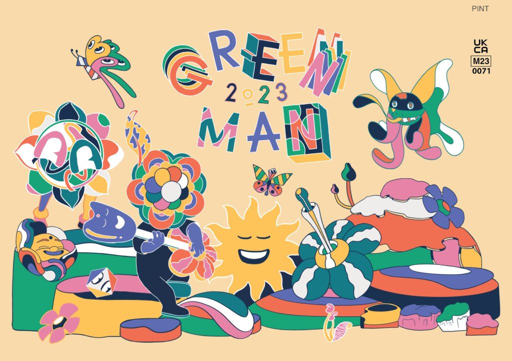
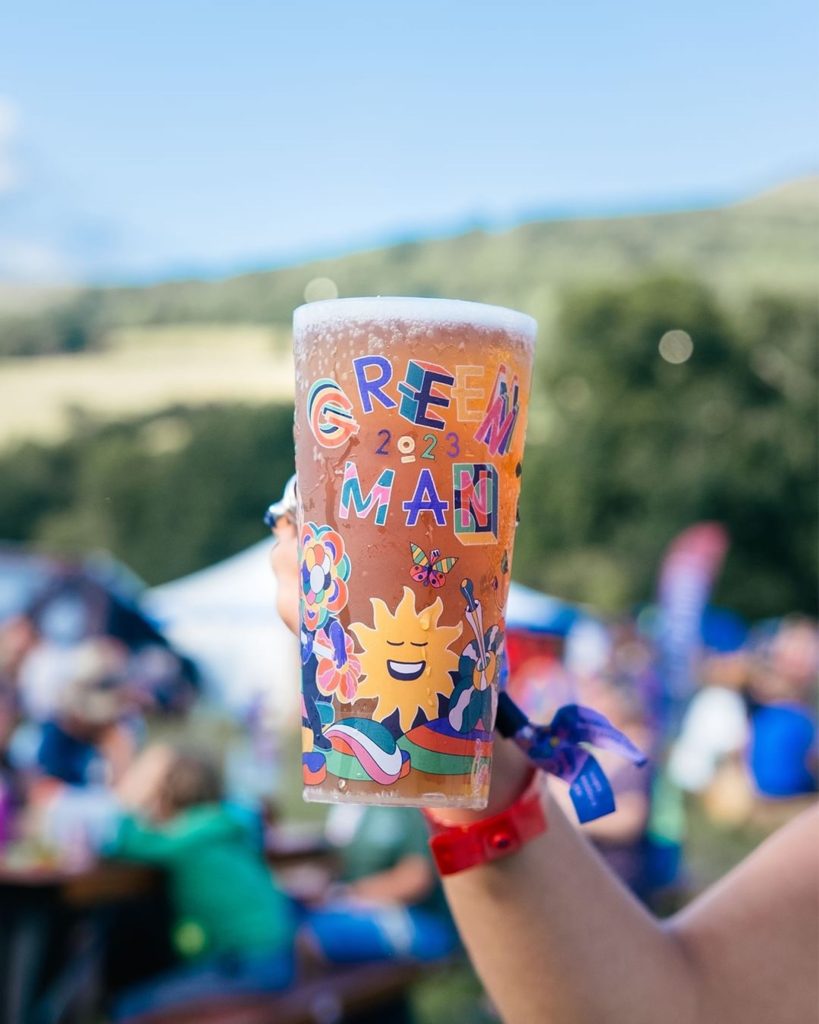
One of the key articles that supported my project development is “Murugiah on How to Illustrate and Brand a Music Festival” from Creative Boom. The article explores how the designer Murugiah created the visual identity for the Green Man Festival, combining illustration, branding, and cultural storytelling to build a vibrant and cohesive design system.
What stood out to me was how Murugiah’s multicultural background influenced his creative direction, blending Eastern and Western imagery to tell a deeper story through design. This directly relates to my own approach in Ethio-Jazz Fest, where I aim to connect Ethiopian culture with modern global design.
The article also highlights the importance of creating a complete brand system rather than focusing only on a logo. Murugiah’s work included everything from posters and merchandise to stage visuals and animations, showing how branding can extend across multiple platforms. This inspired me to think about how my festival identity could work dynamically across print, digital, and motion design.
Finally, I found his comments about animation and workflow valuable. The project involved turning his artwork into moving visuals for live screens at the festival, reinforcing how motion design is now a key part of modern branding — a principle I’ve applied to my project’s motion elements and logo animation.
Tone of Voice
The tone of voice for Ethio-Jazz Fest reflects the soul, warmth, and rhythm of Ethiopian jazz. It is vibrant, expressive, and inclusive, celebrating the fusion of cultural heritage and contemporary creativity.
The festival speaks with a confident yet welcoming tone — inviting audiences from all backgrounds to experience the energy of Addis Ababa in the heart of London. It aims to inspire curiosity, connection, and celebration through both words and visuals.
Key phrases that capture the tone include:
“Feel the rhythm of Addis in London.”
“Where culture meets sound.”
“A celebration of jazz with an Ethiopian heartbeat.”
This voice is supported visually through bold typography, rhythmic layouts, and fluid motion graphics, which together express the spirit of music, movement, and unity that define the Ethio-Jazz Fest brand.
Balancing Colour, Playfulness, and Simplicity in Design
For Ethio-Jazz Fest, the main design challenge lies in finding the right balance between vibrant cultural expression and modern simplicity. The festival’s identity must feel colourful, rhythmic, and energetic qualities that reflect the soul of Ethiopian jazz yet remain visually clear and accessible for an international audience. The risk of using too many bold patterns or overly decorative elements is that the design could become visually busy and distract from the message. Therefore, the aim is to include colour, texture, and motion in a way that communicates warmth and rhythm without overwhelming the viewer. Through careful use of contrast, negative space, and hierarchy, the brand can express playfulness while maintaining sophistication and balance.
The problem, therefore, is not colour itself, but how to use it with control and purpose. Ethio-Jazz has a naturally expressive and emotional character, and the visual identity should echo that in a refined way celebrating its heritage while aligning with contemporary design trends. This approach ensures that the brand remains authentic, professional, and culturally resonant.
The target audience for Ethio-Jazz Fest includes culturally curious urbanites aged 25–40, jazz and world music lovers aged 40–65+, and the Ethiopian diaspora and cultural enthusiasts who seek connection and pride through modern cultural experiences. These groups are drawn to authenticity, creativity, and visual storytelling. They appreciate design that feels intentional, not commercial or overstated. The identity therefore needs to engage them through colour, rhythm, and emotion, balanced with a natural and accessible tone.
The rationale behind the project is to create an independent, culturally rooted festival brand that can grow globally while staying true to its values. Ethio-Jazz Fest offers a space where culture and creativity meet, positioning itself as a meaningful alternative to mainstream festivals that often lack depth and authenticity.
People are increasingly drawn to independent festivals because they value trust, community, and sustainability. Unlike large commercial events, independent festivals feel more personal, authentic, and inclusive, offering experiences that reflect real artistic passion. Ethio-Jazz Fest embodies this spirit through its visual identity connecting people not only through music but also through design that celebrates cultural heritage in a modern and inspiring way.
Reference List
- Boom, C. (2023). Murugiah on how to illustrate and brand a music festival. [online] Creative Boom. Available at: https://www.creativeboom.com/insight/murugiah-on-how-to-illustrate-and-brand-a-music-festival/.