Design Thinking and Development Process
For this project, I designed a web-based animated advert for an imaginary farm-to-table vegan restaurant called The Green Fork. The animation was created using Adobe Animate at 30fps, with a Full HD canvas set to HTML5 output. The aim was to reflect the restaurant’s fresh, sustainable ethos while engaging an eco-conscious audience aged 25–50 who value ethical dining and aesthetics.
Initial Concept and Branding:
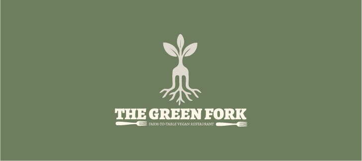
The Green Fork logo uses a simple and symbolic design that blends a fork with a sprouting plant and roots, representing freshness, natural growth, and farm-to-table values. The colour scheme features an earthy olive green (#6B7654) background, evoking sustainability and nature. The fork-plant and text are in a light beige/off-white (#E8E3D4), creating a clean, organic look with strong contrast. Together, the shapes and colours reflect the brand’s eco-friendly, plant-based focus and create a calm, grounded, and welcoming identity.
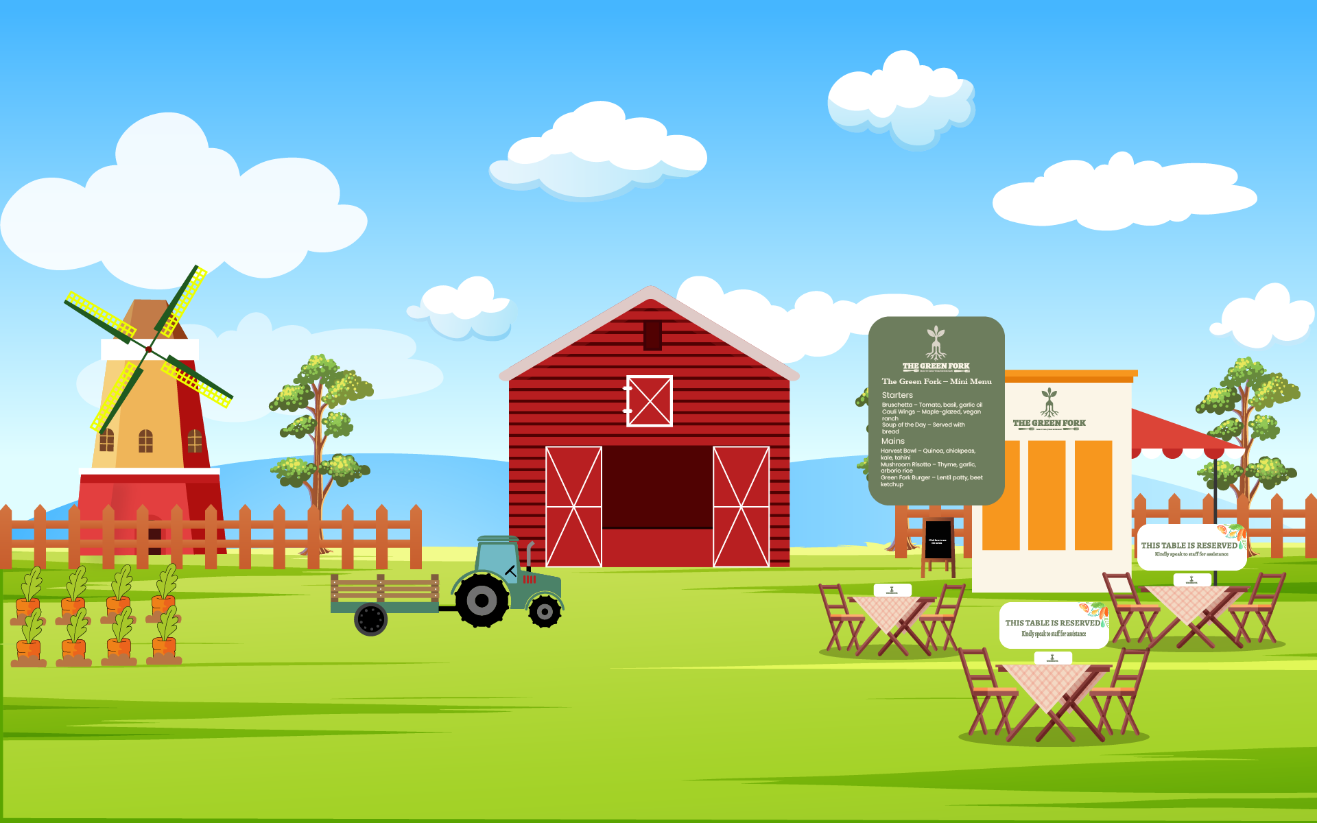
a storyboard of your intended sequence
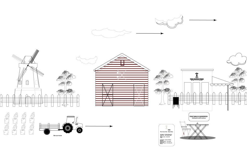
In the animation, several elements bring the farm setting to life. The windmill blades rotate, symbolising sustainability and motion, while a tractor moves forward across the field, representing the farm-to-table journey. Clouds drift gently across the sky, adding a natural, calming feel to the scene. The table setups include interactive buttons that display whether a seat is taken or reserved, making the scene feel functional and real. Additionally, the menu board features a button that, when clicked, reveals the restaurant’s vegan menu, enhancing user interaction. These animated and interactive elements together reflect The Green Fork‘s fresh, modern, and eco-conscious identity.
Intended Audience
The intended audience for The Green Fork animated advert is health-conscious individuals aged 25 to 50 who are interested in sustainable, plant-based lifestyles. This group typically values:
Locally sourced, organic food
Ethical and eco-friendly dining
Stylish yet natural environments
Digital-savvy experiences through web content and social media
This audience may include urban professionals, environmentally aware families, vegans/vegetarians, and flexitarians exploring healthier options. The animation’s friendly, clean visual style and calm, nature-inspired branding are tailored to attract this demographic, combining visual appeal with ethical messaging to foster trust and brand loyalty.
Colour Theory from the Environment:
The colour palette used in the farm environment animation is inspired directly by natural surroundings, reinforcing the farm-to-table and eco-conscious identity of The Green Fork.
Greens dominate the landscape — from light grassy greens to deeper tree foliage — symbolising health, renewal, and sustainability. Green is central in vegan and organic branding because it conveys freshness and life.
Sky blue in the background evokes clarity, peace, and openness. The light, gradient-blue sky adds depth and a sense of calm — encouraging a relaxed dining experience.
Warm reds and browns are used in the barn and windmill structures. Red adds warmth and energy without feeling industrial, while brown grounds the scene with an earthy, rustic tone, hinting at reliability and tradition.
Neutral beiges and yellows on the café building and tablecloths convey approachability and warmth. These soft tones also balance the brighter elements, maintaining visual harmony.
White clouds and highlights introduce brightness and contrast, adding lightness and flow to the animation.
Together, these environmental colours create a cohesive eco-friendly and inviting visual space, ideal for communicating the restaurant’s commitment to locally sourced, plant-based food. The palette supports a calming and optimistic mood, encouraging viewers to associate The Green Fork with freshness, nature, and ethical living.
Shape in the Environment:
The animation uses mostly soft, rounded shapes to create a calm and welcoming atmosphere. Curved trees, hills, and clouds reflect nature and give a peaceful, organic feel. The barn, windmill, and café use geometric shapes with slightly softened edges, suggesting structure without harshness.
The mix of natural and man-made forms supports the farm-to-table theme, while the fork-plant logo connects directly to the environment through root-like and leaf shapes. Overall, the shapes reflect balance, growth, and simplicity — aligning perfectly with The Green Fork’s sustainable brand
Final Animations
Using Adobe Animate gave me a strong understanding of 2D animation and interactivity. I learned how to manage frame-by-frame movement, use symbols effectively, and create smooth animations like rotating windmills and drifting clouds. I also added interactive buttons—one to end the animation, others to show seat status and the menu—using HTML5 Canvas. This experience showed me how Adobe Animate can be used for engaging, interactive storytelling and digital ads.
3D MAYA/BLENDER MODELLING
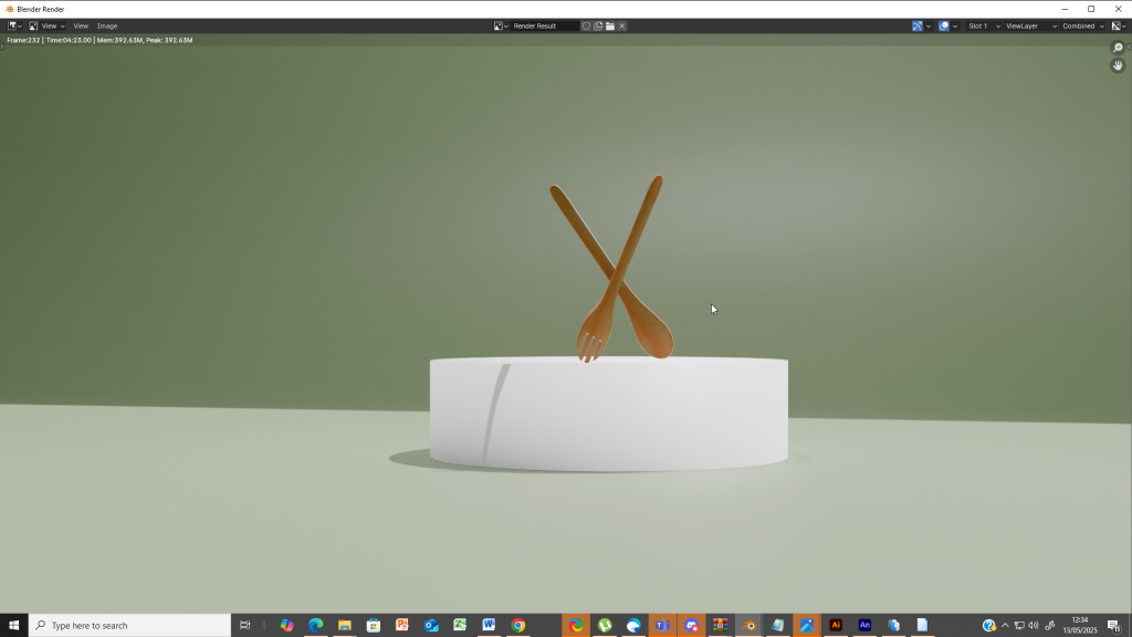
For this project, I chose to use Blender 4.4 over Maya due to my previous experience and comfort with Blender’s interface and workflow. The goal was to create a 3D animation showcasing three items that could be seen or used in The Green Fork vegan restaurant. Staying true to the farm-to-table theme, I decided to model a wooden fork, a wooden spoon, and a takeaway food box. These items reflect the eco-conscious, natural values of the brand while allowing me to explore hard surface modelling and animation in a meaningful context
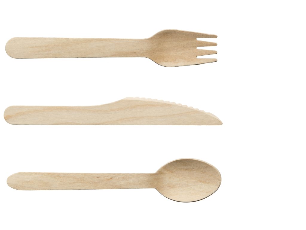
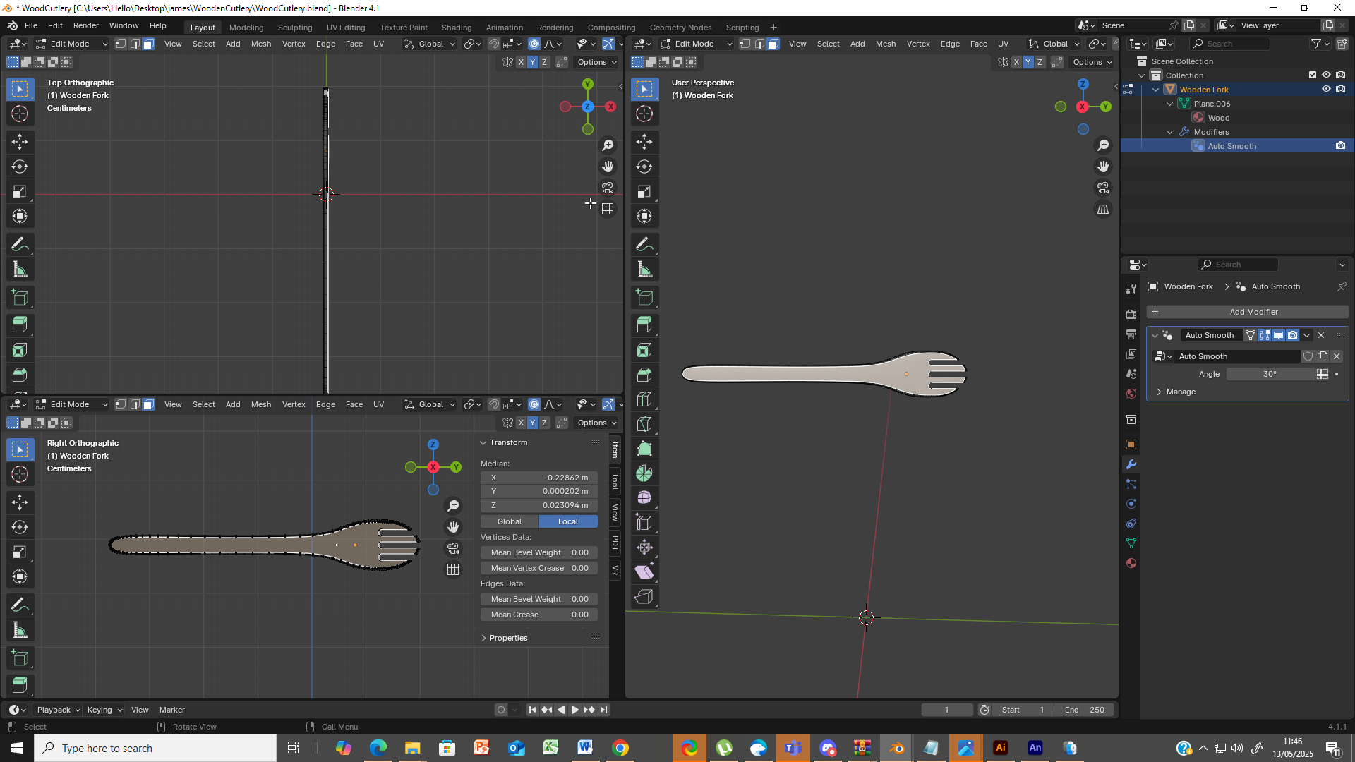
For my 3D model, I decided to create a wooden fork based on a reference image that fits the natural, vegan theme of The Green Fork. I started with a basic plane, then shaped it using extrusion and edge loops to form the fork’s body. To refine the look, I applied auto smooth modifier to smooth out the model and give it a polished, handcrafted feel. This approach helped me create a clean, realistic wooden fork that visually supports the brand’s eco-friendly identity.
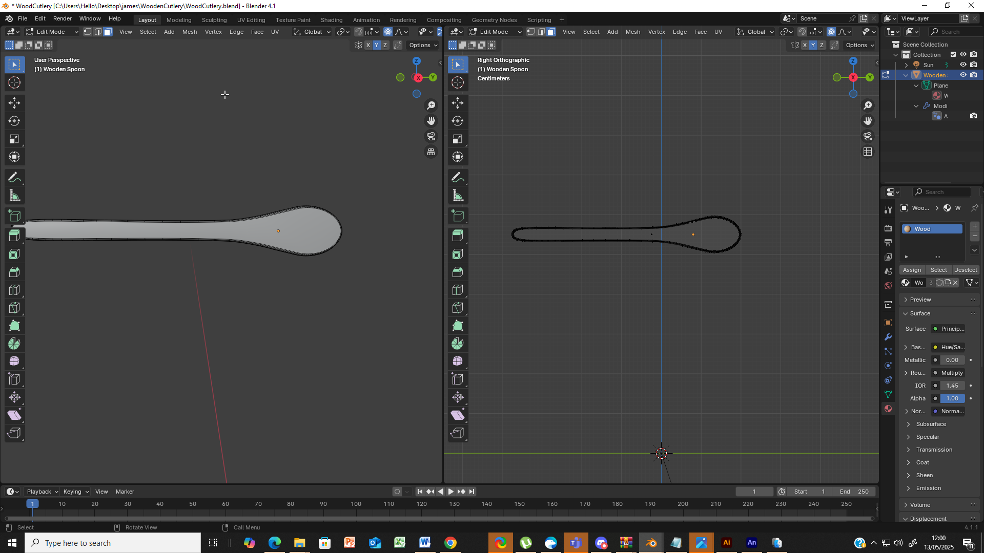
I used the same modelling approach for the spoon as I did for the fork, starting from a simple plane and shaping it using extrude and bevel tools. Working from a reference image made it easier to get the proportions right and maintain accuracy. The modifiers, especially auto smooth , helped smooth the shape and refine the details, making the modelling process more efficient and visually clean. This method made it simple to create organic forms while staying true to the natural, handcrafted look of The Green Fork‘s brand.
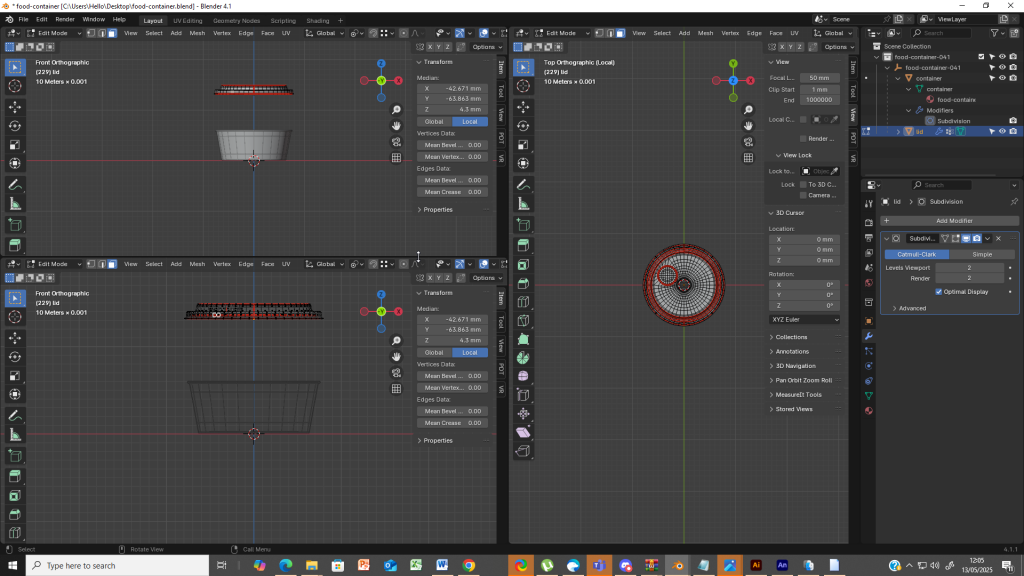
The takeaway food box was the final model I created for this project. I designed it as two separate objects: the lid and the main container, to allow more flexibility with texturing and animation. I plan to apply different textures—the lid with a natural paper feel, and the base in The Green Fork’s brand colours. I used a cylinder as the base shape, then applied the Subdivision Surface modifier to smooth the form. In Edit Mode, I used face selection and extrusion to shape the box, giving it a clean, functional look that fits the eco-friendly aesthetic of the venue.
3D Texturing and Concept Render
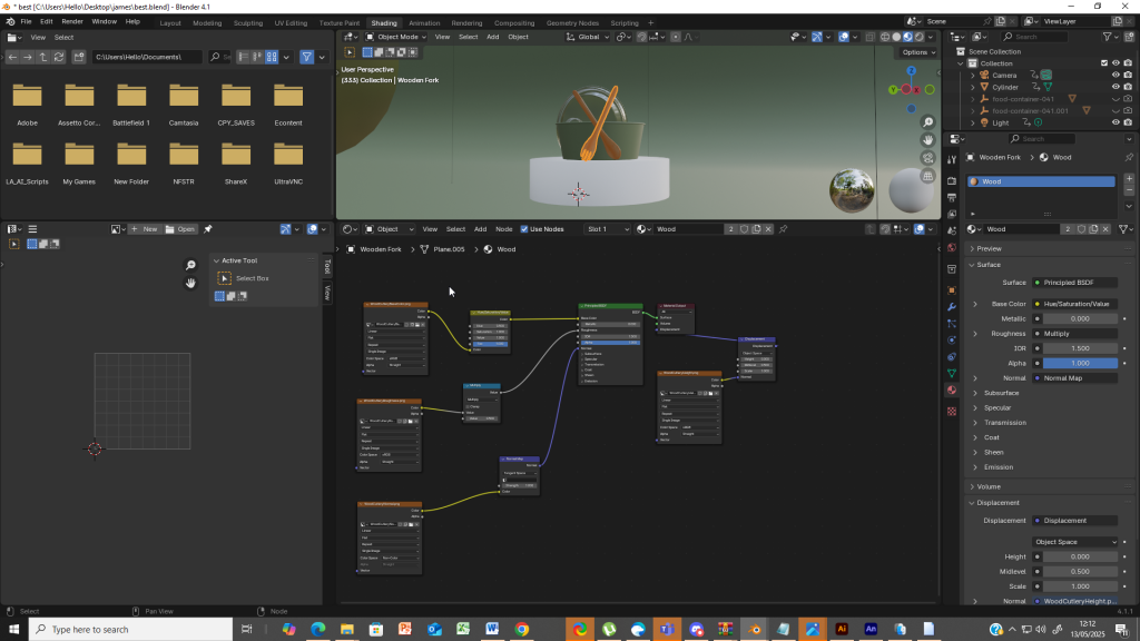
For texturing my 3D models, I chose to work entirely in the Shader Node Editor rather than relying on traditional UV unwrapping. This approach gave me greater flexibility and control, and I found it more intuitive for this project. I used the same texture setup for both the wooden fork and spoon, as they are part of a matching set. The core of the material was built around the Principled BSDF shader, which allowed me to manage multiple surface properties within a single node.
To add more realism, I included a Displacement node to give the surface a subtle, natural unevenness that mimics real wood. I also used a Hue/Saturation/Value (HSV) node to fine-tune the colour balance and create visual consistency between the two utensils. For the texture maps, I combined four types:
Base Colour for the natural wooden look,
Roughness to control the surface reflection and give it a matte, organic feel,
Height Map to subtly push and pull the surface geometry, and
Normal Map to add detailed grain and texture without adding geometry.
This node-based method allowed me to create a highly realistic and visually appealing wooden texture that perfectly complements the eco-friendly and handcrafted theme of The Green Fork. The flexibility of Blender’s material system also made it easier to apply these textures consistently across both models.
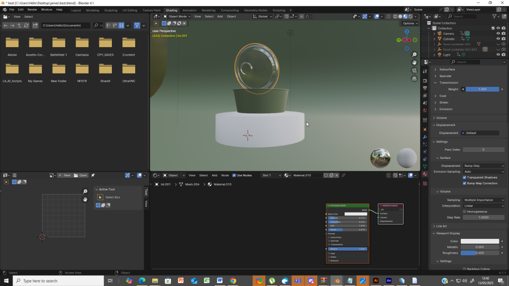
For the takeaway food box, I applied distinct materials to the main container and the lid to reflect both functionality and brand identity. For the main container, I used The Green Fork’s signature earthy green brand colour, ensuring the model visually aligns with the restaurant’s eco-conscious branding. I kept the texture simple yet clean, maintaining a slightly rough, matte finish to reflect a biodegradable, natural material.
For the lid, I wanted to create a semi-transparent texture to suggest a plant-based, compostable plastic. I achieved this by switching the Blend Mode to “Alpha Blend” in the material settings, which allowed me to introduce transparency. I adjusted the Roughness to reduce surface glare and increased the Metallic value slightly to give the lid a soft, smooth plastic-like sheen. These settings gave the lid a modern, clean appearance while still fitting the sustainable theme.
Together, these texturing choices helped distinguish the lid and container while keeping the overall design cohesive and on-brand. The material settings also contributed to the realism of the 3D model, enhancing its role in the animated product showcase.
3D Animation and Lighting
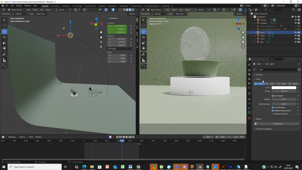
For my animation and 3D scene setup, I intentionally chose a minimalist lighting and modelling approach due to hardware limitations that restricted my ability to render highly detailed textures and complex geometry. Despite these constraints, I focused on delivering a clean and effective visual presentation. I used two strategically placed point lights to illuminate the scene without compromising performance. The first light, set at 1000W with a radius of 0.1, created a sharp, focused highlight to accentuate the edges and shapes of the models. The second, at 500W with a 5m radius, provided ambient fill light, softening shadows and ensuring even illumination across the scene.
For the animation, I built a simple yet elegant product showcase that aligns with The Green Fork’s natural and sustainable values. I designed the fork, spoon, and takeaway box to rise from below the frame, creating a smooth reveal animation. This upward motion conveys a sense of freshness, care, and elevation, echoing the brand’s farm-to-table philosophy. Each item enters the stage in sequence, allowing the viewer to appreciate the design and material before the next appears.
Although I couldn’t fully explore advanced modelling or texturing due to my system’s limitations, I embraced a minimalist aesthetic to maintain clarity and consistency. The clean lighting, simple animation, and controlled colour palette all worked together to reinforce The Green Fork’s eco-conscious brand identity. This project taught me how to adapt my creative choices to technical limitations while still producing a visually coherent and purposeful animation.
Even during the rendering process, I had to make performance-based compromises due to my PC’s hardware limitations. I used Cycles as my render engine for better realism, but to prevent long render times and system instability, I kept the sample count at just 50, which is the lowest viable setting. While this limited the visual quality slightly—especially in terms of shadows and noise—it allowed me to complete the animation efficiently without crashes.
Despite these technical constraints, I focused on clean lighting, simple modeling, and smooth animation to make sure the final product still looked visually consistent and on-brand. This project taught me how to adapt creatively under hardware pressure while still delivering a functional and meaningful animated presentation that reflects The Green Fork’s eco-friendly values.