Visual Design Treatment: Application of Edward Tufte’s Five Theories
Throughout the development of my project, I made a conscious effort to incorporate Edward Tufte’s five design principles. Using the ideas of space over time, colour usage, layering and separation, micro/macro readings, and comparison of small multiples, I designed a story that was easy to follow and visually rich.
Below, I explain how I applied each theory, supported with real examples from my Illustrator work
Space Over Time
Tufte teaches that good visual design should unfold progressively, allowing viewers to absorb information naturally without feeling overwhelmed.
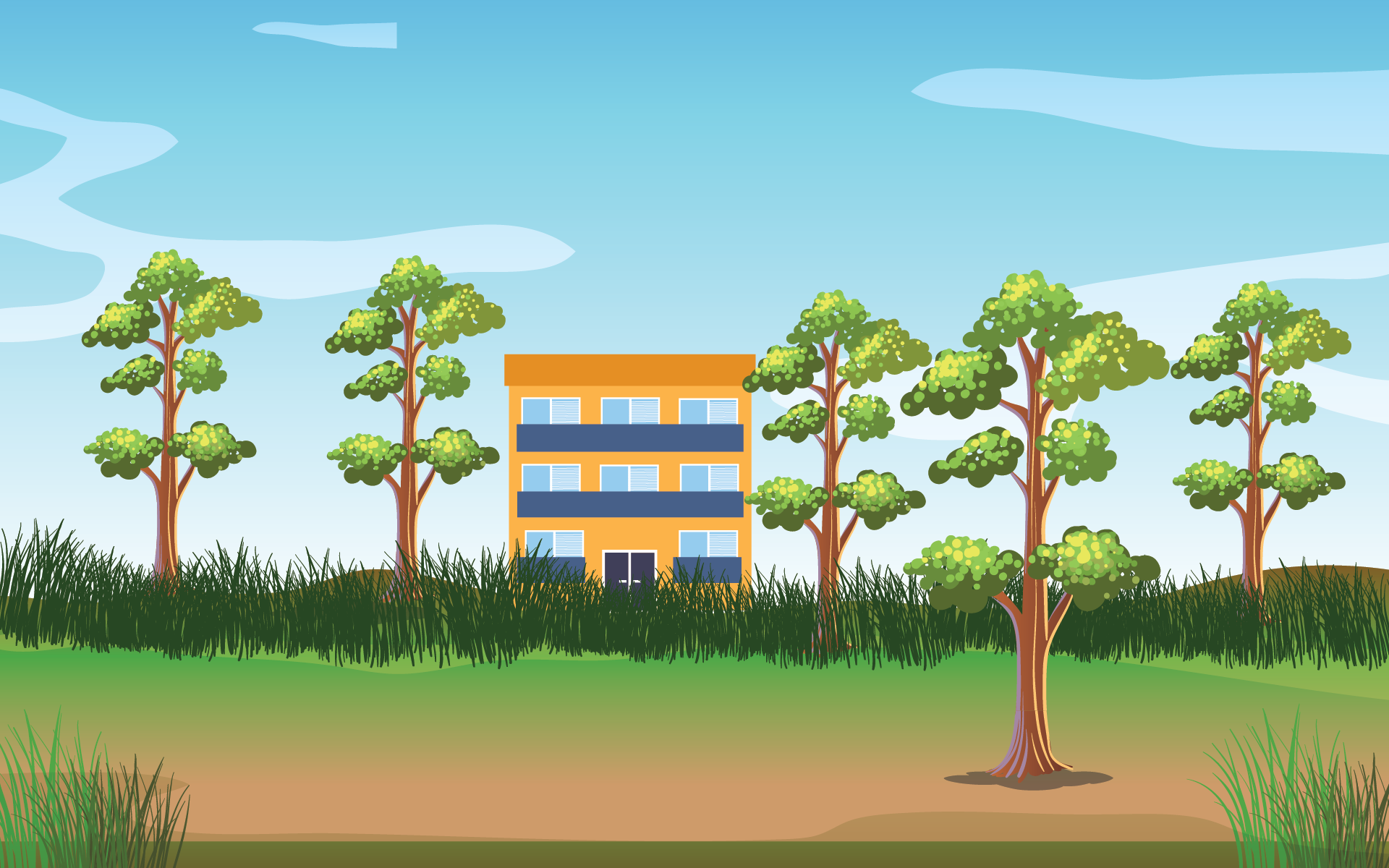
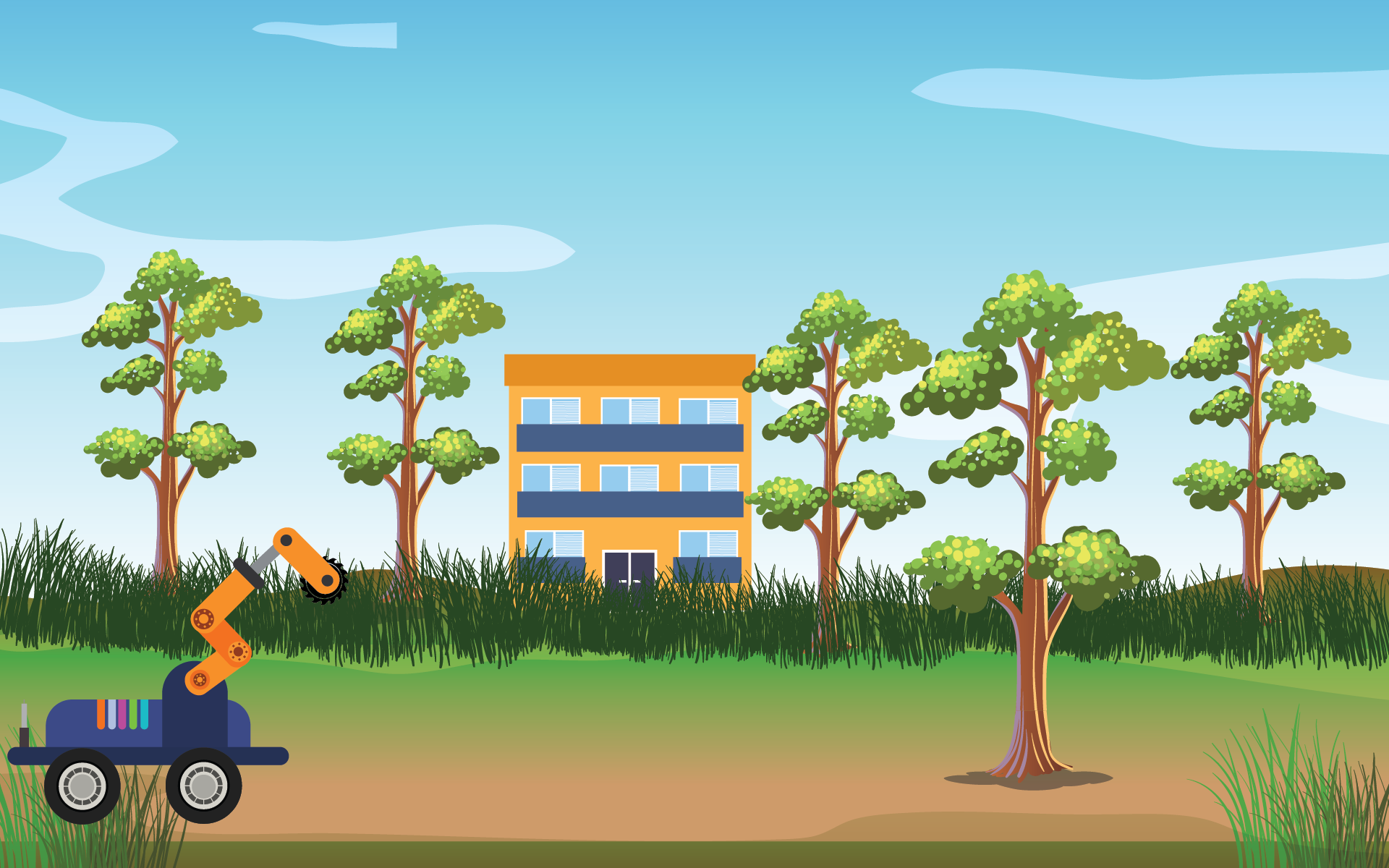
In my animation sequence, I used a clear and structured visual progression. For instance, in the outdoor scene, elements like the trees, robotic arm, and grass are introduced gradually, giving the audience time to understand the environment before introducing more complex actions.
space over time example 1
space over time example 2
Use of Colour
According to Tufte, colour should be used intentionally — to highlight, categorize, and emphasize, not to decorate unnecessarily.
In my work, I limited the palette to natural greens and blues for the outdoor environment, maintaining a calm background. In contrast, the robotic arm is coloured in bright orange, immediately standing out to show its importance and function.
Similarly, in the indoor printer scene, blue is used strategically for the recycling bin, reinforcing the eco-friendly theme.
Use of colour
Use of colour
3. Layering and Separation
Tufte emphasizes that good design should clearly separate layers of information to avoid confusion.
In both scenes, I paid attention to foreground, midground, and background separation.
For example, in the outdoor scene, the trees and robot are sharply detailed in the foreground, while the background sky and clouds are much softer. This helps the viewer focus on the action without being distracted.
In the indoor scene, the table and printer are in the midground, while the deforested background seen through the window stays lighter and less detailed, creating clear depth.
Foreground elements like the printer remain strong and detailed, while background elements are softened, separating different layers of meaning."
4. Micro/Macro Readings
The principle of micro/macro readings suggests viewers should be able to grasp the big picture first, then zoom in on fine details.
When viewers first see the outdoor scene, they immediately understand it is about nature and technology interacting.
As they continue watching, they notice micro-details: the robotic arm interacting with specific plants, movement of grass, and detailed tree leaves.
Similarly, in the indoor scene, the printer and recycling process are obvious first, but viewers who look closer notice cut-down trees outside, highlighting the environmental impact subtly
5. Comparison of Small Multiples
Finally, Tufte’s concept of small multiples showing multiple related views side-by-side helped me visually compare the impact of deforestation.
While I don’t literally show a side-by-side within a single frame, the animation transitions from an outdoor lush scene to an indoor scene with tree stumps visible through the window, encouraging direct mental comparison.
These changing but related scenes act like time-based small multiples, reinforcing the narrative that environmental action (like recycling) is necessary to prevent nature loss.