Typography is the art and skill of organising and designing typefaces (fonts) in a visually appealing and effective manner. It is essential in graphic design, advertising, print media, web design, and a variety of other visual communication sectors. Typography is the process of selecting fonts, establishing type, altering letter spacing, line spacing, and other typographic components to create a readable, aesthetically acceptable, and communicative design.
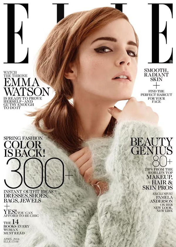
Elle Magazine April 2014-Emma Watson On Cover
This is a good example of the effective use of typographic in editorial design. In this magazine cover design, I’d like to analyse how this magazine cover is good in terms of using successful typographic choices and how they or the designer can encourage readers to pick up the megazine from the shelf.
When Emma Watson appears on the cover of Elle magazine, the font is likely to be created to compliment her image and the general topic of the issue. The font design for Emma Watson’s name or the main feature title would be carefully picked to represent her own style as well as the theme of the issue.
Didot, a serif typeface, is used for Elle Magazine, and it complements the elegance of the Spread. The symbol of the magazine is synonymous with the magazine’s branding. The portrait of Emma Watson, shown above, obscures the masthead and emphasises the importance of the craftsman. Even when her picture is partially obscured by masking, the brand’s strength remains steadfast.
The craftsmen name appears in Elle Magazine in a harsh, limited, san-serif type style. To maximise effect, there is a contrasting typographic relationship on the cover; the masthead and major cover line about Emma Watson are in Serif, while the rest of the cover lines are in Sans- Serif. It establishes a visual hierarchy; the text is Serif, which is the most essential, and the way they design the numbers 300 and 800 looks amazing; it gives the magazine a more pleasing appearance, and also the white background has given a good contrast between a model image and Font colour.
A good typography is a design which communicate appropriately in accordance with the needs placed up on it this typographic practise must balance the essential communication along side aesthetic sensibilities. (Harkins, M., 2011)
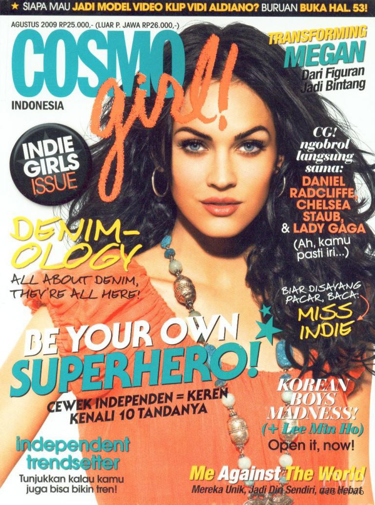
Cover of Cosmogirl Indonesia with Megan Fox, August 2009
This is a poor example of fashion magazine typography.
This magazine cover demonstrates how a lack of basic typographic principles can ruin a design. In my opinion, the key to creating a flawless magazine is adhering to rules, which include following text hierarchy, order, and variation in text justification, as well as creating negative space for clear vision. Without these, readers will find it difficult to read the headline or understand the magazine.
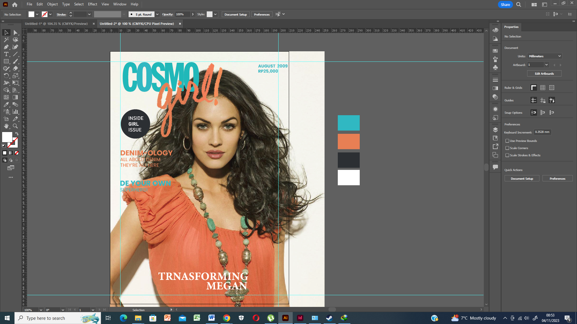
I began by looking for the original photo of Megan Fox’s photoshoot online. The photo I found there wasn’t very good, so I just imported it into Photoshop and tried to make it better. Next, I started researching the magazine’s most popular headlines. After that, I discovered that the masthead (logo), the cover story, the issue date, and two up to minor headings were all very helpful for the magazine. As I mentioned in the paragraph above, the issue with this magazine is that it uses too many fonts, colours, and there isn’t any negative (white) space. Finally, I selected Headlines from the magazine: I begin by completely redesigning the magazine, so I transfer the image from Photoshop to Illustrator for the finished design. I then begin by creating a crucial grid for a good layout, and I select the Poppins font for the majority of the headlines. In order to make things more beautiful and minimalist, I only use two fonts and colours.
I make every effort to match the text’s colour with the backdrop to prevent preview errors, as on the original cover, the text’s colour frequently mismatches with the background owing to poor colour selection.
In the end, once I’ve chosen the colour and font, I pay attention to the text hierarchy to provide clarity and a clear view for the readers. I think this minimalist approach and clear view make my redesign more guidance-giving.
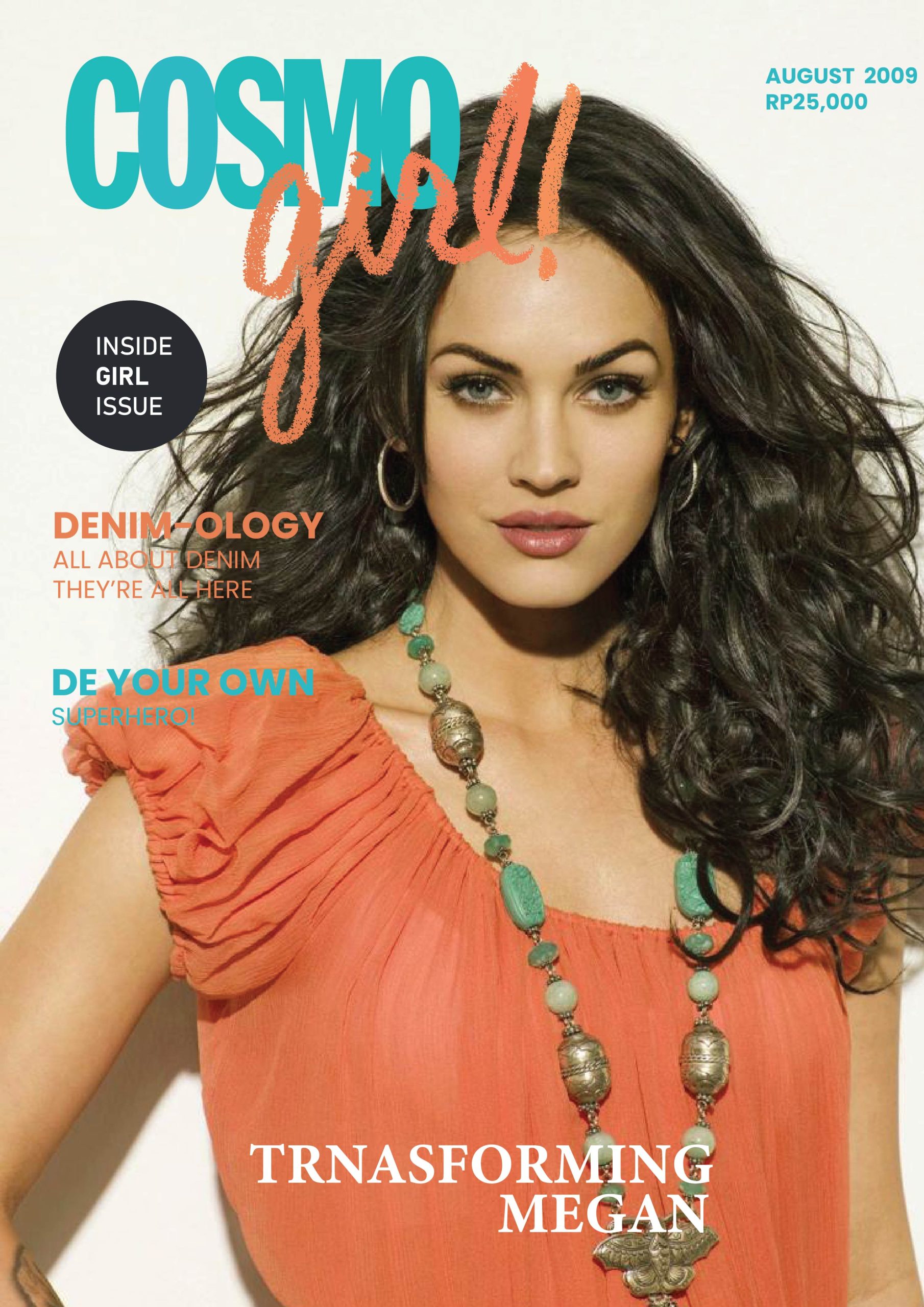
Redesign
Reference List
Adele-like makeup (no date) Pinterest. Available at: https://www.pinterest.co.uk/pin/37436240627490262/ (Accessed: November 3, 2023).
Harkins, M. (2011) Basics Typography 02: Using Type. Lausanne, Switzerland: AVA Publishing.
Moholy-Nagy, L. (2001) “Looking Closer 3, Classic Writings on Graphic Design,” pp. 20–22.
The FMD-FashionModelDirectory.com (no date) Cosmogirl Indonesia, The FMD – Fashionmodeldirectory.com. Available at: https://www.fashionmodeldirectory.com/magazines/cosmogirl-indonesia/covers/august-2009/megan-fox-5417/ (Accessed: November 4, 2023).