Colour is a vital element of graphic design, a tool that can be utilised to grab attention, keep and govern the viewer, and inform them about the type of reaction they should have to the information presented. Colours can be used to create a specific emotional reaction in the viewer, colours attach meaning, and our reaction to this will depend on cultural relationships, trends, age, and individual preference.
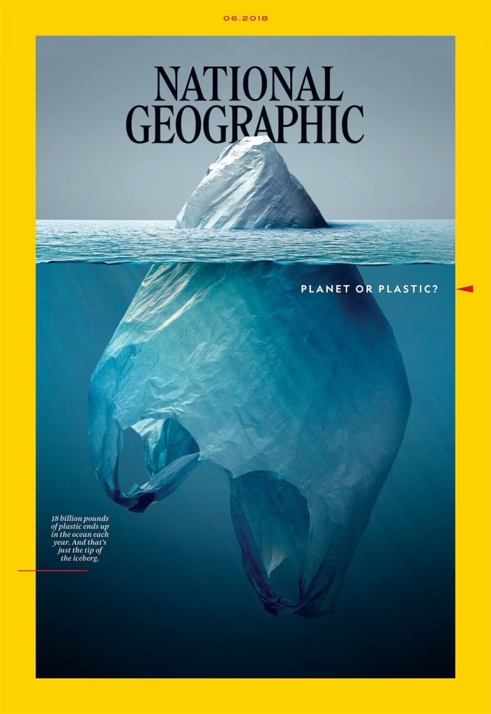
The “National Geographic” June 2018 ‘Planet or Plastic?
This is an excellent example of how colour may be used in editorial design. This magazine employs colour in a deliberate way to establish hierarchy between components and to highlight key design features.
Effective use of the colour in editorial magazine design should be thoughtful and strategic process , aligning with the magazine identify and content goals while creating an engaging and visually appealing reading experience its ‘s essential to strike a balance between creativity and readability ensuring that the colour choice enhance the content rather than distract from it
The cover of National Geographic is an example of how colour can be carefully employed to engage readers and provide a powerful message. Choosing the right colours, images, and typography results in a visually attractive magazine cover.
The visual arrangement of the cover is crucial to its efficacy. The plastic bag is positioned in the middle of the frame, creating a focal point that grabs the viewer’s attention. The placement of the bag in the sea acts as a potent visual metaphor, representing the problem of plastic pollution that affects all of the world’s oceans.
The cover’s colouring scheme has strong symbolic meaning. The colours of the earth’s oceans and natural landscapes are represented by the dominating blue and green tones. These colours remind us of environmental activism and how crucial it is to protect our planet’s natural beauty. The harsh white of the writing and plastic or planet contrasts sharply with these natural hues, emphasising how critical the situation is.
The “National Geographic” June 2018 cover is an example of how a magazine cover can be a potent instrument for promoting a sense of responsibility and increasing awareness of important global concerns. The cover successfully conveys meaning through its meticulous use of colour, composition, symbolism, and emotional resonance. communicates its message and engages readers in a meaningful dialogue about the environment and plastic pollution.
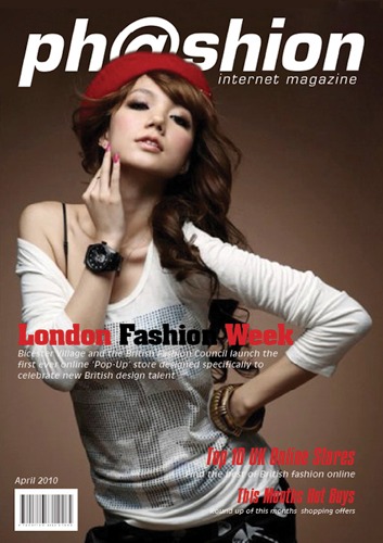
The way this online magazine uses colour in its design demonstrates how ineffectively or poorly the designer chose the font’s colour and how much the model’s cloth colour mismatch. One of the biggest mistakes made by graphic designers is placing white text on a white backdrop. If we want the text to stand out in the design, it should be a different colour from the background.
The use of colour in this magazine is ineffective. The colours are all bleached out, and there is a general absence of effective colour principles throughout the design. The design is flawed since the backdrop colour, model clothing, and text hues are not balanced.
I can’t change the background because the quality of the image I found on the internet is very poor, making it difficult for me to mainpulte the background, but the goal of this assignment is to figure out the problem, not to change the entire design, so I try to solve the main problem of the design, which is as mentioned above, how can they use the white font colour in white background, which totally makes the cover poor
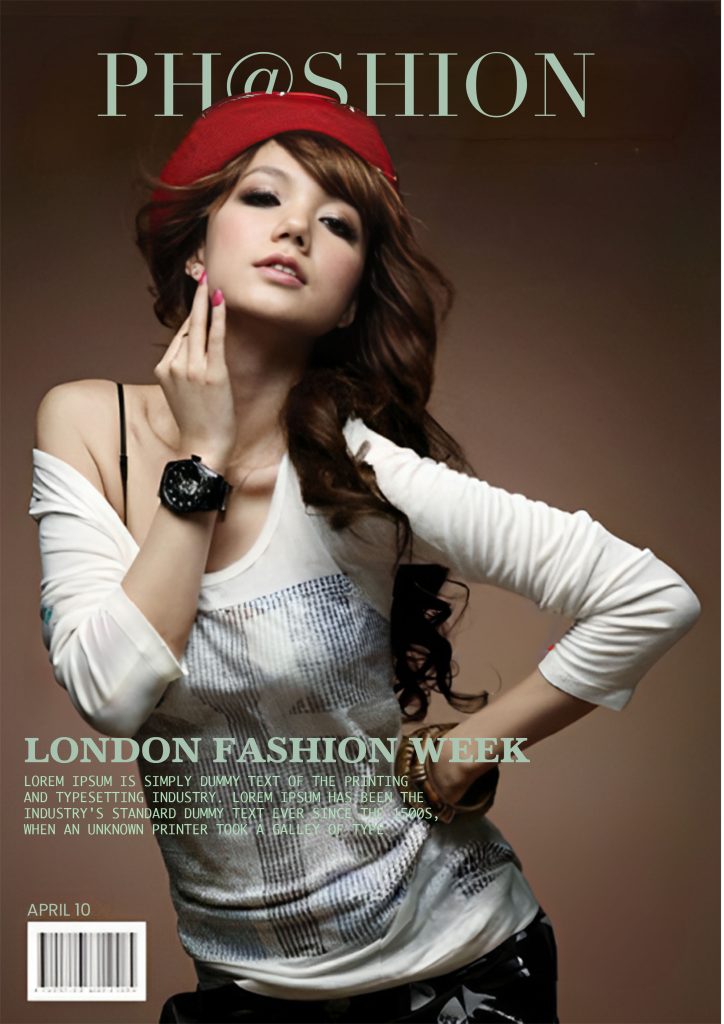
My redesign
Then I started from the logo, changing the colour as well as the font style. I don’t know what font they use for the masthead, but I’m sure didot font is much better than the existing one. After I changed the font style, my next step was to change the colour from white to a different one, and then I tried to cover some letters in the picture with the eraser tool
The magazine is much better after boosting the pre-existing hues and making modest changes to others. The initial design lacked variety in colour selection; perhaps if I get a high-quality image, I can make it more eye-catching and completely different from the original.
Reference List :
1. Ambrose, G. and Harris, P. (2005) Basics Design 05: colour. AVA Publishing.
2. Gage, J. (1999) Color and meaning: Art, Science, and Symbolism. Univ of California Press.
3.Ph@shion magazine design (no date) Portfolio | Ph@shion Magazine | Editorial Design. Available at: http://www.genusdesign.com/portfolio/ph@shion_agazine.html (Accessed: 03 November 2023).
4. Review, C. (2019) ‘Planet or Plastic? by National Geographic,’ Creative Review, 8 May. https://www.creativereview.co.uk/planet-or-plastic-by-national-geographic/.