Use Of Colour
I apply Tufte’s principle of colour by using bright, vibrant colours—such as orange, lime green, and watermelon—on the Reboost labels. These colours are carefully chosen to distinguish each flavour, ensuring instant recognition and creating a strong visual identity for the product. In the animation, I use these colours to guide the viewer’s attention to key moments, like when the fruit transforms into a can. The high-contrast combinations not only highlight the transformation but also make the text and product details clear and easy to read. This thoughtful use of colour helps maintain clarity and accessibility, ensuring the design resonates with my target audience while also enhancing the overall viewing experience.
Space over time
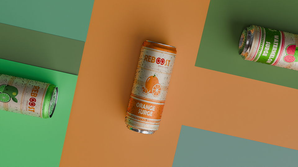
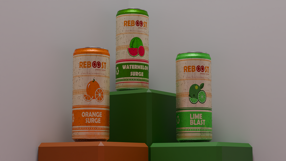
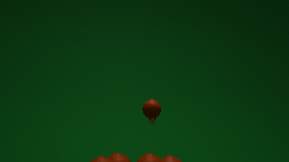
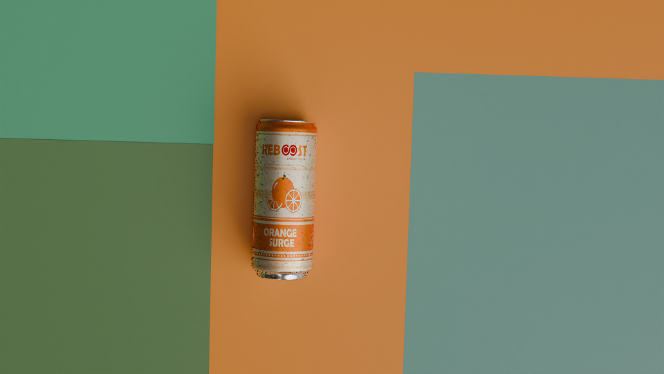
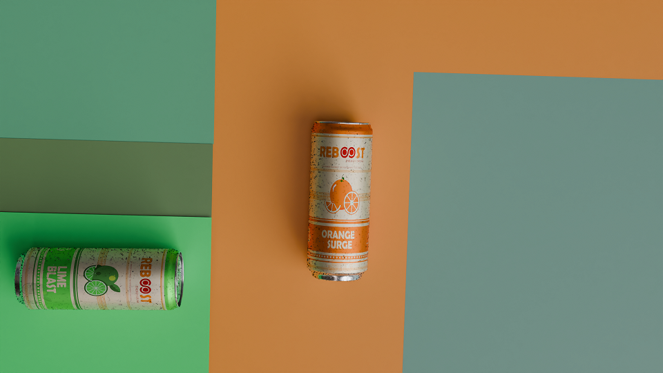
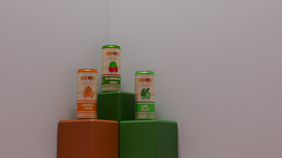
I apply Tufte’s principle of Narrative over Space and Time in the Reboost animation by designing a smooth and engaging transformation sequence. The animation begins with an orange emerging from a pot, symbolizing the natural origins of the ingredients. As the fruit morphs into an energy drink can, I visually communicate the transformation, reinforcing the connection between fresh, natural produce and the product. Finally, the can rolls into place alongside other flavours, emphasizing the variety of options available and strengthening the overall branding of Reboost. This structured flow ensures that viewers can easily follow the narrative, intuitively understanding the progression from fresh fruit to an energizing, final product. By organizing the sequence logically, I help guide the viewer through the story while keeping the experience clear and visually engaging.
Layering separation
In my Reboost label design, I apply layering and separation by using the can model as the central focal point, placing it prominently in the foreground for instant recognition. To enhance the visual hierarchy, I incorporate a metallic texture on the can, making it stand out with its shiny, reflective finish. The background features subtle fruit illustrations and ingredient imagery, which add context without overwhelming the main message. To further create separation, I use water droplets on the can’s surface, giving it a fresh and realistic look while providing a layer of depth. This combination of textures and elements ensures a clean, engaging design, guiding the viewer’s focus to the essential product information.
Comparison of small multiples
In my Reboost project, I apply the principle of Small Multiples to the packaging design by maintaining a consistent layout across all three flavours—orange, lime, and watermelon. Each label follows the same structure, with identical placement for key elements like the product name, flavour, and essential product information. The variation comes in the fruit illustrations and flavour-specific details, where I use unique, vibrant images that represent each flavour. For example, the orange flavour features an illustration of an orange, the lime flavour shows a lime, and the watermelon flavour displays a watermelon. This approach allows me to create a clear and easy comparison of the different flavours while ensuring that the design remains cohesive and aligned with the Reboost brand identity. By keeping the layout consistent, I make sure the viewer can instantly recognize the brand and distinguish between the flavours with minimal effort.
Micro/Macro
To apply Tufte’s Micro/Macro principle in my Reboost project, I structure the design to transition seamlessly between two levels of detail. At the macro level, I provide an overview of the entire product, showing the can in its entirety with the brand’s name and flavour prominently displayed. This establishes the overall identity of the product and its appeal. As viewers engage further, I zoom into smaller details, such as the vibrant fruit illustrations on the label, the list of natural ingredients, and the nutritional breakdown. These close-ups provide a deeper understanding of the product’s health benefits, reinforcing its natural and energizing qualities. In the animation, I enhance this transition by starting with a wide shot of the fruit, before zooming in to capture its vibrant textures and individual components as they transform into the can. This gradual shift from macro to micro ensures viewers can appreciate both the overall concept and the specific, health-focused details, making the product both visually engaging and informative.
