Conceptual Design Idea (metamorphosis) and Research 

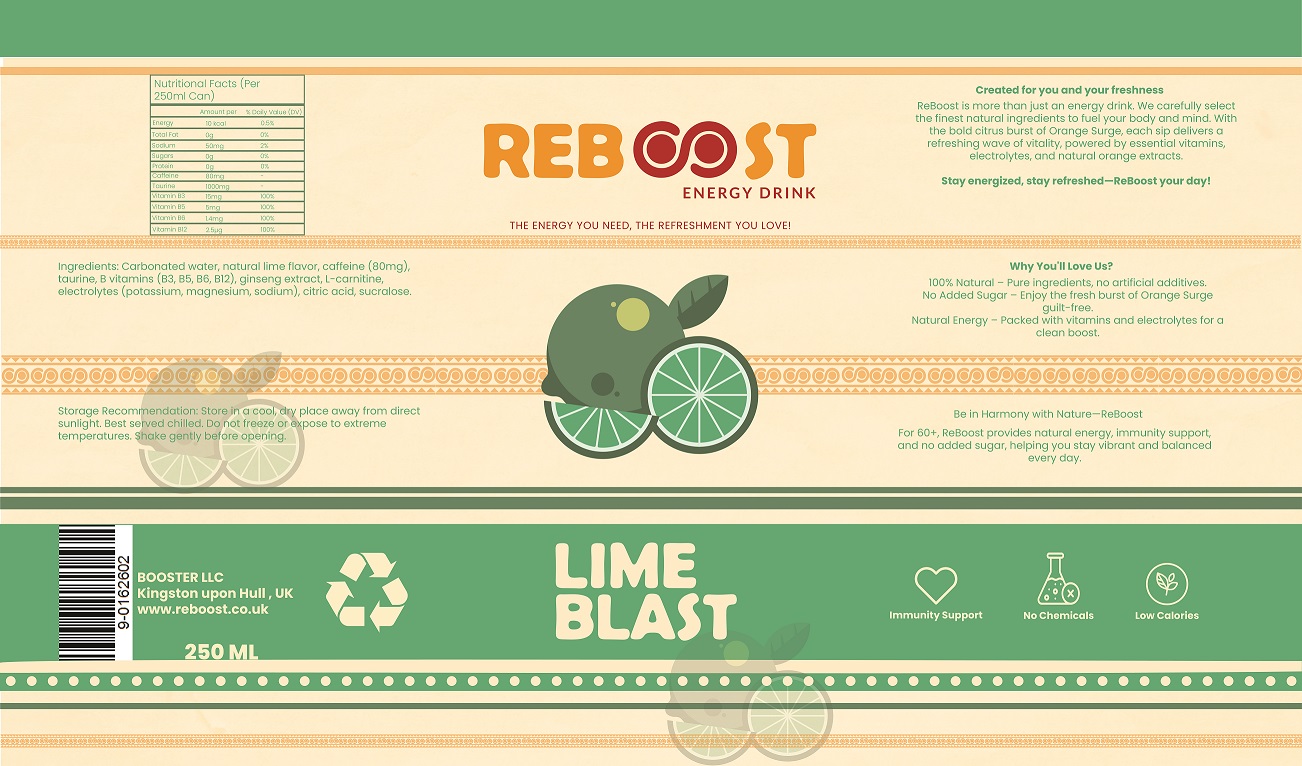
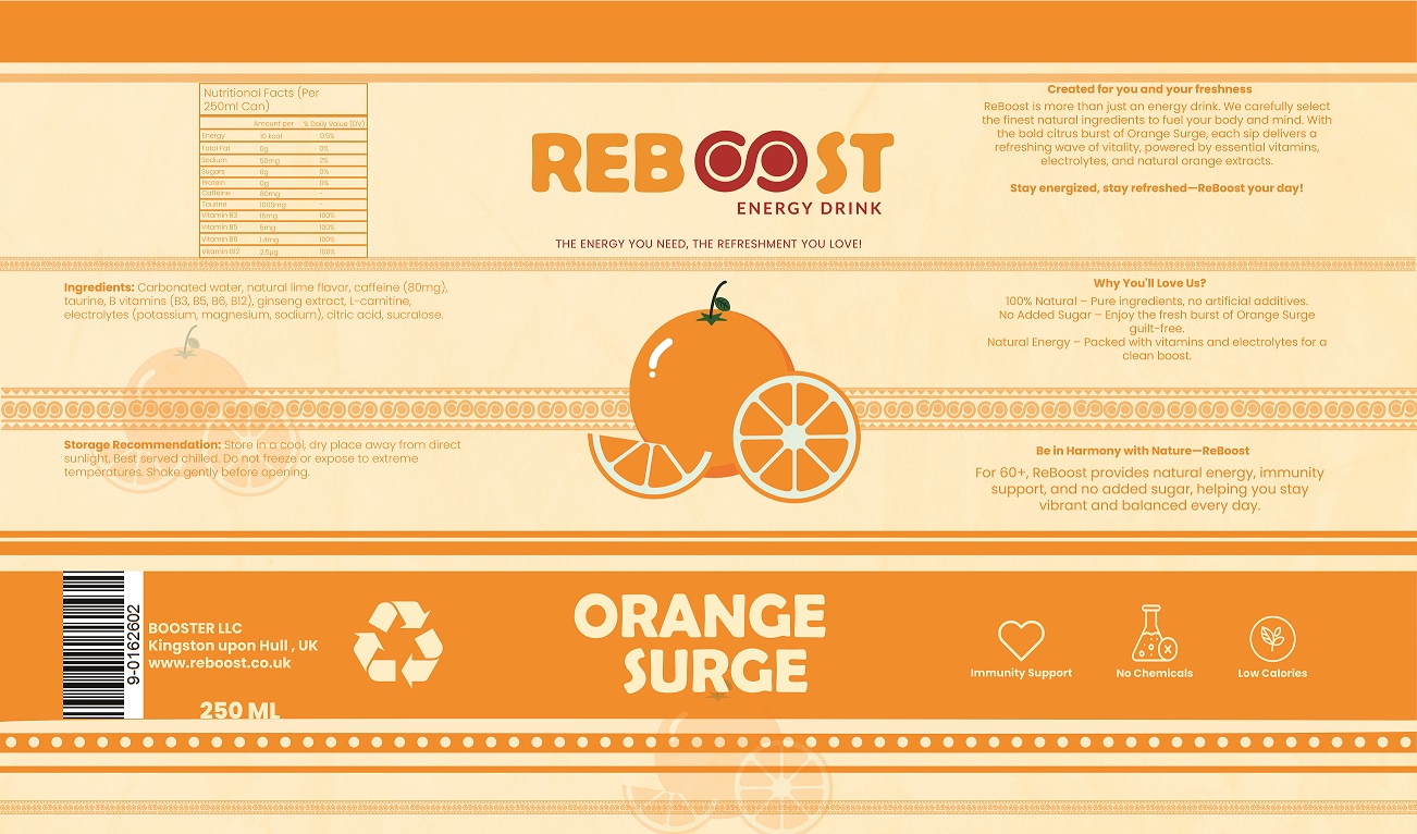
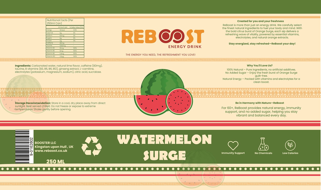
The conceptual design for Reboost Energy Drink revolves around the theme of metamorphosis, symbolizing the transformation of natural fruit into a revitalizing energy drink. This aligns with my core mission for Reboost: to provide older consumers with a natural, healthy energy boost. The metamorphosis theme highlights both the physical transformation of fruit into a drink and the emotional renewal Reboost offers. My goal is for Reboost to help older adults enhance their vitality and energy levels with a healthier alternative to traditional energy drinks.

The metamorphosis concept reflects renewal and change, just as fresh fruit becomes a drink. This theme connects easily with the target audience, emphasizing rejuvenation and vitality—values I want to represent. By using natural ingredients, Reboost aligns with today’s health-conscious consumers and offers an energy boost without the negative side effects of sugar-laden drinks.


Ingredients and Flavours

For Reboost Energy Drink, I chose fruits like lime, watermelon, and orange because of their health benefits for older adults. As we age, maintaining good health is even more important, and these fruits are packed with essential vitamins, antioxidants, and hydration.

  • Lime is high in vitamin C, supporting the immune system and aiding digestion, which is crucial for older adults.
  • Watermelon is rich in water, helping with hydration and providing vitamins A and C to support healthy skin and vision.
  • Oranges are loaded with vitamin C and antioxidants, strengthening the immune system and promoting healthy skin and joints.

These ingredients were carefully selected to provide vital nutrients and support overall well-being for older consumers.

Research on Other Energy Drinks

Monster Logo
Redbull logo
Rockstart logo

During my research, I analyzed logos from major energy drink brands like Red Bull, Monster, and Rockstar, each targeting younger, high-energy consumers:

  • Red Bull’s logo, with two bulls charging towards a yellow sun, symbolizes strength and power, appealing to a youthful, adventurous audience.
  • Monster’s logo features jagged “claw” marks in neon green, attracting rebellious consumers with its edgy design.
  • Rockstar’s logo, with bold typography and a star graphic, represents performance and rebellion, appealing to music-driven, youthful groups.

These brands use vibrant, extreme visuals to target younger consumers involved in high-adrenaline activities. However, I realized their aggressive branding doesn’t align with the older demographic that values health, sustainability, and a more gentle, consistent energy. Reboost was designed to cater to this older audience, offering a healthier, more balanced alternative.

Logo and Brand Name

logo sketch
Logo

The logo design for Reboost features an infinity loop in the “OO” of the word “Reboost,” symbolizing the brand’s promise of endless energy and rejuvenation. This infinity symbol represents both the cycle of renewal that Reboost offers and the longevity of energy that the drink aims to provide. I chose this design because it effectively communicates the brand’s central message of ongoing vitality, making it appealing to the older demographic who values sustainable, long-term energy.

The brand nameReboost” was selected because it conveys the idea of a renewed sense of energy and vitality. The name reflects the drink’s ability to refresh and revive, which is particularly appealing to older adults who may feel that traditional energy drinks are too harsh or unsuitable for their lifestyle. The name “Reboost” captures the essence of rejuvenation, signalling that the drink can help them regain and sustain their energy levels naturally.

Label Design

Lime blast label
Orange Surge label
Watermelon Surge Label

The label design plays a crucial role in conveying the brand’s message of rejuvenation and health. For the Lime Blast flavour, the label uses a vibrant green (#59AF7C) to evoke feelings of freshness and energy. The Orange Surge flavour uses a bright orange (#F7931E), symbolizing enthusiasm and vitality, while the Watermelon Surge flavour incorporates a soft green (#5A863C), capturing the natural, refreshing qualities of watermelon. These colour choices not only differentiate the flavours but also create a cohesive visual identity that resonates with the brand’s target audience.

The illustrations on the labels further support the metamorphosis theme. Each flavour features illustrations of the corresponding fruit—lime, orange, or watermelon—transforming into the Reboost energy drink. This visual representation reinforces the idea that the product is made from natural, wholesome ingredients, directly appealing to health-conscious consumers. The inclusion of fruit images helps make the product more approachable and relatable, particularly for older adults who may be more inclined to trust a product that visually emphasizes natural ingredients.

The label also highlights that Reboost contains “no added sugar,” a key selling point for older adults who are more cautious about sugar intake. The clean and simple design, combined with icons that emphasize key benefits such as immunity support and vitality, ensures that the product is easy to understand and visually appealing to older consumers

Reference List

  1. Red Bull (2024). Red Bull Gives You Wings – RedBull.com. [online] Red Bull. Available at: https://www.redbull.com/gb-en.

    2.Monster Energy (2023). Monster Energy | Energy Drinks, Coffee, Tea and Juice. [online] www.monsterenergy.com. Available at: https://www.monsterenergy.com/en-gb/.

    3.https://www.rockstarenergy.co.uk/

    4. https://www.seniorhomeplus.co.uk/blog/food-and-nutr/the-importance-eating-fruits-for-the-elderly

Leave a Comment

Your email address will not be published. Required fields are marked *

Scroll to Top