During my competitor research, I found Uber and Bolt to be the best websites for online taxi companies due to their excellent use of white space and minimalistic design. Their streamlined layouts and limited options make navigation intuitive and user-friendly, ensuring a seamless experience for customers.
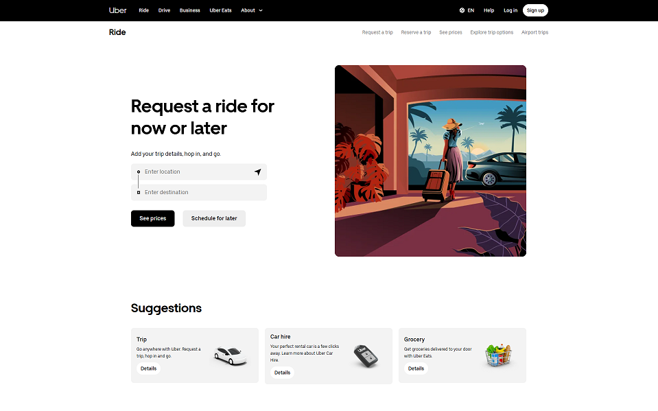
Uber Wesbite
Uber’s website excels with its sleek, modern design and minimalist layout, offering a user-friendly interface and clear navigation. Integrated features such as fare estimation and real-time tracking enhance convenience for users, while its strong mobile optimization and seamless app integration make it highly accessible. However, Uber’s design can feel overly generic, lacking localized appeal that could better connect with specific markets. Additionally, the platform’s limited focus on eco-friendly initiatives is a missed opportunity, and its heavy reliance on app usage might alienate users who prefer to book rides directly through the website.
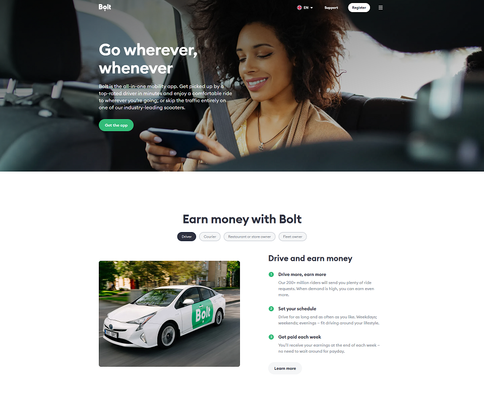
Bolt Website
Bolt’s website stands out with its vibrant color scheme and bold typography, creating a modern and visually appealing design. It emphasizes affordable fares and sustainable transport options, making it attractive to eco-conscious users. The dynamic “How It Works” section effectively explains the booking process, enhancing user understanding. However, the website’s limited visual content can make it feel less engaging, and the lack of prominent testimonials or customer feedback reduces opportunities to build trust and credibility with users.
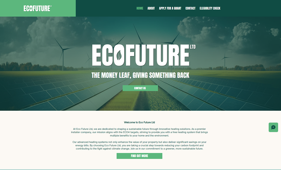
Eco Future
ecofutureltd webiste
Eco Future Ltd’s website effectively communicates its mission to provide sustainable heating solutions and outlines its services clearly, such as insulation grants and solar PV systems. The step-by-step explanation of the grant process is user-friendly and informative. However, the website’s design lacks modern appeal, and its navigation could be more intuitive, particularly between similar sections like “Apply for a Grant” and “Eligibility Check.” Additionally, the absence of interactive elements like testimonials and limited mobile optimization hinder user engagement and trust-building. Improving these aspects would enhance the overall user experience.
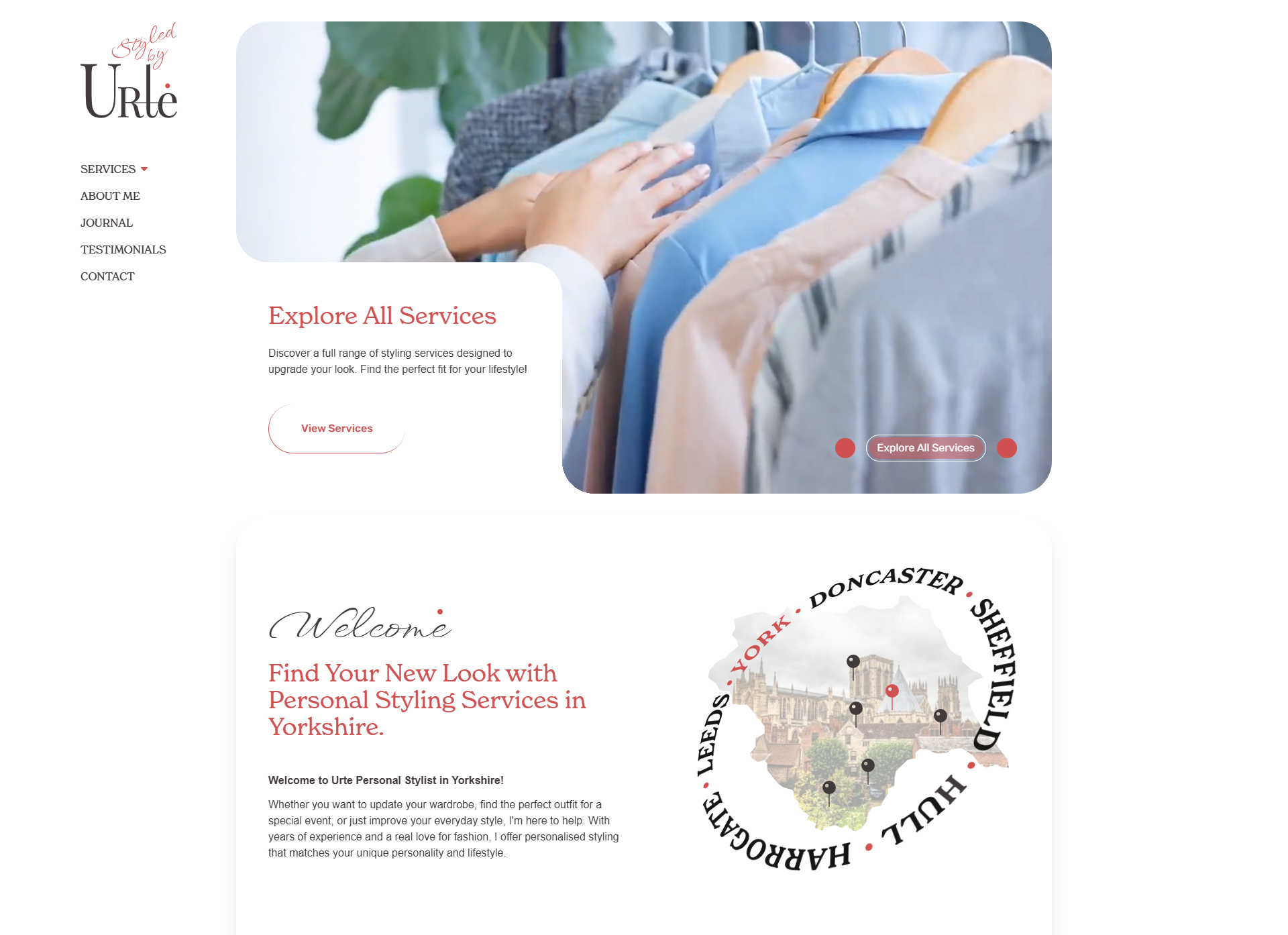
urte-personalstylist
Urte Personal Stylist’s website effectively highlights her services, such as wardrobe edits and personal shopping, emphasizing a tailored approach that caters to individual client needs. The clear service descriptions make it easy for visitors to understand the offerings. However, the site could benefit from more high-quality visual content, such as images or videos showcasing her styling work, to better engage potential clients. Additionally, the absence of client testimonials or case studies limits opportunities to build trust and credibility. Improving SEO optimization could also enhance the website’s visibility and attract more organic traffic.
Logo Research
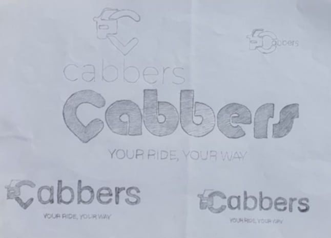
Logo Sketchs
I began the logo design process by sketching various concepts for the “Cabbers” brand, focusing on the tagline “Your Ride, Your Way.” These initial hand-drawn sketches helped me explore the relationship between text, symbols, and the overall feel of the brand. I experimented with integrating key elements like cars, directional symbols, and the idea of location to reflect the essence of a taxi service.
One of the core ideas I developed was to combine the letter “C,” representing the brand’s name, with a car icon and a location pin. This combination symbolized transportation, destination, and accessibility, which are central to the brand’s identity. I shaped the “C” to form the outline of the car, with the location pin incorporated at the bottom to create a dynamic, unified symbol. This design not only tied together the core elements of the brand but also conveyed the message of precision and reliability in reaching one’s destination.
From these sketches, I refined the design digitally. The finalized logo features a bold, rounded typeface for “Cabbers,” ensuring it is approachable and recognizable. The car-and-location-pin icon was simplified into a clean, minimalistic design to complement the text without overpowering it. The bright yellow background, a color universally associated with taxis, gives the logo high visibility and a vibrant, professional feel.
This process of combining key visual elements allowed me to create a logo that is both functional and visually appealing, encapsulating the brand’s identity and purpose effectively.
Internet logo
physical logo
Legibility and Versatility
The “Cabbers” logo is designed with clarity and adaptability in mind. The bold and rounded typeface ensures that the brand name is easy to read across various digital platforms, including websites, apps, and social media. The simplicity of the icon—a combination of the letter “C,” a car symbol, and a location pin—ensures that it is instantly recognizable even at smaller scales, such as on mobile screens or as an app icon.
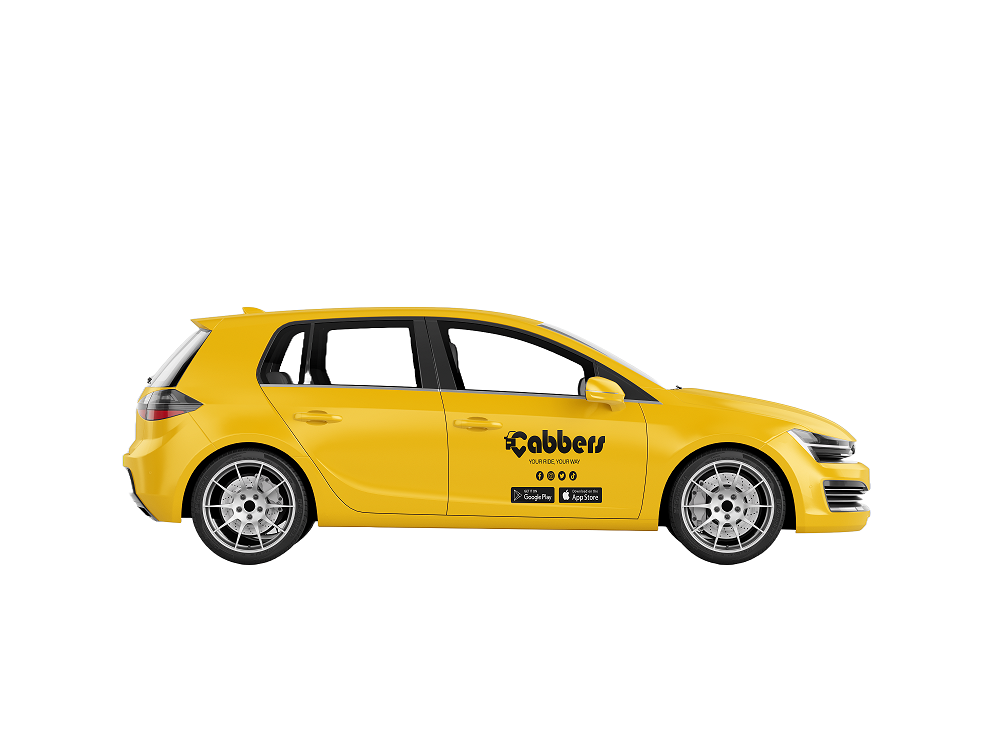
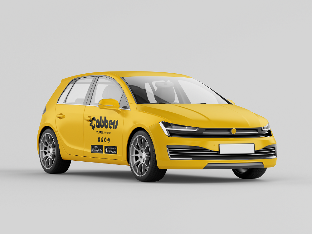
For physical applications, such as vehicle mockups, business cards, or promotional merchandise, the logo maintains its legibility and visual impact. The bright yellow background enhances its visibility, making it stand out in crowded urban environments, which is critical for a taxi service.
as vehicle mockups
as vehicle mockups
as vehicle mockups
Connection to the Brand’s Product
The logo effectively communicates the core of the Cabbers brand—a reliable and convenient taxi service. The incorporation of the location pin directly relates to navigation and destinations, while the car symbol immediately conveys the transportation aspect. The creative use of the letter “C” ties the visual identity directly to the brand name, making it memorable and cohesive.
The tagline, “Your Ride, Your Way,” paired with the logo design, reinforces the company’s mission to provide a personalized and customer-focused experience. The design speaks to a modern, tech-savvy audience by presenting a clean and contemporary aesthetic that aligns with the expectations of app-based taxi services.
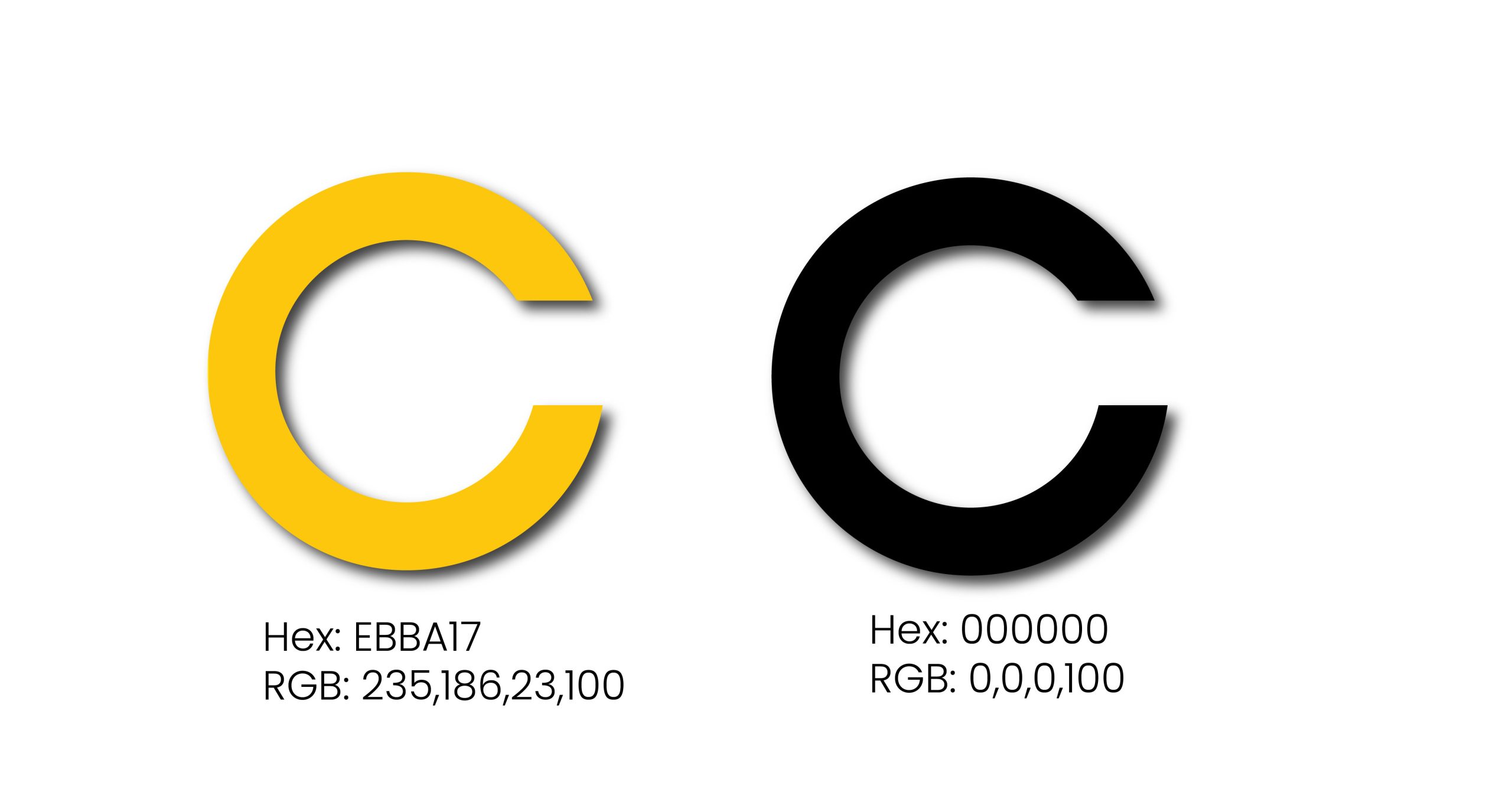
Colour Palette
Colour Palette
Yellow and black are widely used in taxi services due to their high visibility and psychological impact. Yellow grabs attention and conveys energy, while black adds contrast and communicates reliability and professionalism.
For Cabbers Online, this color scheme ensures key elements like buttons, banners, and navigation stand out, creating a bold and user-friendly design. It reinforces trust and makes your brand instantly recognizable, whether on the website or app.
Home Page Wireframes
Low Fidelity Sketches
Low-fid sketches
The low-fidelity sketches validate the design by showcasing a clear and purposeful structure that highlights essential functionalities, such as booking a taxi and exploring services. This approach ensures that key features are easy to access and understand, enhancing usability and customer satisfaction. By focusing on a user-centered design, the layout effectively supports the company’s goals of providing a seamless experience for users while building a strong, recognizable brand identity.
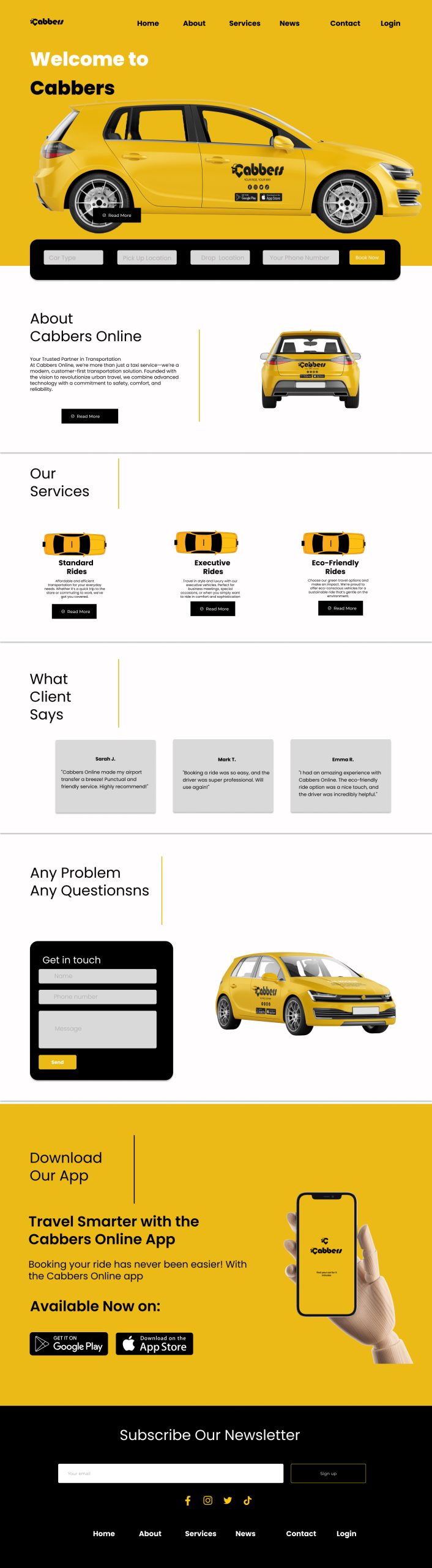
Mid Fidelity 1
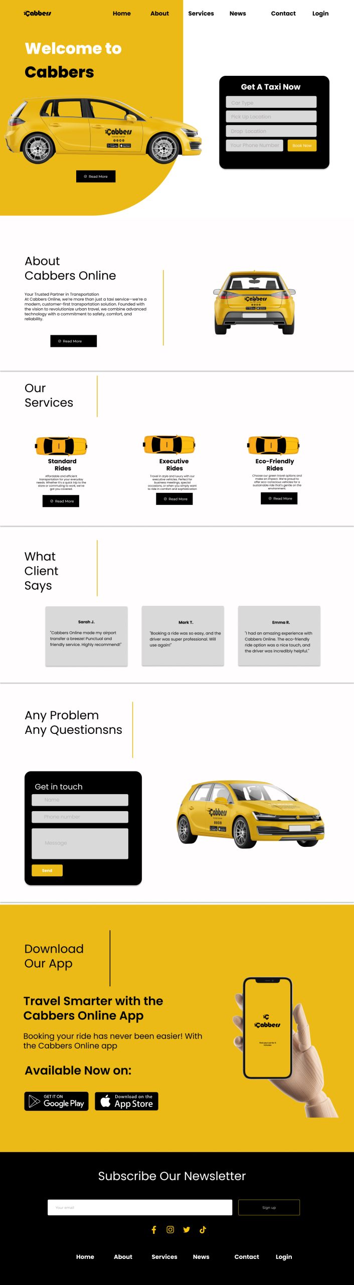
Mid Fidelity 2
Both designs offer unique advantages that cater to different aspects of user experience and functionality. The first design presents a visually balanced layout with the booking section placed horizontally beneath the hero banner. For me, this placement ensures a smooth flow from the main image to the booking form, maintaining a clean aesthetic and consistent branding with the signature yellow and black theme. However, I feel the booking section might not stand out enough due to its horizontal alignment, potentially reducing its effectiveness as a primary call-to-action. This design seems well-suited for tech-savvy users like me who are familiar with ride-booking platforms and prefer seamless navigation.
On the other hand, the second design prioritizes functionality and conversion by placing the booking form in a prominent vertical layout beside the hero banner. To me, this ensures immediate visibility and encourages users to take action without scrolling. The vertical placement creates a strong visual hierarchy, directing my attention straight to the booking tool. While this layout is highly conversion-focused, I notice it slightly compromises on visual breathing space, making the hero section feel a bit cramped. This design feels ideal for users like me who value quick and efficient access to booking features without unnecessary navigation
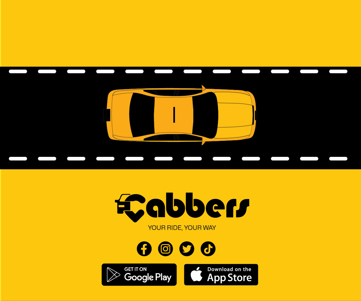
When designing the branding for Cabbers, I focused on creating a visual identity that clearly communicates the brand’s purpose and values. The bold yellow and black color palette was chosen to evoke energy, movement, and professionalism. Yellow, often associated with transportation, adds vibrancy, while black provides sharp contrast and clarity.
The logo combines a car outline and a heart within the “C” of “Cabbers” to represent both reliable transportation and customer care. This blend of function and emotion reflects the brand’s dual focus on efficiency and trust. The bold, geometric font ensures readability and conveys strength, while its slight curves add a friendly touch.
In the layouts, I kept the designs clean and engaging. The top-down view of a car on a road reinforces the transportation theme without cluttering the space. Key elements, like the tagline “Your Ride, Your Way” and the app store buttons, are prominently positioned to guide the viewer naturally. Social media icons signal the brand’s accessibility and encourage engagement.
I worked to maintain consistency across all designs, ensuring a cohesive and unmistakable visual language. The relationship between the car icon, heart shape, and bold typography balances functionality with care, creating a holistic identity. Overall, I feel these choices effectively communicate Cabbers’ values and resonate with its audience.
I created two Instagram reels for Cabbers with the aim of promoting the brand and boosting app downloads. In the first video, I focused on showcasing the Cabbers logo with smooth animations to create a professional and modern feel. The video highlights the essence of the brand while keeping it visually engaging and memorable.
The second reel is text-based and designed to captivate viewers through a bold, minimalistic approach. It starts with a black screen and the text “Need a ride? Fast.” appearing in bold yellow, immediately grabbing attention. This is followed by the text “Reliable. Safe. Always.” with dynamic animations to emphasize trust and reliability. Toward the end, I incorporated a sleek logo animation where the Cabbers logo forms alongside the tagline, leaving a strong brand impression. Finally, the last slide includes a call-to-action: “Download the Cabbers app now,” with fading App Store and Google Play icons, encouraging viewers to take immediate action.
I worked on these videos with attention to detail, ensuring the animations and transitions align seamlessly with the brand’s identity. I believe these reels effectively communicate Cabbers’ core values—speed, safety, and reliability—while appealing to a wide audience.