Low fidelity
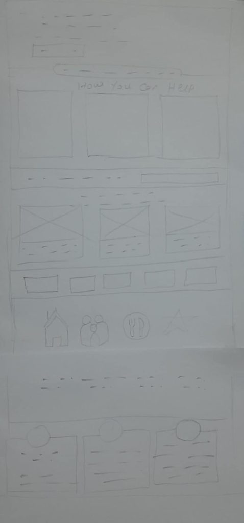
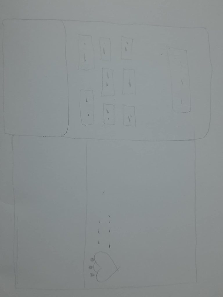
When designing the low-fidelity layout for Welcome House, I began by visualizing key sections that reflect the organization’s mission and values. I sketched out various layouts, focusing on essential components such as a welcoming hero section with a bold message and call-to-action, an “Our Impact” section highlighting key metrics like shelters provided and families helped, and testimonial sections that share personal stories from beneficiaries, volunteers, and donors. I also included areas for campaigns and partner logos to showcase credibility and engagement opportunitie
Mid-fidelity
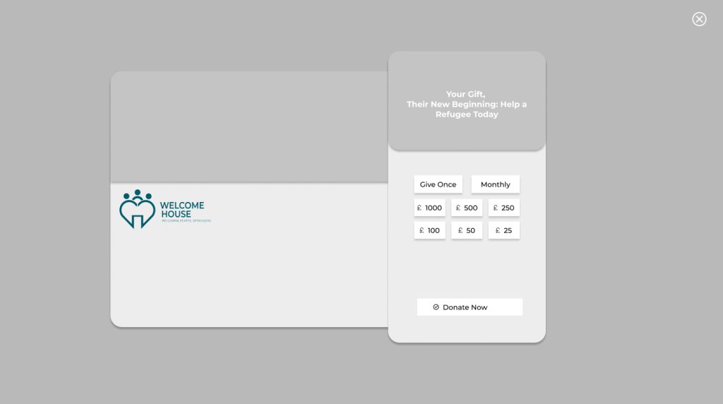
The shift from low-fidelity (low-fid) to mid-fidelity (mid-fid) design is a significant step in the design process. For me, it represents moving beyond basic wireframes or sketches to a more detailed and refined prototype. While low-fidelity designs focus on rough layouts and fundamental content placement, mid-fidelity prototypes incorporate more realistic elements like typography, grayscale visuals, and some interaction. I use mid-fid designs when I want to start addressing user experience nuances, such as navigation flow, content hierarchy, and layout balance, without diving into full-color details or final aesthetics. This phase allows me to test usability and refine the structure before committing to a high-fidelity design.
With its straightforward style, Hero content, and powerful calls to action like “GET INVOLVED” and “Donate Now,” the home page serves as a kind of warm greeting for me. Meanwhile, the mid-fid design helps me keep the structure organised and free of distractions. By providing the mission, history, and team bios in a clear, logical manner with space for images to foster confidence, the About Us page enables me to establish a personal connection. The News page ensures easy navigation by providing users with updates, news, and announcements in a straightforward structure. Last but not least, the donation page is essential to reaching objectives, therefore I make it easy to use for donors by including a prominent button, motivations for giving, and customisable settings.
High fidelity
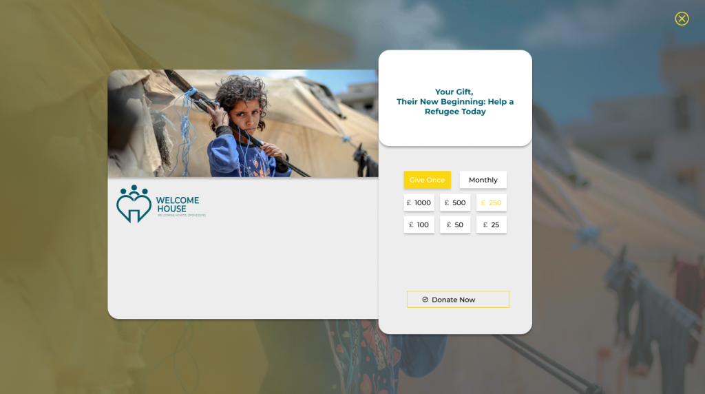
The high-fidelity design for the Welcome House website ensures that the mobile-responsive version maintains the same polished look and feel as the desktop version, emphasizing consistency and accessibility. High-fidelity designs are vital because they represent the final product’s aesthetics and functionality, helping users visualize the complete experience. Compared to the mid-fidelity version, which focused primarily on layout and structure, the high-fidelity iteration introduces real imagery, color schemes, typography, and interactivity to align with the organization’s branding and mission.
One of the key changes from mid-fidelity to high-fidelity was enhancing mobile responsiveness. I ensured that all elements, including navigation, CTAs, images, and text, adapt seamlessly to smaller screens while preserving their visual clarity and functionality. For example, sections such as the “Testimonials” and “Our Impact” scale appropriately, with columns stacking vertically for readability. The navigation bar transforms into a hamburger menu, making it easy to access on mobile devices, and CTAs remain prominent and touch-friendly. The mobile version mirrors the desktop design’s professional and welcoming tone, ensuring users feel the same level of engagement regardless of their device.
While the high-fidelity design excels in creating a cohesive and user-friendly experience, some refinements could further enhance the mobile version. For instance, introducing subtle animations, such as fading transitions for images or sliding menus, could improve interactivity. Ensuring text-heavy sections, like “Our Mission” or news articles, use collapsible panels on mobile would also improve readability and reduce scrolling. Overall, the high-fidelity design demonstrates my focus on creating a consistent, visually appealing, and functional platform across all devices, staying true to Welcome House’s mission and audience needs.


