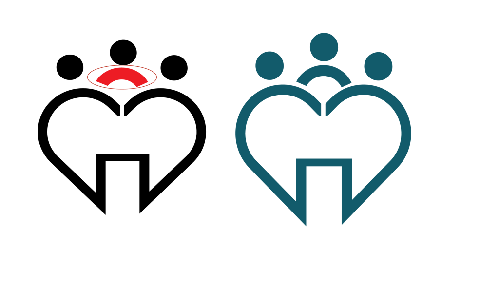
The first feedback I received was about the logo, specifically the human figure within it. I had initially changed the color to red, but its stroke size was different from the rest of the elements, which made it stand out inconsistently. As soon as I got this feedback, I adjusted the stroke size to match the rest, ensuring it looked uniform and cohesive. For me, it was important to address this quickly because I value consistency and wanted the logo to reflect a polished and professional look
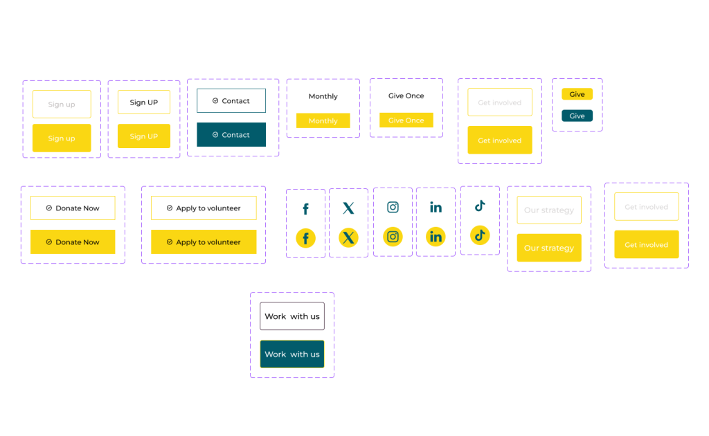
The second feedback I received was regarding the call-to-action (CTA) buttons, specifically pointing out accessibility issues. Some of the buttons had mismatched colors when hovered over, and there were readability problems due to the background image, making it hard for users to interact with them. After receiving this feedback, I recognized the importance of addressing these issues. For me, ensuring accessibility is a priority, so I will adjust the color contrast and hover effects to improve readability and create a more user-friendly experience. I’m committed to making these fixes and ensuring the design is both functional and accessible for all users.