1. Logo variation
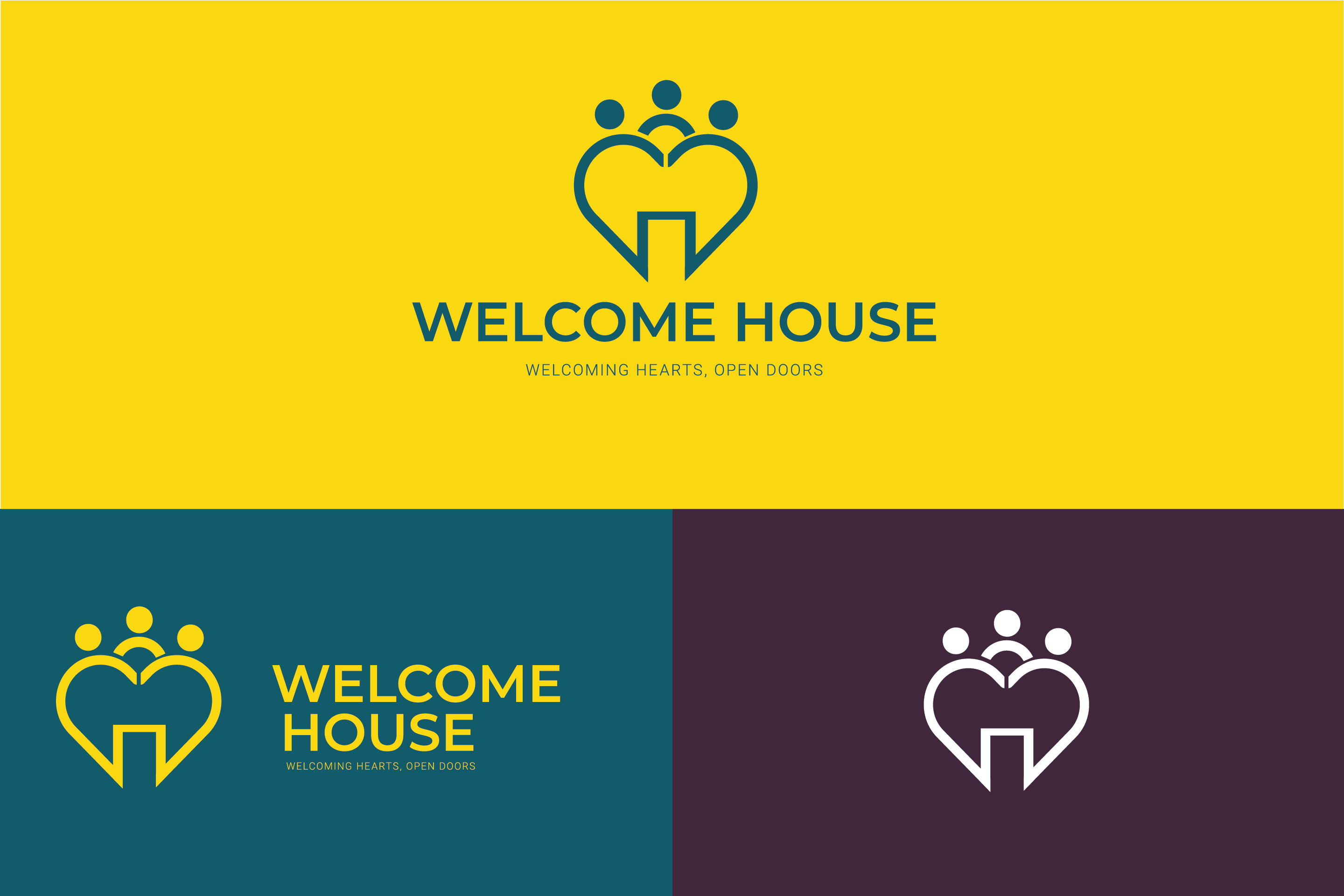
This is my logo variation for Welcome House, displayed against different background colours to show how the logo adapts and stands out in various contexts. To increase versatility and usability, I have created three different logo formats vertical, horizontal, and icon only versions. The vertical logo is perfect for applications that have vertical space, such as banners, posters, and mobile app splash screens. It ensures a clear visual hierarchy and balances all elements—heart, gate, and people figure—effectively. The horizontal logo is designed for wider formats, making it ideal for website headers, email signatures, and print materials. This version allows the design to remain linear and visually coherent in longer spaces. The icon-only logo simplifies the design into a compact symbol focusing on the combined heart, gate, and people figure. This version is particularly suitable for smaller applications, such as social media profile pictures, favicons, or stamps, where space is limited but brand recognition is crucial. Having these three variations ensures that the Welcome House logo remains consistent and adaptable across various media, maintaining brand identity while fitting different visual needs for both digital and print use.
2. Branding Colour Palette for Welcome House
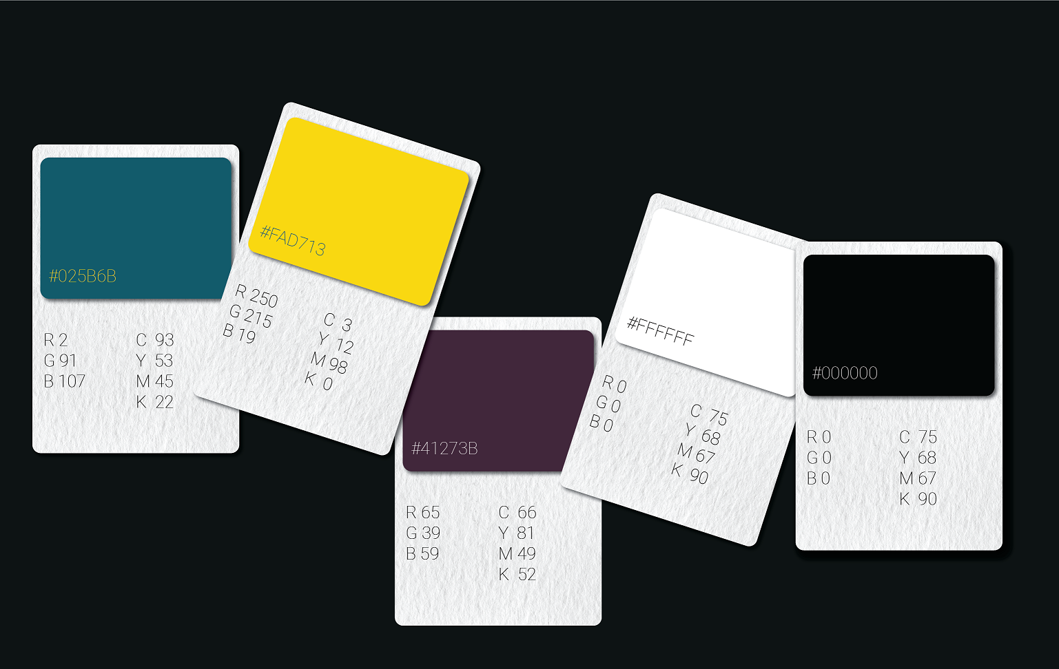
The chosen colours for Welcome House branding #025B6B #FAD713 #41273B #FFFFFF and #000000 reflect the organization’s mission and values. Each colour plays a specific role in communicating the brand’s identity
- #025B6B -Represents trust, support, and tranquillity, fostering a sense of reliability and safety.
- FAD713 – Offers warmth, positivity, and optimism, symbolizing hope and encouragement for those seeking help.
- 41273B Conveys stability, compassion, and deep-rooted commitment to the community, reflecting the organization’s caring and grounded nature.
- FFFFFF (White): Used for clarity, simplicity, and creating a clean, welcoming space.
- 000000 (Black): Provides contrast and enhances readability and emphasis in text and outlines.
It is important to apply these colours consistently across all platforms and materials in order to preserve branding consistency. This covers the social media platforms, print materials, and website. Among the main suggestions are
Primary and Secondary Colours
- Teal serves as the primary branding colour.
- Yellow and burgundy act as accent colours for highlights, buttons, and key design elements.
- White and black are used for backgrounds and text to ensure readability and balance.
Design Elements
To establish a unified brand identity for Welcome House, the colour scheme must be used consistently across the buttons, icons, typography, and logo. My goal is to make sure that these colours are carefully incorporated into each design aspect while preserving professionalism and harmony. Specifically, white will be carefully employed as negative space to help balance the entire design and produce an audience-pleasing, clean, approachable look.
I’ll create thorough brand guidelines with exact colour codes (HEX, RGB, and CMYK) to further solidify the identity. These rules will be used as a guide to ensure that the colour scheme is applied uniformly throughout all print and digital materials. By using these steps, I can make sure that every visual component is in line with the organization’s goals and core principles, creating a cohesive, polished look that makes an impact
3. Call-to-Action (CTA) buttons
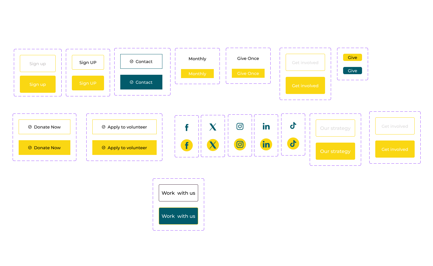
For the Welcome House website, I designed Call-to-Action (CTA) buttons by closely following the established branding guidelines to ensure a cohesive and visually appealing user experience. The buttons utilize the primary branding colours strategically: yellow (#FAD713) is widely used for CTA buttons to evoke warmth, positivity, and visibility, while teal (#025B6B) is applied selectively based on the background to maintain contrast and harmony. The text colour alternates between black (#000000) and white (#FFFFFF), carefully chosen to ensure maximum readability and alignment with the overall design.
Hover effects are thoughtfully implemented to enhance interactivity and engagement. For yellow buttons, the hover effect transitions the background to a lighter tint of yellow, while for teal buttons, the background shifts subtly to a softer teal tint. This dynamic yet consistent approach reinforces the brand’s welcoming and supportive ethos while maintaining a polished and professional appearance.
4. Typography
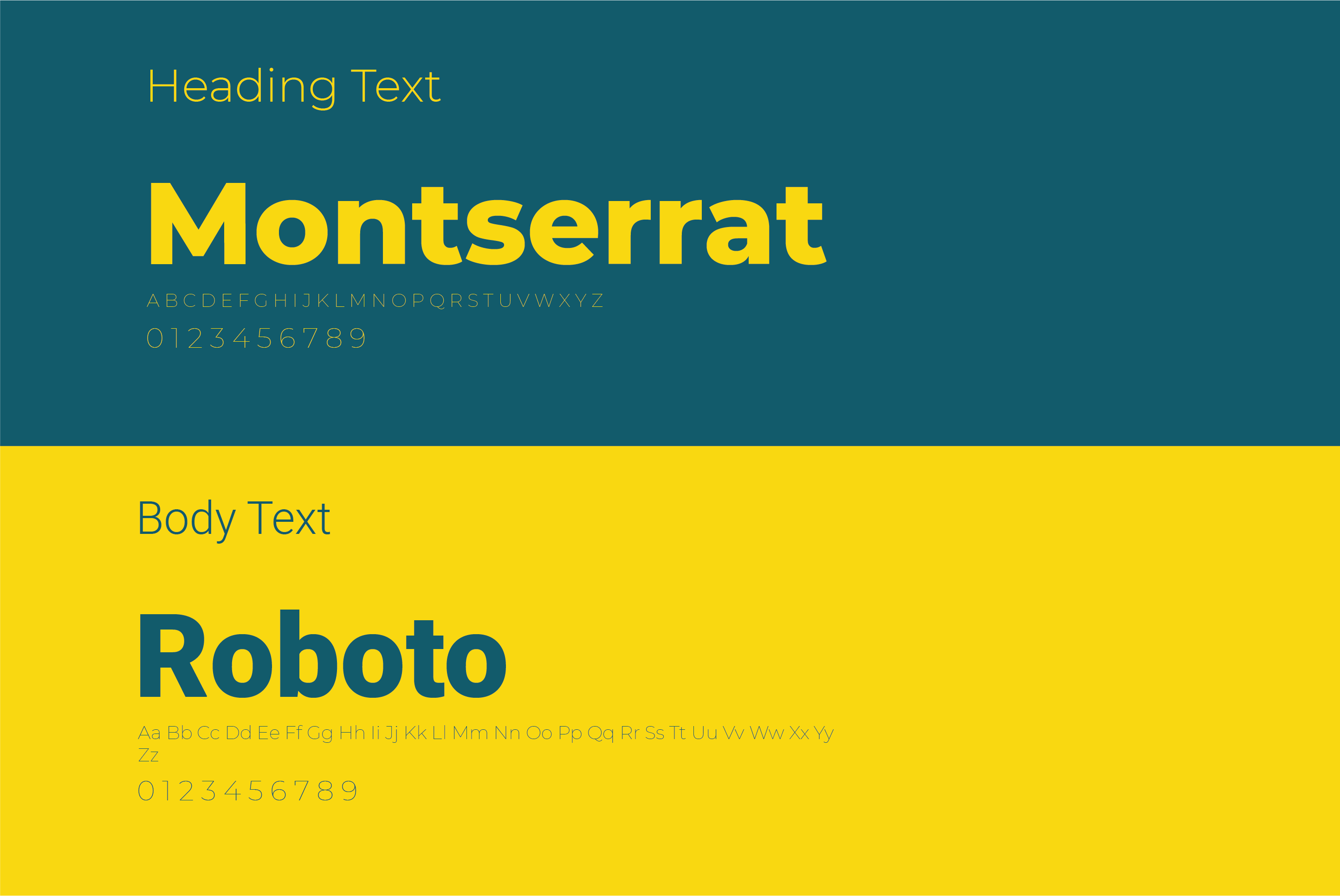
In keeping with the organization’s objectives and guiding principles, the typography I selected for the Welcome House website combines modernism, readability, and approachability. Because they improve the user experience and blend well together, I chose the typefaces Roboto and Montserrat. I use Montserrat to make heads and titles bold, geometric, and polished, which guarantees refinement and clarity while projecting assurance and dependability. I choose Roboto, an approachable and readable typeface that lends warmth and approachability, for body text and detailed material. I create a harmonic hierarchy by combining these types Roboto guarantees easy readability, while Montserrat draws attention, which is exactly in line with Welcome House’s welcome and encouraging aim.