Responsive design
Responsive web design adapts to the size, orientation, and capabilities of the device being used, online content is automatically optimised for the best possible viewing experience. It provides information in the most approachable and captivating format possible, whether on a desktop, tablet, or smartphone, improving accessibility and usability across all platforms. This is achieved by dynamically adjusting layouts, graphics, and text. (Carver, 2014)
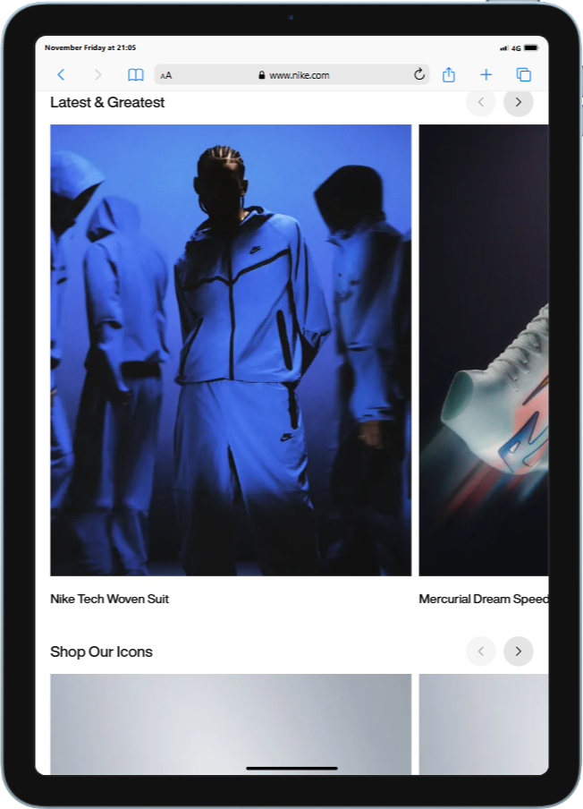
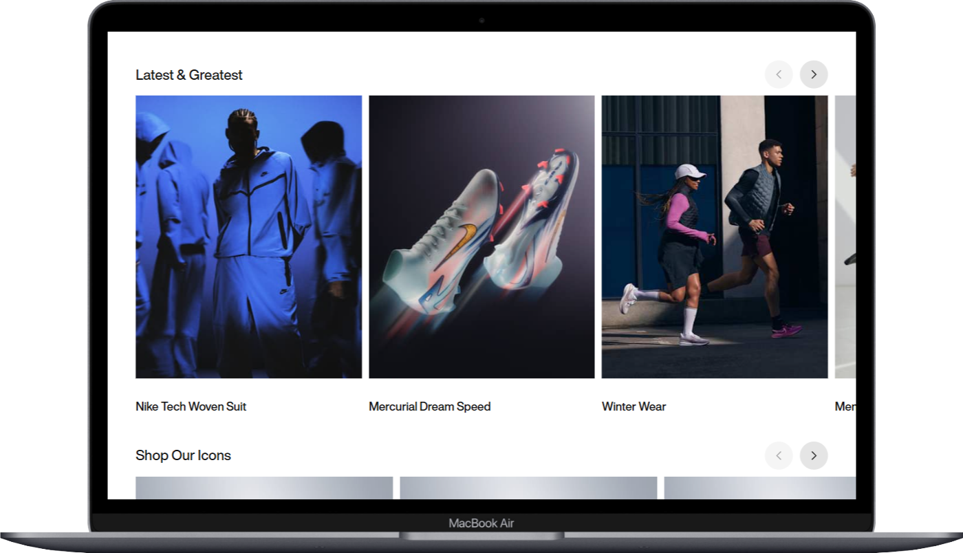
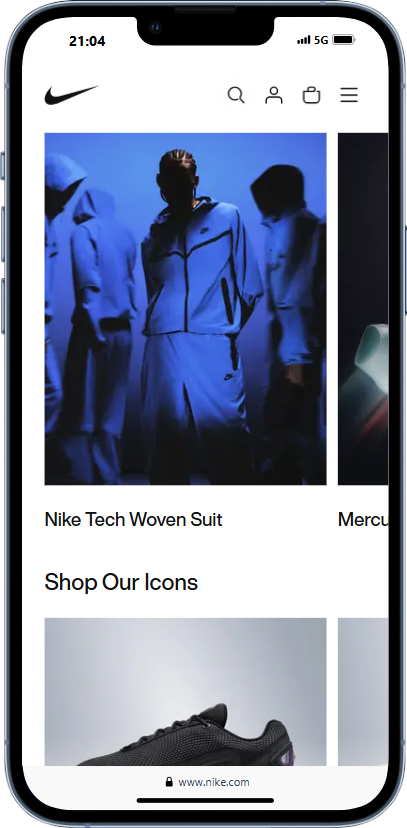
The first example I want to explore The Nike website is can consider successful example of responsive web design because of its carefully considered Design high level of, performance optimisation, adaptive layout, and simple navigation. Users may navigate with ease because to its fluid grid design, which guarantees that material, is visible and available on all devices—from computers to smartphones. The user experience is improved overall because it is simple for visitors to find exactly what they’re looking for thanks to the well-structured categories and clear navigation. Its flexible design probably places a high priority on quick loading speeds, which are important for both SEO and user engagement and keep users interested. The multi-column layout on desktops makes the most of screen real estate by arranging a variety of products side by side. The large horizontal navigation menu offers quick access to a number of categories and special offers on the other hand, the mobile version has a single-column style that arranges items vertically, making it easier to browse through the products and details. A hamburger menu streamlines navigation, improving usability and clearing up the user interface (UI). Nike creates a consistent and entertaining purchasing experience by adjusting its layout, content, and user interaction according to the device being used. This encourages people to interact with the brand on several platforms.
Accessibility
The process of creating inclusive and useable websites for all users, irrespective of their abilities or limitations, is known as web accessibility. Following accessibility guidelines guarantees that users with different needs can access material and features on your website with equal ease. You may create an experience that enables users of all physical and cognitive abilities to interact with your website in a similar, seamless way by adhering to specified design and development guidelines. This guarantees that nobody is left behind in the digital sphere and promotes inclusivity (Baker, 2021). In my research on web accessibility, I think it’s critical to take people with different kinds of impairments—such as visual, auditory, cognitive, or motor disabilities—into account. Web Content Accessibility Guidelines (WCAG) and other standards serve as guidelines for accessibility. Important components of accessible design are: Keyboard Navigation, which guarantees that all interactive elements can be accessed without a mouse; Alt Text for Images, which provides descriptions of visual content for visually impaired users; Semantic HTML, which guarantees proper use of elements like headers, lists, and buttons for better navigation via screen readers; and High Contrast Modes and Adjustable Font Sizes, which provide enhanced readability through contrast options and font size adjustments.
Example
Plan International’s website appears in accessibility. It guarantees reading for people with visual impairments by using text that is clear and has a high contrast. Users with visual impairments can view all material on the website thanks to its comprehensive alt text for photos and screen reader assistance. Additionally, it has clear headings that make it easier to find information, is completely keyboard accessible, and is crucial for people with motor limitations. Furthermore, its adaptable design effortlessly adjusts to various platforms, showcasing Plan International’s dedication to diversity and fostering a satisfying user experience for all.
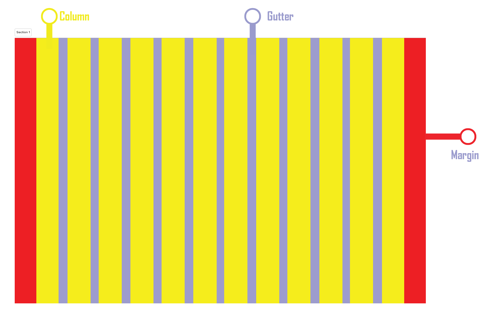
Grid
“Grid‘s A visual made up of columns, gutters, and margins that provide a structure for the layout of elements on a page.” (Gordon, 2022)
The above quote captures grids’ usefulness and emphasises their significance in design. My research revealed that grids have their roots in print media, dating back to the early typeface and manuscript layouts created by book printers and scribes. But in the 20th century, grids gained popularity and formalisation, particularly with the emergence of contemporary graphic design. This evolution was significantly influenced by the International Typographic Style, sometimes known as Swiss Design, of the 1940s and 1950s, which promoted grids as a crucial instrument for establishing layouts that are balanced, consistent, and clear. This historical background emphasises grids’ enduring value and the reasons we should keep utilising them to improve the organisation and usability of contemporary design.
Grids are the foundation of clear and effective web and interface design, providing a structured way to organize content. Through my research, I’ve gained a deeper understanding of how grids function and how they can significantly enhance usability when designing websites. A grid is primarily made up of three key components: columns, gutters, and margins.
For both designers and end users, the grid system has several benefits. Assuring balance and uniformity across the design, it allows designers to quickly create interfaces that are cohesive and well-aligned. Grid-based layouts make it simple for users to rapidly scan and browse content since they are intuitive. Grids are also crucial for flexible web design since they can be easily adjusted to fit various screen sizes and orientations. Designers can guarantee a consistent and optimal user experience across a range of devices by employing breakpoints to make sure the layout adapts fluidly. However, today I’m going to be focusing on three common grid types used in websites and interfaces: column grid, modular grid, and hierarchical grid.
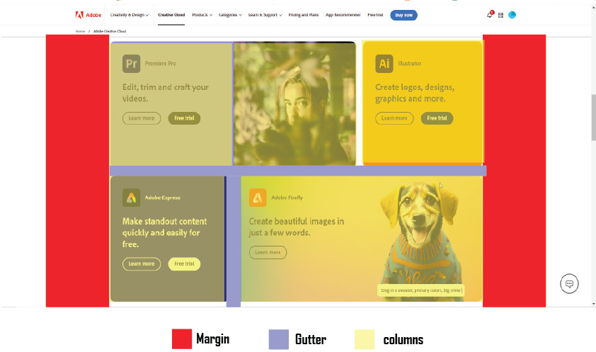
- Column grid -This kind of grid arranges text in vertical columns and offers a straightforward framework that is perfect for layouts that need to be clear and consistent. In responsive design, column grids are frequently employed because they make it simple to adapt to various screen sizes while preserving a consistent alignment.
Example of column grid Website
A multi-column grid is used on Adobe’s website to display its range of information, products, and solutions. A balanced arrangement is made possible by the grid structure, making it simple to browse various product categories and promotional materials. The whole browsing experience is improved by the design’s consistency across devices.
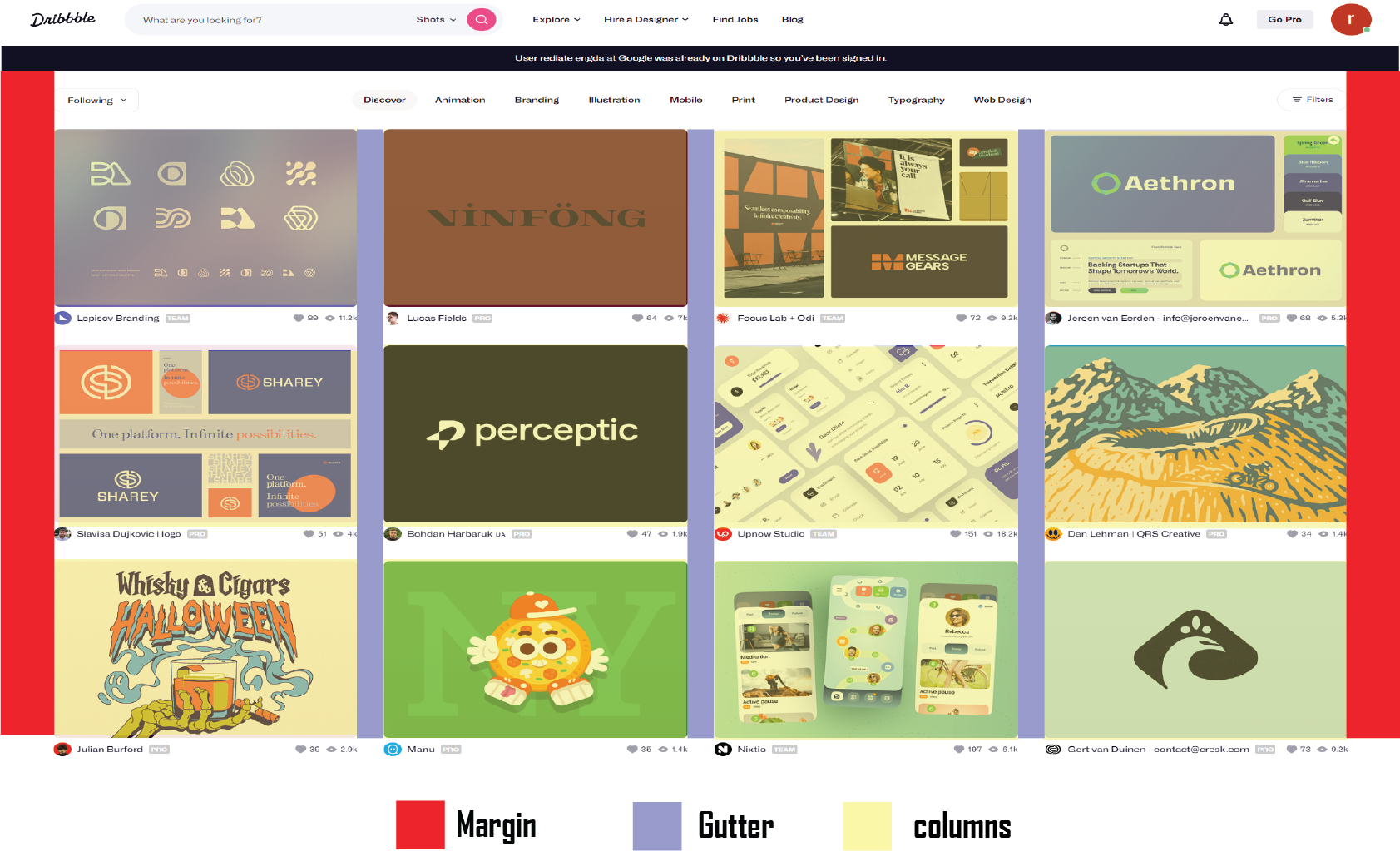
Modular Grid – The modular grid adds rows to the column grid, extending it further. Modules are formed by the intersection of columns and rows, to which content and elements are matched. E-commerce and listing pages benefit greatly from modular grids because the rows can be repeated to allow for browsing.
Example of Modular Grid Website
Like Behance, Dribble uses a modular grid architecture in which each visual project gets its own block or module. Each project is given equal weight and space in the layout, and users may peruse a large number of imaginative concepts without feeling overloaded thanks to this simple, grid-based framework.
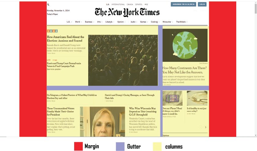
Hierarchical Grid – In contrast to column or modular grids, hierarchical grids are not rigidly structured. The grid regions are rearranged to highlight specific elements, and they are instead depending on the content’s value. Hierarchy is essential for directing the user’s attention in more imaginative or visually appealing designs, which frequently use this kind of grid.
Example of Hierarchical Grid Website
This kind of grid is frequently used by news and media websites to highlight certain stories and post more than others. Check out this visual representation of The New York Times’ homepage using a hierarchical grid. The New York Times is a prime example of how a hierarchical grid layout may improve user experience by giving priority to crucial material, preserving organisation, and offering visual interest. This design strategy is a prime example of contemporary web design in the media sector since it efficiently facilitates the dissemination of news and information.
Sustainability and Ethics
The Welcome House website’s integration of sustainability and ethics starts with eco-friendly hosting that lowers its carbon footprint and effective design for quick, low-energy loading, which is perfect for users with limited data or older devices. The website will prioritise accessibility by adhering to WCAG guidelines to guarantee screen reader compatibility, offering multilingual options to cater to a wide range of users, and providing alternative text for images. Transparency is essential; although explicit data privacy regulations safeguard user information, an impact reporting section can highlight program results and foster donor trust. Usability and load speeds will be enhanced with a simple, streamlined design, particularly on mobile devices. Frequent audits will maintain the website’s compliance with accessibility and sustainability guidelines, resulting in a responsible, welcoming resource for the community.
Reference list
- Baker, K. (2021). The Ultimate Guide to Web Accessibility. [online]
- hubspot.com. Available at: https://blog.hubspot.com/website/web-accessibility.
- Fevr (2023). The influence of Swiss Design by FEVR Motion Graphics. [online] FEVR Motion Graphics Company & Animation Studio. Available at: https://wearefevr.com/the-influence-of-swiss-design/.
- Gordon, K. (2022). Using Grids in Interface Designs. [online] Nielsen Norman Group. Available at: https://www.nngroup.com/articles/using-grids-in-interface-designs/.
- Web Design, UI/UX, Branding, and App Development Blog. (2023). Website Grid Design: Comprehensive Guide for Web Designers. [online] Available at: https://www.ramotion.com/blog/website-grid-design/.
- Carver, M., 2014. The responsive web. Simon and Schuster.