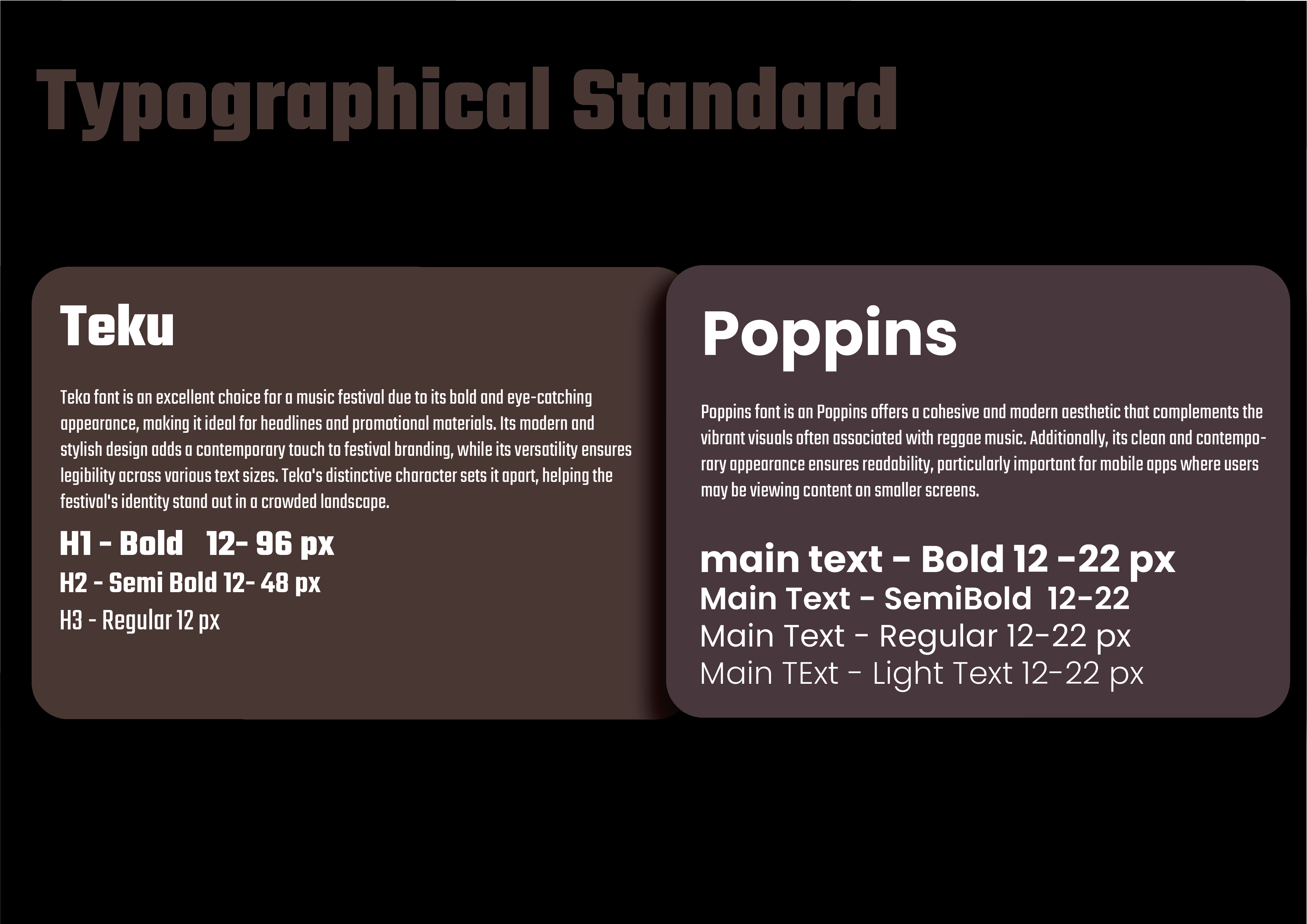
Typography and Logo development
typography is “the art or skill of designing communication by means of the printed word” (Childers & Jass, 2002). In crafting the MId fidelity prototype, I maintained a straightforward and bold approach to the text. Transitioning to Adobe Illustrator for the final prototypes, I began exploring font combinations to ensure consistency with this vision. Typography emerged as a crucial focus, with the desired typeface needing to effectively convey the festival’s messages.
Because of its boldness, readability, and modern design, the Teko font and Poppins were a great choice for the Reggae Festival website. The vibrant energy of reggae music is skillfully captured by its striking design, which also makes sure that important festival information is always easily accessible. Its sleek and modern appearance also fits in well with current web design trends and appeals to younger audiences. All things considered, Teko proves to be an aesthetically pleasing and useful solution, adding to the festival website visitors’ immersive and memorable online experience.The Poppins font provides a unified and contemporary style that harmonises with the vivid imagery frequently linked to reggae music. Furthermore, its sleek and modern design guarantees readability, which is crucial for mobile apps where users might be viewing content on smaller screens.
Logo Development
In my search for motifs for the Reggae Riddim Festival logo, the lion emerged as a powerful symbol deeply ingrained in Rastafarianism and reggae culture. Representing strength, African identity, and resistance, the lion, linked with Haile Selassie as the “Conquering Lion of the Tribe of Judah,” embodies divine presence and ancestral lineage. Within reggae music, it symbolizes empowerment, liberation, and social justice, evoking pride, resilience, and inspiration worldwide. By integrating this iconic symbol into the festival logo and using Adobe Illustrator’s pen tool, I created illustrations resembling lions with dreadlocks, capturing the spirit of Rasta culture while honouring the lion’s symbolic significance.
Mood boards
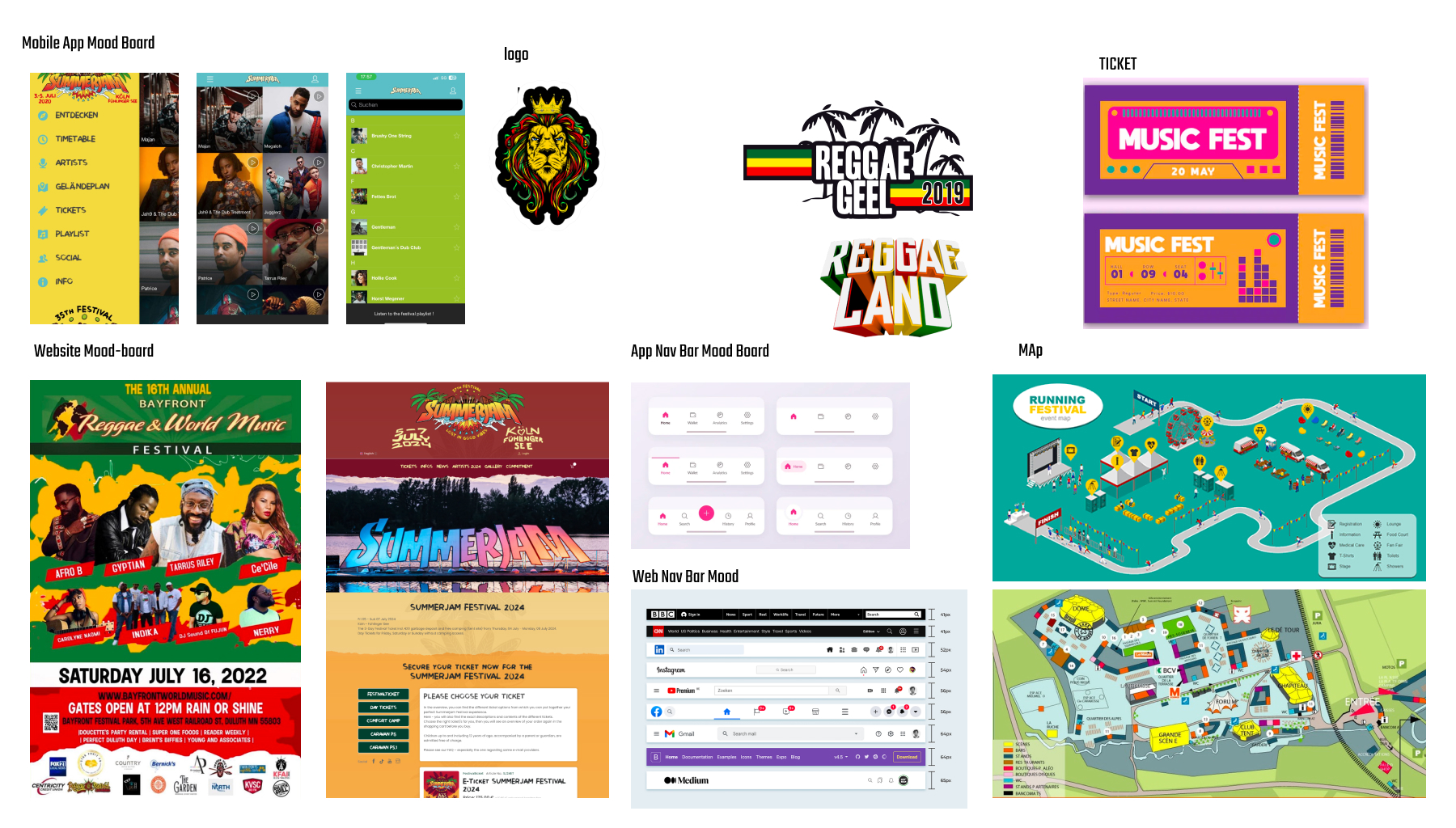
The creative direction a project should go in is captured and communicated visually with the help of a mood board. It is made up of various visual components that when combined, produce a specific appearance, feel, and style.
Generally speaking, mood boards are made early on in a creative project. The final product’s appearance and feel will be shaped by these, which are the designer’s initial ideas and concepts. (Stevens 2023)
The purpose of a my mood board is to evoke a specific feeling or atmosphere that aligns with the goals and objectives of the project. By collecting and arranging visual references, like how the relevant and to see what trade apply on website and application applied those days so fisrt I will try research how Reggea Fedstival logo created and what typem of the colour the used , then how mobile app Ui design for example how nav bar , line up , Map well designed and well compatible with color and I will try exploer how the Reggea website designed and I wanted to include colour schemes too which I did by adding swatches to certain areas of the collage foreshadowing reference points when designing the prototype. And also how the festival ticket designed
Reference List
- Childers, T.L. and Jass, J. (2002). All Dressed Up With Something to Say: Effects of Typeface Semantic Associations on Brand Perceptions and Consumer Memory. Journal of Consumer Psychology, 12(2), pp.93–106.
www.uxdesigninstitute.com. (2023). A Step-by-Step Guide to Mood Boards for UI Designers. [online] Available at: https://www.uxdesigninstitute.com/blog/mood-boards-for-ui-designers/#:~:text=A%20mood%20board%20is%20a [Accessed 3 Apr. 2024].