Visual Design Treatment- How Will I Incorporate Tufte’s Principles
Tufte’s use of colour
Tufte’s use of colour focuses on clarity, hierarchy, and logical organization rather than decoration. He believed colour should encode information, not be random. For example, colour gradients represent elevation, with lighter shades for high points and deeper tones for low points
World map demonstrating Tuftes theory on use of colour
I’ve applied this to Reboost, using bright fruit colours like orange, lime green, and watermelon to clearly differentiate the flavours and ensure instant recognition for the audience. The thoughtful colour choices help guide the viewer’s attention, especially in the transformation scenes of the animation. By using high-contrast combinations, I also ensure that text and product details remain clear for my target audience.
Tufte’s principle of space over time
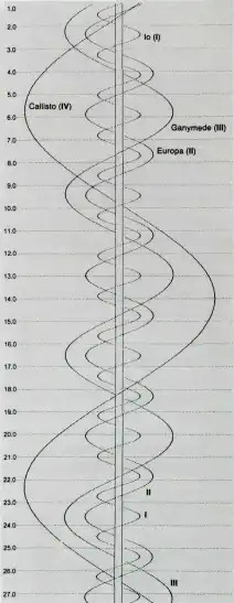
The sequence of events plays a central role in the presentation and experience of the story. (Harry Hagan, 2021) Narrative over Space and Time is a design principle that structures visual elements sequentially to tell a clear and engaging story Tufte applies this concept in timelines, animations, and layered visualizations to guide viewers through a logical progression of information
The corkscrew chart showing the position of Jupiter’s moons, using the theory of narrative over space and time
I apply this principle in the Reboost animation by designing a smooth transformation sequence. It begins with an orange emerging from a pot, symbolizing natural ingredients. The fruit then morphs into an energy drink can, visually communicating the product’s transformation. Finally, the can rolls into place alongside other flavours, reinforcing variety and branding. This structured flow ensures that viewers can intuitively follow the journey from fresh fruit to an energizing final product.
Layering separation
Layering and separation is another important set of principles that can help reduce clutter and confusion in data visualization (Tufte. E.R, 1990)
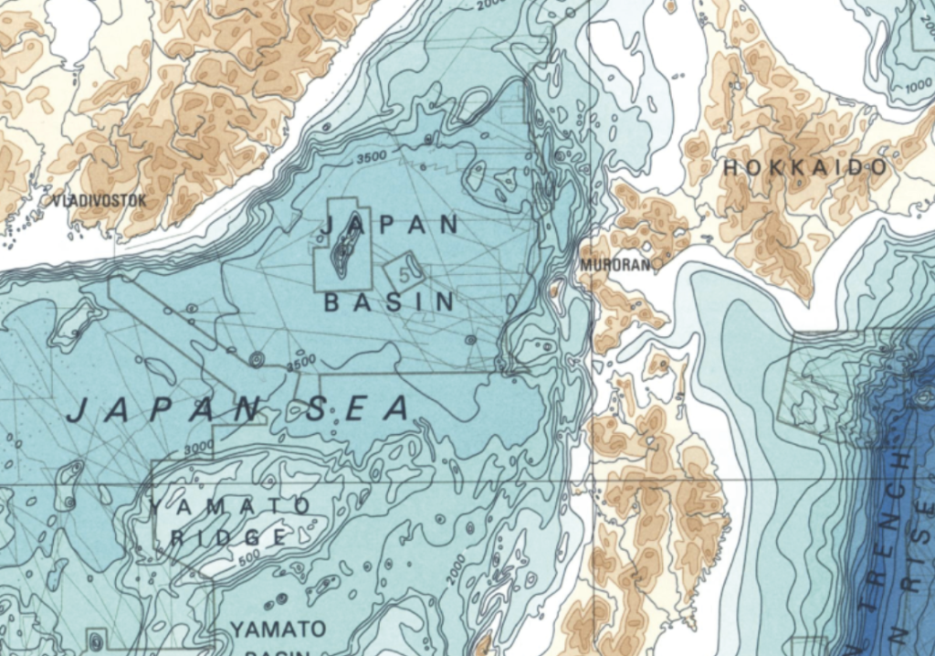
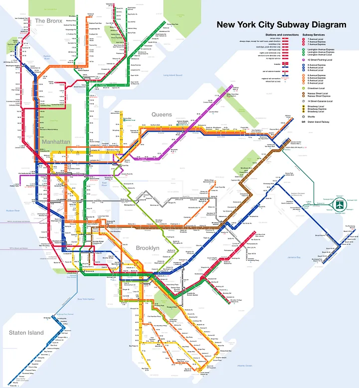
Tufte’s principle of Layering and Separation emphasizes organizing information in distinct layers to enhance clarity and communication. This approach creates a visual hierarchy, ensuring that key elements stand out while background details provide context without causing clutter.
Colour plays a crucial role in this process, as muted tones can recede into the background while vibrant colours highlight important information. For example, in Figure 2, desaturated land and water serve as a backdrop, allowing transit lines to stand out. Overloading a design with excessive detail, such as a satellite image, would make it harder to interpret.
Transit maps make excellent use of color and abstraction to turn an otherwise extremely complex visualization in to something understandable by humans. It is clear in this map, for example that the light blue line can be used to get to Staten Island
In my Reboost label designs, I apply this principle by positioning the product name and flavour text prominently in the foreground for instant readability. Behind them, subtle fruit illustrations and ingredient imagery add context without overwhelming the main message. This structured layering ensures a clean, engaging design while maintaining focus on essential product information.
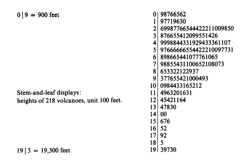
Micro/Macro
Micro/Macro design is a critical and effective principle of information design because it allows readers to understand complex content by giving them an overview, while also presenting immense detail. (Tufte. E.R. 1990)
steam and leaf displays
To apply Tufte’s Micro/Macro principle in my Reboost project, I structure the design to move between these two levels of detail. The macro perspective gives viewers an overall view of the product, while zooming into the smaller details, such as ingredients, nutritional breakdown, and flavour profiles, provides a deeper understanding. In the animation, I plan to focus on close-up shots of the transformation from fruit to can, highlighting the vibrant details of each fruit and ingredient, emphasising the product’s health benefits.
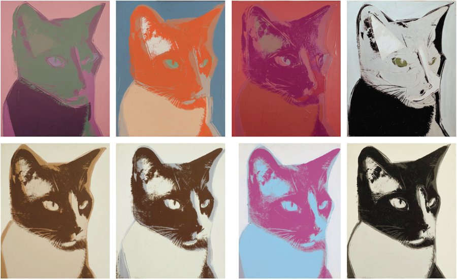
Comparison of small multiples
Tufte defines Small Multiples as using “data-thick slices of information” to offer variation on a major theme, allowing users to compare changes, see differences, or view alternatives (Tufte, E.R. 1990).
Andy Warhol inspired cat portrait demonstrating small multiples
In my Reboost project, I apply Small Multiples in the packaging design by keeping the layout consistent across all flavours (orange, lime, watermelon) while varying the fruit illustrations and flavour details. This approach helps the viewer easily compare each flavour while maintaining a cohesive brand identity.
io. (2017). Narratives of Time and Space Comments. [online] Available at: https://cms633.github.io/Spring-2017/commentary/narratives-of-time-and-space-comments.html [Accessed 10 Mar. 2025].