Responsive and Mid Fidelity Layouts

Mid Fidelity For App

The basic structure and functionality of a digital product are developed with greater detail during the mid-fidelity prototyping stage of the design process than during the low-fidelity stage, but not to the same extent as during the high-fidelity prototype stage. A clearer representation of the finished product is usually provided while allowing for flexibility in design iterations. These visual elements typically include more refined colour schemes, typography, and simple interactive features. (Snyder, 2003)

Visual consistency is maintained by the mobile app layout, which sticks to a 4-column grid with a gutter of 20 and a margin of 35. Three onboarding pages and a welcome note greet users and instruct them to enable necessary settings like location services and notifications. The sign-in or sign-up pages, which have the festival logo, are accessed by users following onboarding. Users can easily access the home page, which offers a number of features like notifications, social media platform integration, and user account settings, after successfully logging in. Performers with bios, music samples, and links to their social media profiles are featured on the artist page. Users purchase tickets for the festival’s various days in the ticket section, where they also get QR codes that allow them to enter. A lineup page is available. a schedule of artists’ performances, while the map tab hosts an interactive map for easy navigation within the festival grounds. Overall, the app prioritizes user engagement, convenience, and accessibility.

Companion App Onboarding MId-Fid
Companion App Mid-Fid

Mid Fidelity For Web

For the website overhaul, I employed a column layout grid consisting of 12 columns. The text was stretched to fit the columns, and the margins were adjusted to 70 pixels with a 20-pixel gutter. The main page underwent substantial revisions based on user feedback, resulting in major alterations from its initial low-fidelity iteration. The revised design of the page now follows a landing page pattern, displaying a prominent image along with two Call to Action buttons and important date and time information, instead of the previous lineup highlights, partner logos, and footer. This change is in line with the objective of a festival landing page, which is to primarily promote and provide information to visitors about the event.

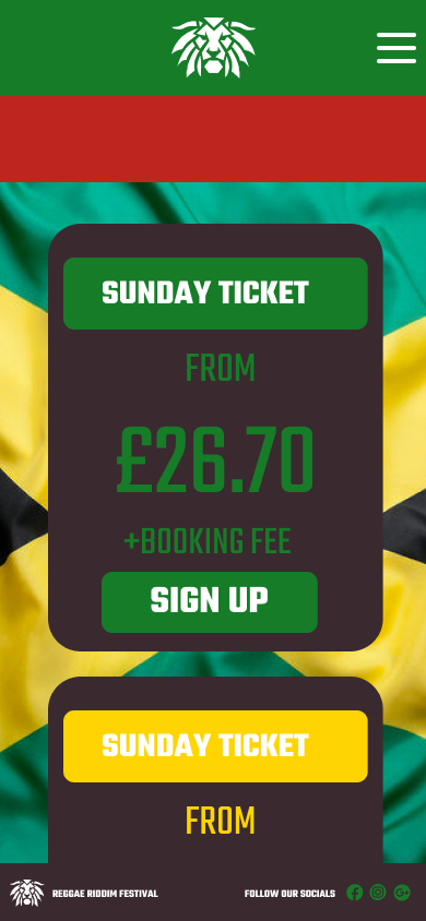
The ticket page was streamlined to present succinct festival details, showcasing ticket choices on Friday, Saturday, and Sunday along with prominent “Buy Now” Call to Action buttons. A footer was appended in the lowermost part of the page, showcasing the festival’s emblem and links to its social media platforms.

Similarly, the artist page implemented a layout that resembled the ticket menu, but was specifically designed to display artist names along with accompanying photographs. In order to maintain consistency, a footer was included to this page, which includes branding components and social networking icons.
The Gallery page is as a visual repository of previous festival events, with the intention of showcasing noteworthy moments. Once again, a footer with logo components and social media connections was incorporated to improve user navigation.

Finally, the Info page was improved to include three essential sections: FAQs, Accessibility Information, and Travel Information. FAQs provide answers to frequently asked questions from attendees, while Accessibility Information guarantees that all guests, including individuals with impairments, are able to fully participate. The Travel Information offers crucial instructions for participants on how to reach the festival venue from different areas. This holistic approach improves user experience and accessibility throughout the whole event website.
 
 
Website Mid-Fid

Responsive Layouts


UI designers can now create web pages thaåt adapt to different screen sizes with ease thanks to responsive design, which embodies the adaptability concept. This method enables quick and efficient rendering, ensuring a great user experience on desktops, tablets, and mobile devices. Responsive design promotes accessibility and makes sure that content is accessible and engaging on any device by putting an emphasis on flexibility and user-centricity. (Almeida, F., & Monteiro, J. (2017)

Fundamental concepts underpin responsive design, which makes websites fluidly adjust to a range of screen sizes and devices. These principles include content prioritisation, performance optimisation, a mobile-first strategy for prioritising smaller screens, breakpoints for adaptation points, media queries for tailored styles, fluid grids and flexible media for proportionate scaling, and more. By adhering to these guidelines, responsive design meets the various demands of contemporary users by providing a unified and intuitive user experience across platforms.


I’ve carefully applied fundamental design principles to the Reggae Festival website to ensure seamless cross-platform adaptability, while also giving smaller screens priority for important content. It’s evident from comparing the designs side by side how each version enhances the others, keeping consistency while changing the focus of the content. In particular, I’ve made the festival date presentation simpler to make it easier to read and less cluttered. I’ve used a bold, attention-grabbing font to make this section stand out because I understand how mobile users browse, and it covers a large percentage of smaller screens. By purposefully focusing on the most important details, users are prevented from scrolling past crucial information. The updated layout improves the user experience overall, encouraging engagement and accessibility across all devices by matching design decisions with insights from user behaviour.

Mobile Responsive layout

Reference list 

  1. Almeida, F. and Monteiro, J., 2017. The Role of Responsive Design in Web Development. Webology14(2).

  2. Snyder, C., 2003. Paper prototyping: The fast and easy way to design and refine user interfaces. Morgan Kaufmann.


Leave a Comment

Your email address will not be published. Required fields are marked *

Scroll to Top