Website Prototype
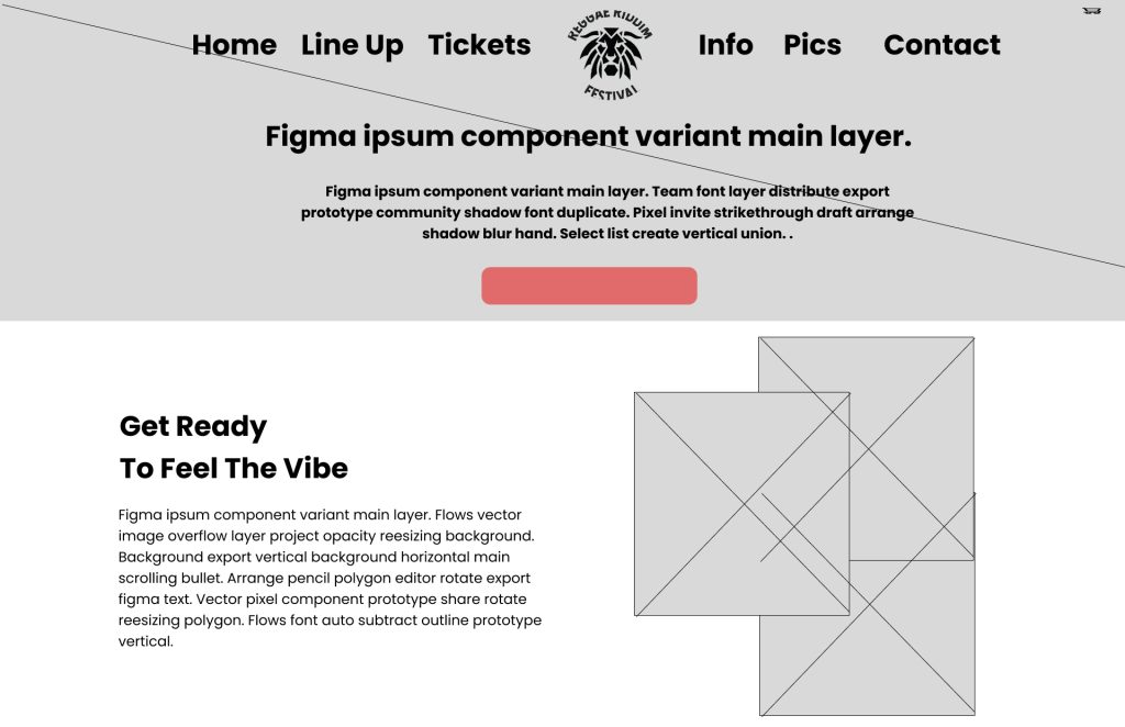
The visual hierarchy of the website may be upset if the logo is positioned in the centre of the menu. Because this is a standard practice on the web, consumers typically expect to locate the logo in the upper left corner of the page. Users may become confused and find it more difficult to recognise and efficiently navigate the site if it is placed somewhere else. Furthermore, placing the logo in the centre of the screen could throw off the visual hierarchy and make it more difficult for consumers to tell the difference between the menu items and the logo. Users may become confused as a result and find it more challenging to use the website efficiently. It is helpful to keep a consistent layout and follow accepted conventions, like positioning the logo in the upper left corner,helps users quickly orient themselves and find familiar navigation elements. By following these principles, we can ensure a more intuitive and user-friendly experience for visitors to the website.