This is my initial typographic logo. I followed the rules and used my first and last names, but in my country, we use our middle names. I chose the Poppins font because it defines a minimalist approach to design and is easy to manipulate. I also rounded the font to convey good humour and smoothness, flow, and I created a unique focal point for the letter E because it is a special character from my name,
My personal rationale for selecting the colour green is that it represents fresh starts, security, and rebirth. These concepts are closely related to how I live, speak, learn, and approach everything in this instant when a new life begins for me, so I want to use my typographic logo to express these concepts.
Green represents beginnings, fresh growth, vibrant health, and other concepts related to life, rebirth, and renewal in a spiritual sense.
Typographical Name Logo 2
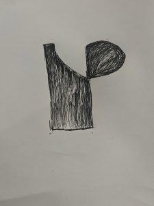
Before switching to digital drawing, I first draw a rough version of my typographic logo on paper. For my second logo, which combines the first letter of my name, I choose a design monogram logo type.
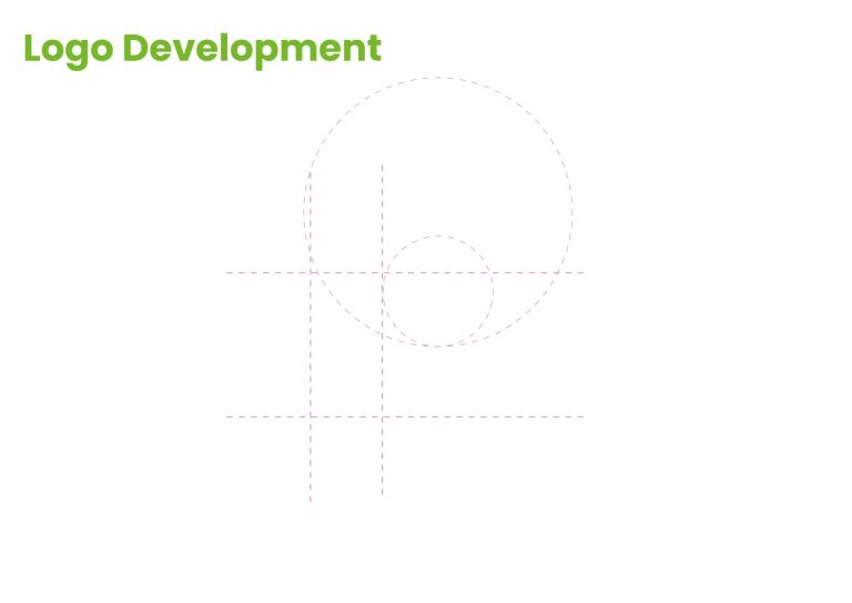
For my second attempt at creating a logo, I prefer to utilise the Grid and Shape Builder tool rather than an available typeface. The studio practise sessions have greatly improved my knowledge of Grid and layout, and I think that utilising a grid to produce a monogram logo is a really easy and efficient method.
and lastly, I created a lovely monogram logo that combines my first name and the initial point (R). From my perspective, this looks like R and point. I also created a favicon for my website’s identity logo, which I utilised as the home button for my website.
Reference
Verywell Mind. (n.d.). How Does the Color Green Make You Feel? [online] Available at: https://www.verywellmind.com/color-psychology-green-2795817#:~:text=Green%20is%20a%20mix%20of.