Self-Promotional Image Poster -1
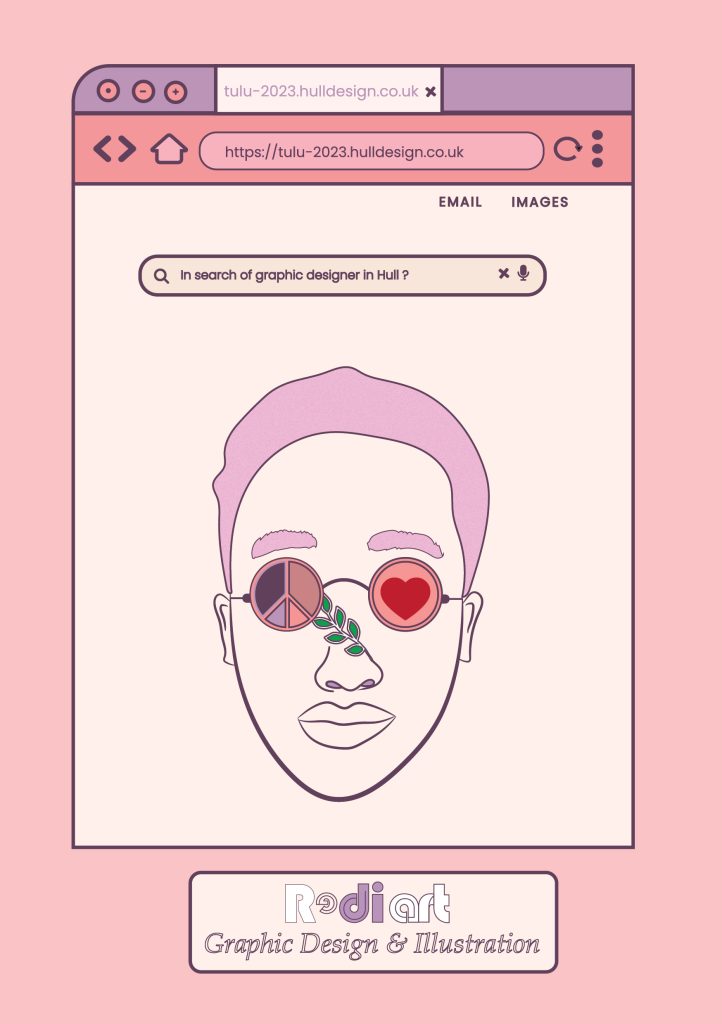
My first self-promotion poster was intended to feature my face as well as my concern for the importance of peace, love, and nature in both individual and global contexts. However, for this poster, I focused more on showcasing my design skills for anyone who contacted me regarding a design project. To that end, I created a retro-style web browser from scratch, starting with the minimize, maximize, close, tab, backward, forward, home, and reload icons. I believe that by using these designs, people can see my ability to create visually appealing designs, searching for graphic designers in Hull? I wrote, adding a Search button to the main body of the window that was generated. It demonstrates that when someone searches for graphic designers in Hull City, my illustration and studio name are displayed on the page. I get a lot of influence for my illustrations from American graphic designer Chip Kidd, who used minimalism as a design strategy to produce a number of book posters. I choose to use a minimalism approach in my illustrations because I want to show how nature and peace can coexist. I depict these ideas as eyeglasses for peace and love in both of my eyes, and I include some plants for a convoluted natural look in my noise.
Self-Promotional Image Poster -2
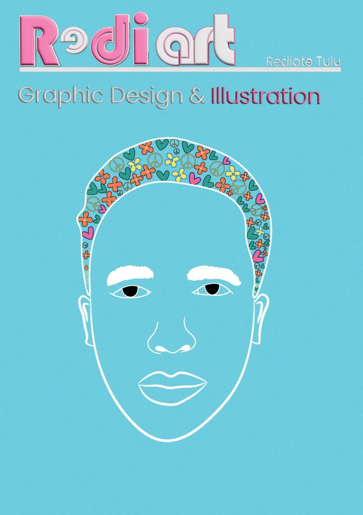
For my second self-promo poster, I wanted to use more typography, pattern, and colour while conveying my message to the world about how important peace, love, and nature are to a healthy way of life. As we all know, these days are marked by frequent wars and climate change, so we must work together to make changes as soon as possible to avoid making our world a horrible place that is unfair, if not for the next generation at least. I have included those three elements in my design. Therefore, the first step was to sketch love, peace, and nature (a flower). I then illustrated myself from a reference image, adding peace, love, and a flower to my hair or mind to give a message about how important those three things are. My studio will be called Redi Art, which is why I use this name when designing typeface, which I truly enjoy doing I therefore decide to create some attractive typography using shapes and employ some 3D technologies to create a typeface that looks better.