Brand typography serves as a vital component within a brand’s style guide, orchestrating the presentation of written content to resonate with the brand’s unique personality and voice. It goes beyond merely selecting a font or typeface; it encompasses the artful arrangement of textual elements, ensuring clarity and consistency across various communications. In essence, brand typography is the visual language that harmonizes written expressions with the brand’s identity, contributing to a cohesive and memorable brand experience.
Selecting the right typefaces and fonts for your brand is akin to choosing a language that speaks volumes about your values and brand personality, much like the impact of colors. Typography is a multifaceted storyteller, delivering a nuanced portrayal of what your brand represents.
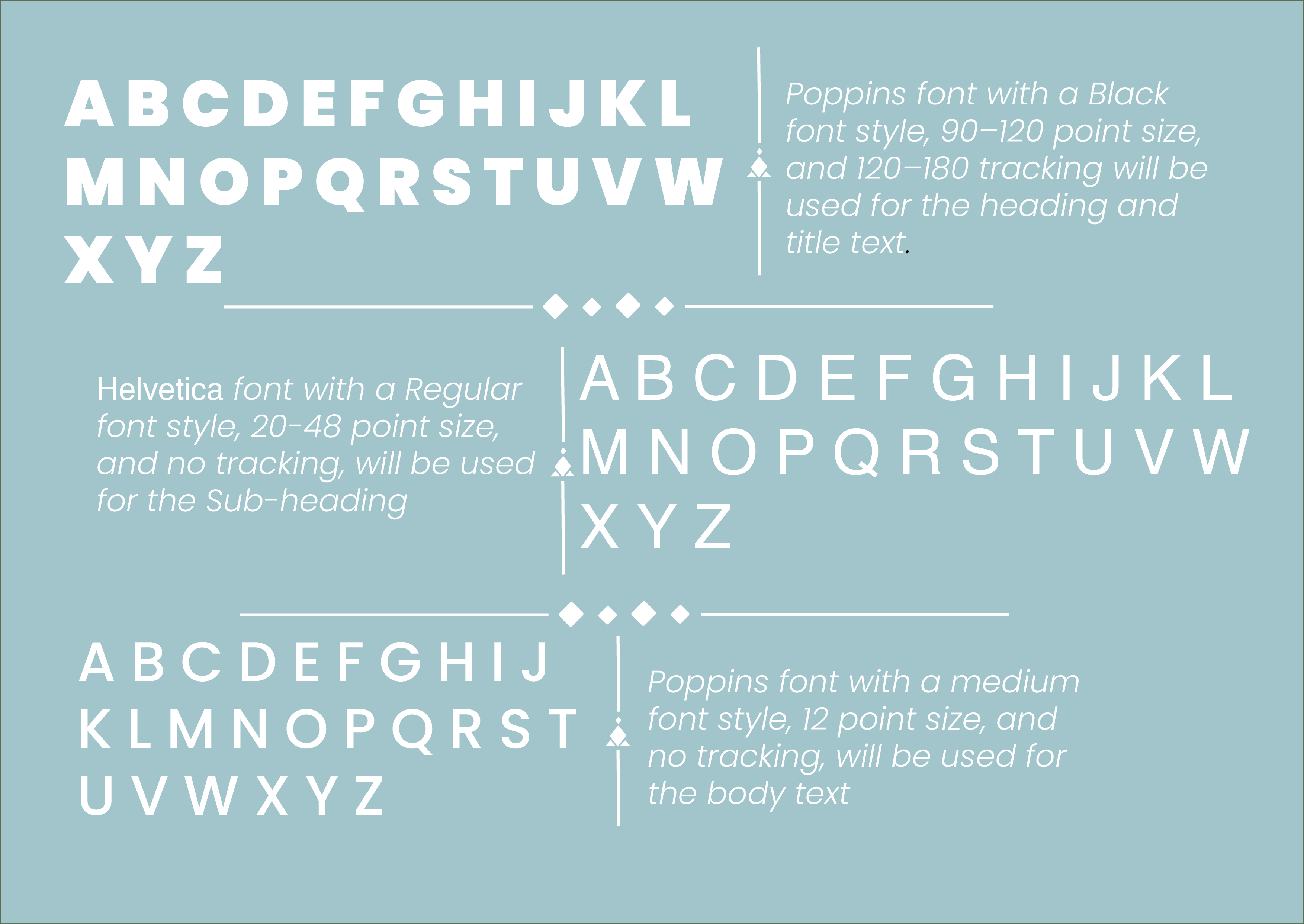
The first Typographical standards page is primarily going to be uses for the advertisements (Editorial design pages)
In crafting my brand identity, i have chosen Poppins as the primary font for my headings and titles. The bold and modern design of Poppins, coupled with its Black font style, conveys a strong and contemporary visual presence. To ensure prominence, i opt for a large font size ranging from 90 to 120 points, offering a commanding and attention-grabbing impact. Additionally, a tracking range of 120 to 180 further enhances the spacing between characters, striking a balance between readability and a bold, distinctive appearance. This deliberate choice of Poppins font, with its specific style, size, and tracking parameters, reflects our commitment to a cohesive and impactful brand image.
For my sub-headings, i opted for the timeless Helvetica font in Regular style. Its clean lines and straightforward design provide a subtle yet professional aesthetic. With a versatile point size ranging from 20 to 48, our sub-headings maintain a balanced hierarchy while accommodating various content contexts. The absence of tracking ensures optimal legibility, allowing the Helvetica typeface to deliver a clear and refined appearance.
My body text is set in the Poppins font, known for its versatility and modern appeal. With a Medium font style, it strikes a balance between readability and a touch of sophistication. At a comfortable 12-point size, the text remains legible while maintaining a clean and elegant loo
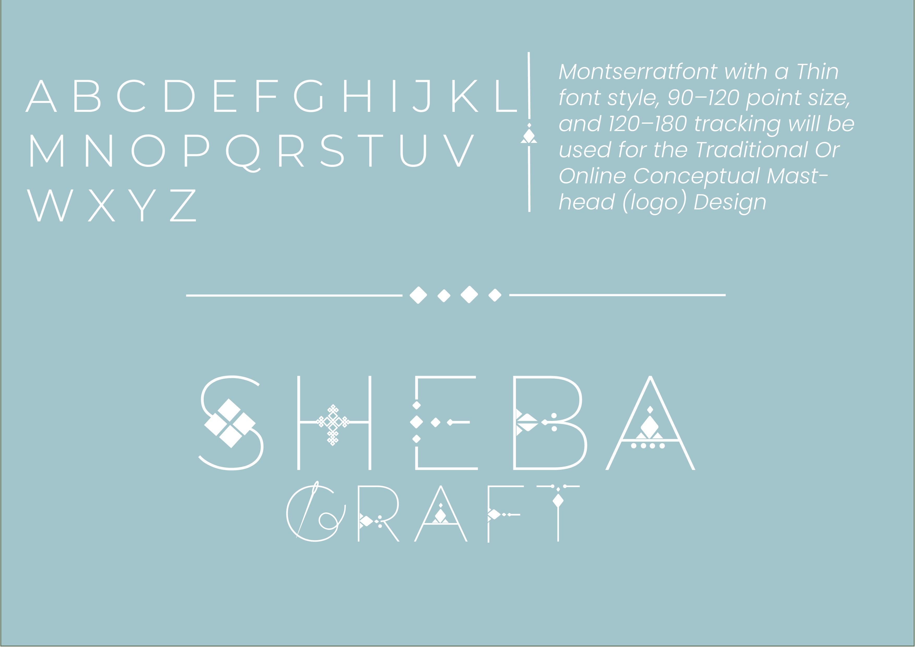
For my Traditional or Online Conceptual Masthead design, i ‘ve chosen the Montserrat font in a Thin style. The delicate strokes of Montserrat Thin exude a sense of elegance and modernity, perfectly aligning with my brand’s visual identity. The large point size, ranging from 90 to 120, ensures a bold and impactful presence for my masthead. Additionally, a tracking range of 120 to 180 adds a touch of spacing between characters, contributing to a well-balanced and harmonious design. The Montserrat Thin font strikes the ideal balance between sophistication and contemporary flair, making it the perfect choice for my conceptual masthead.”
Reference list
www.designrush.com. (n.d.). Brand Typography: Why It Matters And How To Find The Right Fonts For Your Brand. [online] Available at: https://www.designrush.com/agency/logo-branding/trends/brand-typography.