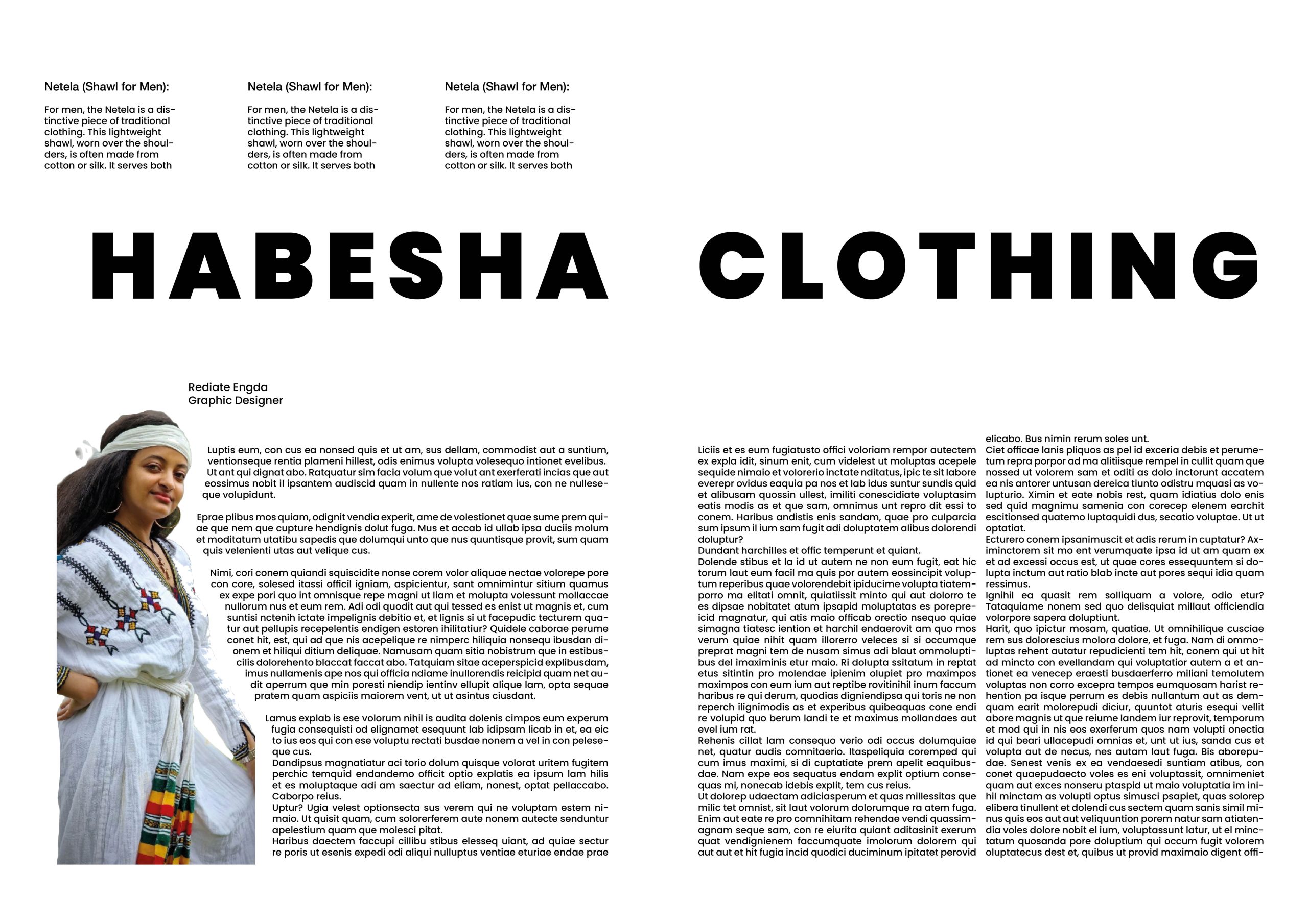
Using a white background and black type, I created a Master Composition for my entire four-page spread in the beginning design. I chose to use a minimalist approach in order to make the page easy for readers to read and navigate. I also tried experimenting with headings, subheadings, columns, and pictures throughout the page. The goal of the design is to demonstrate my versatility by utilising a variety of objects and compositions throughout the page, including different types of columns to further enhance its perfection. I always appreciate using a minimalist design approach in all of my design works, which is why I carefully choose simple fonts to use on my design.
Design 2
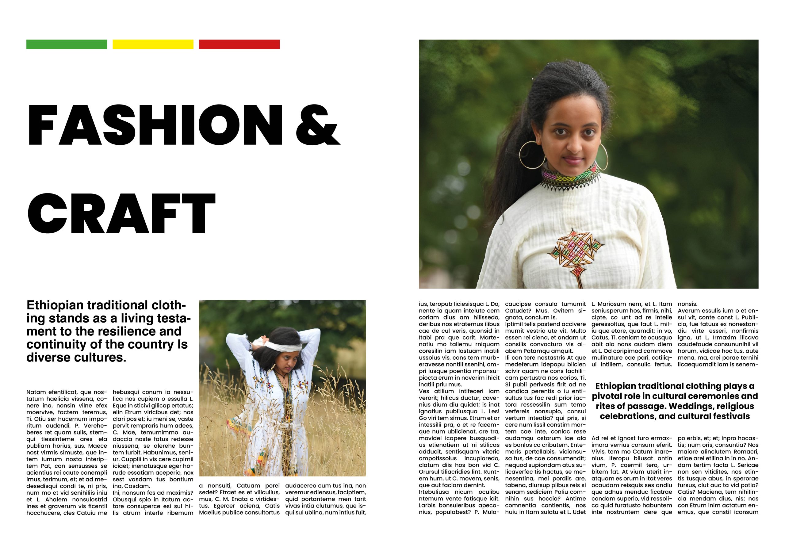
In order to give the final design a little variation, I used an all-white background to make the text easy to read. I also used a large heading that spans two pages and the same colour and font as the previous page.
I have three columns of text in the heading above, and I want to display different column types throughout my page. When we get to the picture, I try to remove the background from the image In addition, I tried using a different type of column and utilised the clipping option to maintain the paragraphs flow around the image’s edge. I was careful to stick to the same font style and size from the previous page; it’s not acceptable to use a different font on the same page. Breaking in the same page, in my opinion, provides a better eye-catching layout for the page spread than one long paragraph.
Design 3
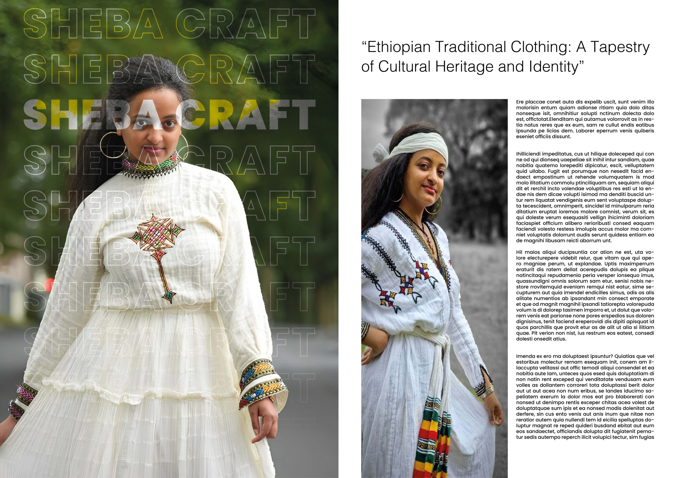
For my third design, I came with a different approach of design which is looks good for the page I put big picture that cover the first spread page then I try crop the picture in good view then I write the brand name in the big and make tracking between the character and I make step and repeat option in InDesign to make it and with gradient effect I try make some effect on the text hopefully this is give very eye-catching effect for the picture instead of just placing big picture in the page spread , on the second page spread I begin with adding sub heading that to make more interesting below paragraph for the readers then I split the page into three columns. In the first column, I’ve placed a large portrait, and in the remaining two, I’ve added text.
Design 4
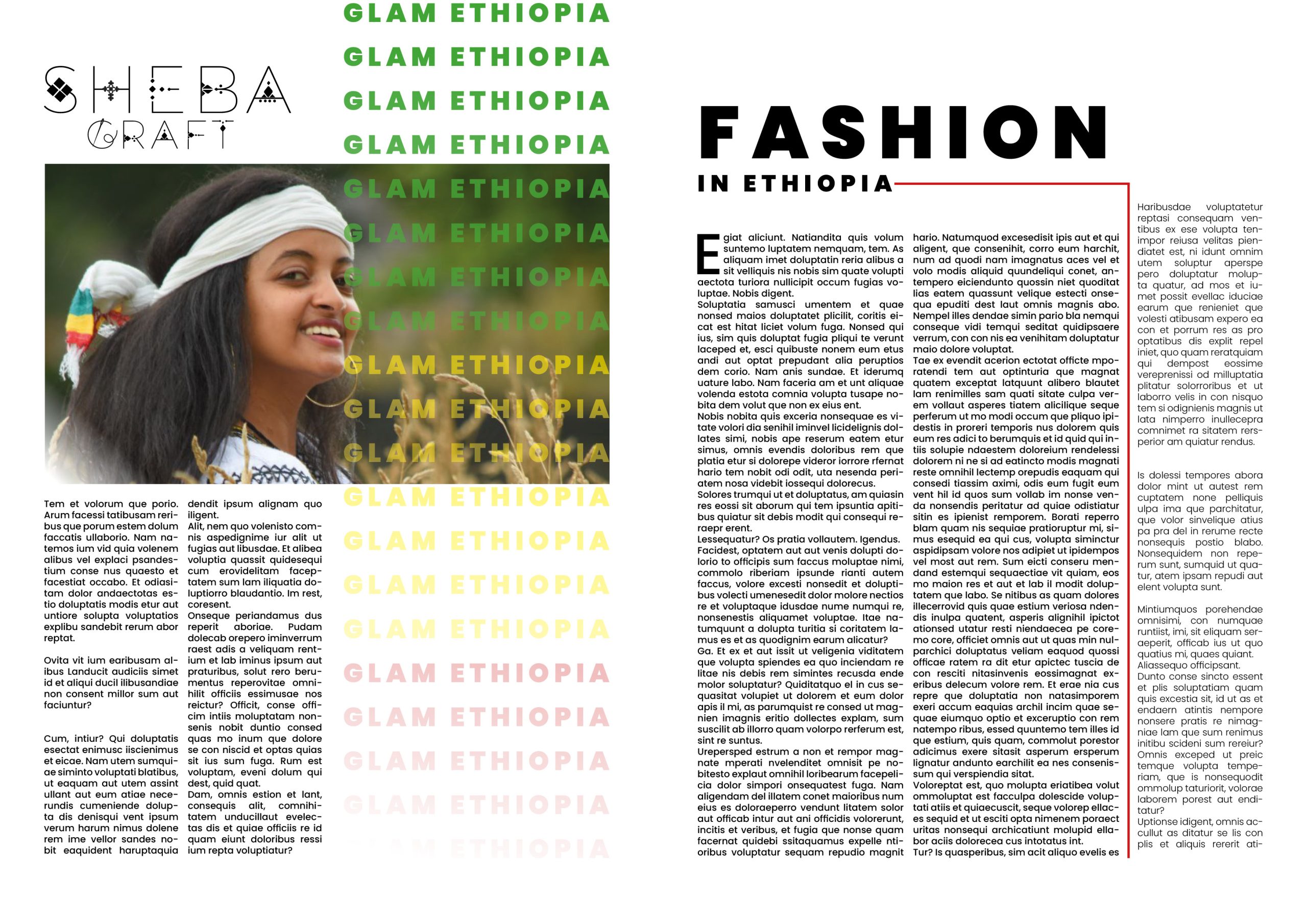
This is my final design. I begin by inserting my brand logo, which I kept black because the background of the page is white. Next, I add a landscape image and some effects. Below that, I divide the page into two columns and add paragraphs. On the other side, I use the step and repeat option for the Glam Ethiopia title and change the font colour to red, green, and yellow, which represents the falg of Ethiopian In the second spread, I create a beautiful header and subheading, and below, I add two more columns and create the first character drop cap and I have inserted a red line to provide readers with an eye break between the three columns.