Composition in graphic design refers to the order and organisation of numerous visual elements within a design or layout, such as text, images, forms, colours, and other graphical components. It is a basic part of graphic design that defines how these elements interact with one another and how effectively the whole design expresses its intended message. A well-crafted design not only appears visually good, but also clearly communicates the message and engages the audience.
vanity fair magazine 2017 September edition Emma Stone
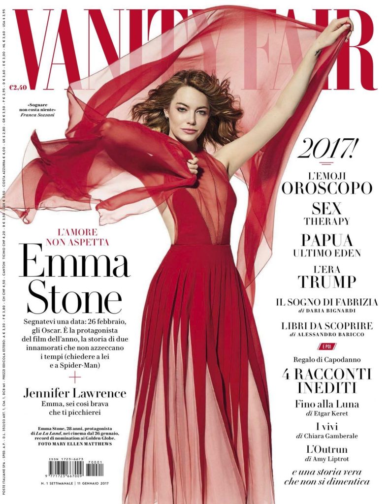
The Vanity Fair magazine cover starring Emma Stone is a testament to the power of compositing in generating an aesthetically pleasing and emotionally compelling magazine cover. It uses composition to effectively balance out aspects and guide the viewer’s attention throughout the design.
Through its central placement, the magazine cover preserves a pleasing visual equilibrium. The model’s positioning in the middle of the frame gives the image a sense of stability and directs the viewer’s attention to her.
The model’s appealing facial expression, emphasised by her dazzling face and confident appearance, establishes a connection with her audience. Her demeanour exudes warmth and charisma, quickly elevating her status.
The bright red outfit contrast well with Emma Stone pale skin tone and the crisp, white background. This balance of colours produces a visually stunning and special image.
The masthead and cover lines of the magazine are flawlessly and fluidly incorporated into the arrangement. Because they are positioned at the top and bottom, they don’t distract from the main idea, and the contrast between the black text and the red header connects the design together.
By keeping the design simple and clean, it highlights the subject’s inherent beauty and allure, and the diagonal lines formed by the model’s arms and the line of her dress also help to draw the viewer’s attention inward to her face. The minimalist approach to composition is in line with this magazine cover’s reputation for sophistication.
Emma Stone confident and approachable expression resonates with the viewer. Her smile and body language convey sense of charm and allure
Each element’s placement in this design directs the eye in different directions, allowing us to take our time and fully appreciate it. The spectator will find the design to be appealing and well-balanced.
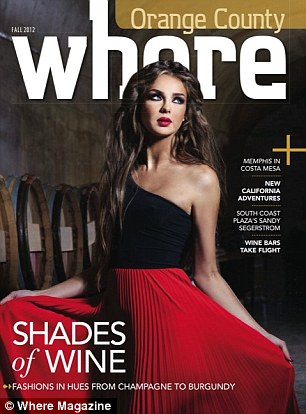
How where become whore
This magazine demonstrates how it doesn’t use efficient composition and layout techniques, how some of its cover images were unintentionally arranged, and how the publication has obfuscated Because of the way the first letter “E” in the masthead lettering is arranged with the head of the magazine’s cover model, readers of the magazine may get confused and believe that the cover model is not a wholesome, fashion model figure, rather than that the magazine’s name has become whore. But a very different thing
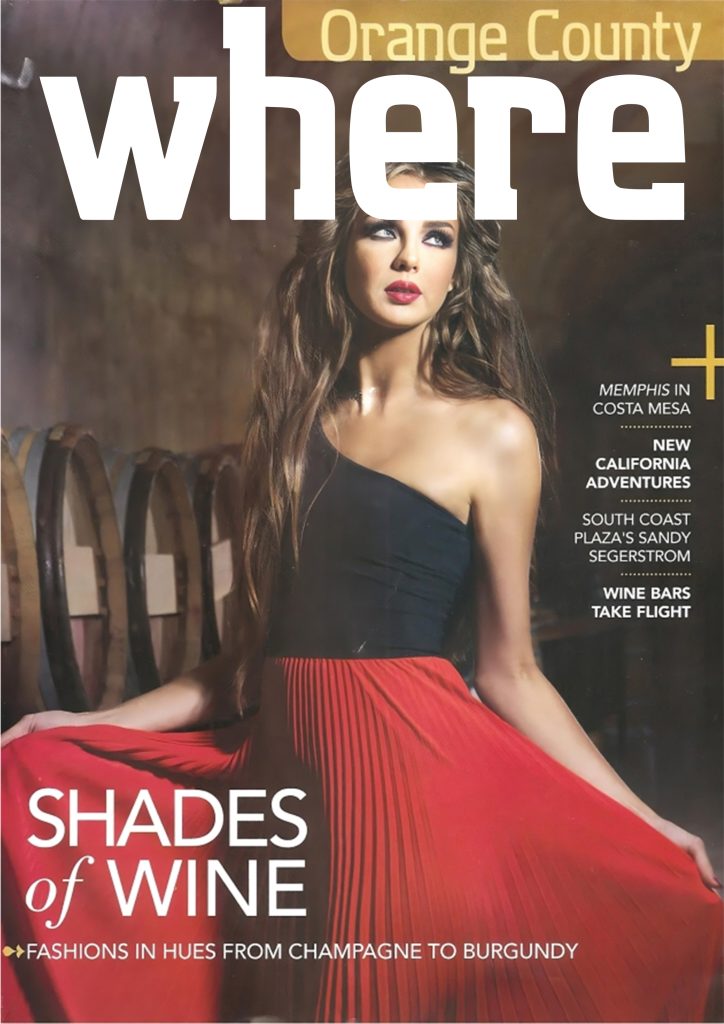
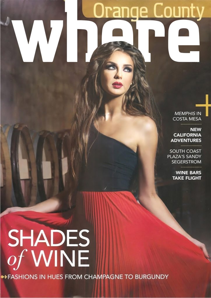
To redesign this magazine and to fix the composition problem that I encountered in the design, my first step was to increase the picture size because I couldn’t find the large size on the internet, so I simply used some techniques in Photoshop to reduce the quality of the image. After that, I had to redesign the masthead or logo because it was easy for me to manipulate the logo after I remake it by myself, so it was the most difficult part of the process, so I had to track each element with the pen tool.Because I couldn’t find the exact font that the designer used to design the logo, I decided to make my own. After that, I copied the logo to Adobe Photoshop and from above writing which is i figure out the problem of the design was totally the logo cover through the model image that gives embracing meaning for the cover it’s totally disrespectful for the model honestly so the next step was with erasier tool I tried to erase the cover parts covering my subject.It was not a flawless redesign, but my purpose was to highlight what the problem was, such as bad compostion in the second remake example, which was completely simple; I simply copied and pasted the logo in front of the model, which is too easy to reveal the title.
Reference List :
1.Emma Stone star in vanity fair Italia January 2017 cover story (2017) DSCENE. DESIGN SCENE. Available at: https://www.designscene.net/2017/01/emma-stone-vanity-fair-italia.html (Accessed: November 2, 2023).
2. Davis, M, & Hunt, J 2017, Visual Communication Design : An Introduction to Design Concepts in Everyday Experience, Bloomsbury Publishing USA, London. Available from: ProQuest Ebook Central. [2 November 2023].
3.Frauenfelder, M. (2012). Orange County Where magazine on newsstands. [online] Boing Boing. Available at: https://boingboing.net/2012/09/11/orange-county-where-magazine-o.html [Accessed 2 Nov. 2023].